Category: Print Dedsign

  • Logo Design Examples

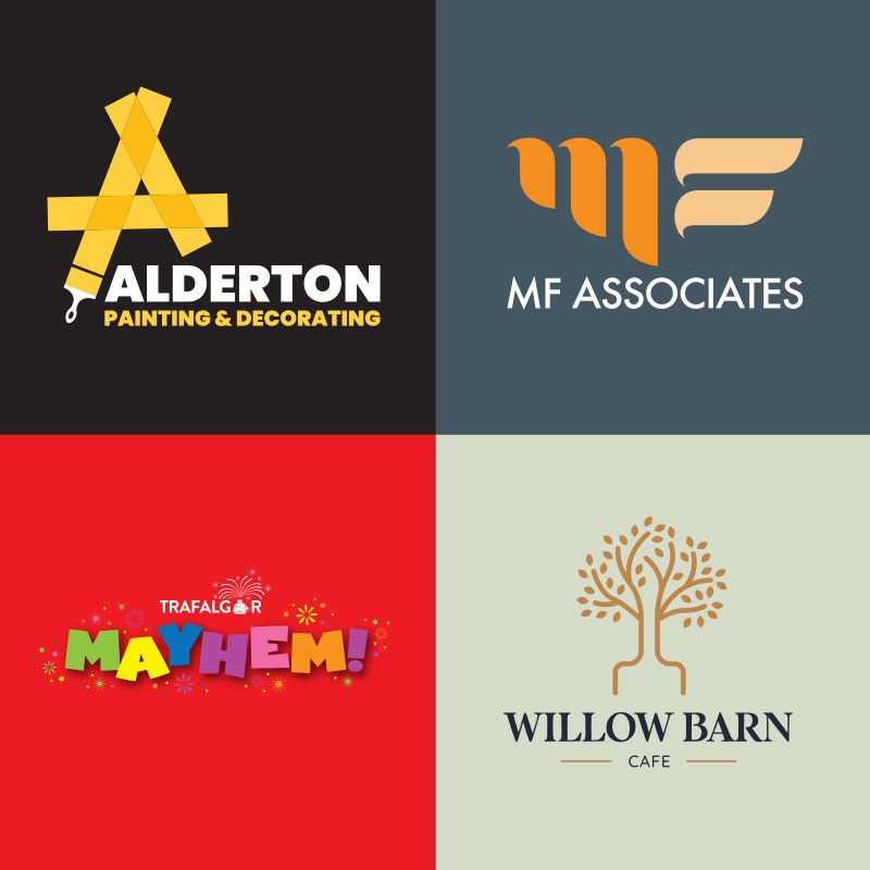
    As a freelance graphic design from Suffolk, I have the privilege of being asked to be involved a huge range of products, from Start-ups, to established large organisations. The initial logo design and visual identity is a great way to set the tone ans how the businesses communicates to their customers. It is your chance to make a good first impression. Here are a few logo design examples completed over the last 12 months.

    Suffolk Painter Logo Design
    Logo Design Examples

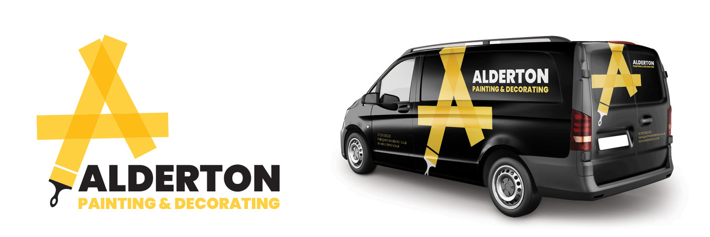
    Simple yet effective logo for a local decorator. Using this new brand on direct mail leaflets, advertising and social media, this really helps them stand out from the crowd and gives potential customers an idea of their attention to detail.


    Logo example for Suffolk Cafe

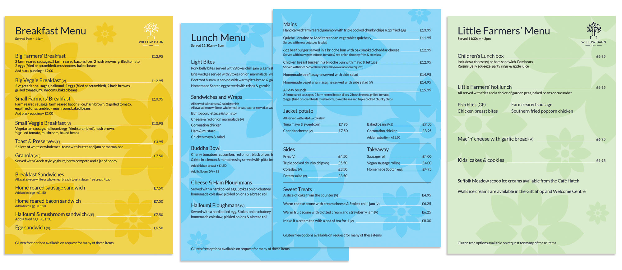
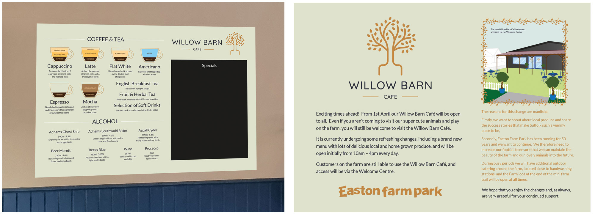
    Logo design examples for the Willow Barn Cafe at Easton Farm Park. The logo references the willow trees grown near the Deben which are highly sought after in the use of cricket bats. The colour choices are designed to differentiate the cafe from the more primary colours used in the farm park to help attract a wider gae group to just use the cafe as a place to visit with friends and family.


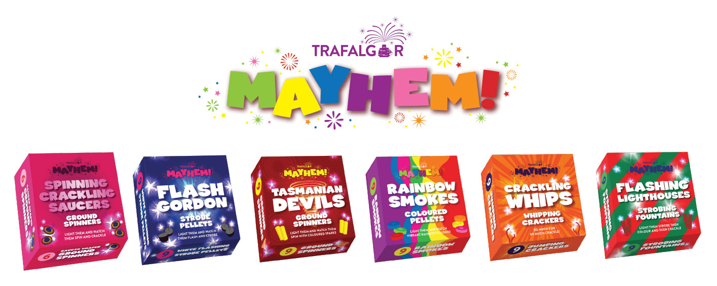
    Mayhem logo design example

    Logo for a range of pyrotechnic products sold by Trafalgar Fireworks. The Mayhem name and range brings all these products into one famiuly making it easier to market and help with customer identification.


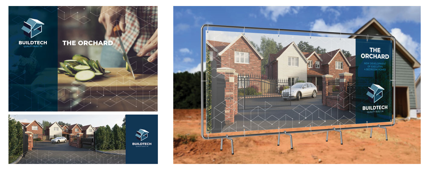
    Logo example of local building company
    social media support advertising and onsite hoardings

    Visual identity for building company based in East Anglia. These example show the advertising and social media support for marketing a new housing development in Brentwood.


    Logo design for specialists in financial markets search consultancy and website design project.


    Wellbeing logo design

    Logo design and visual identity for Suffolk based wellbeing start-up


    Logo Design Examples

    If you are involved in a start-up or an established company and need to have a logo designed, or your existing brand givena refresh, then please get in touch and I’ll be able to discuss your best options.


    Latest News, Projects and Articles

    For more news, projects and case studies click here >

  • Christmas Packaging

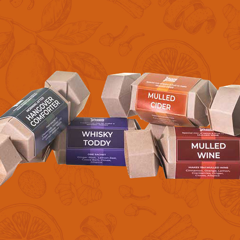
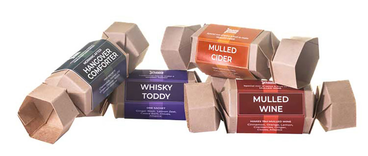
    This highlights a fun Christmas Packaging project for an East Anglian based supplier of herbs and spices. As part of their Christmas Range, they developed a cute Christmas cracker style pack for sale in farm shops and food courts. A simple, low cost item that is so important for these retailers, they can be easily merchandised in the food section, displays and even at the point of purchase.

    Christmas Cracker style spices packaging

    Designed to be easily differentiated, they use bright, bold colours, but still feel appropriate for this time of year. The front displays the product name in a traditional style label with a hint of a ribbon. Using the six sides of the cracker to our advantage, we are able to separate out the logo, the name and the ingredients, giving each element space to communicate. The background uses traditional Victoriana style line illustrations hinting at the mix of spice within the packs.

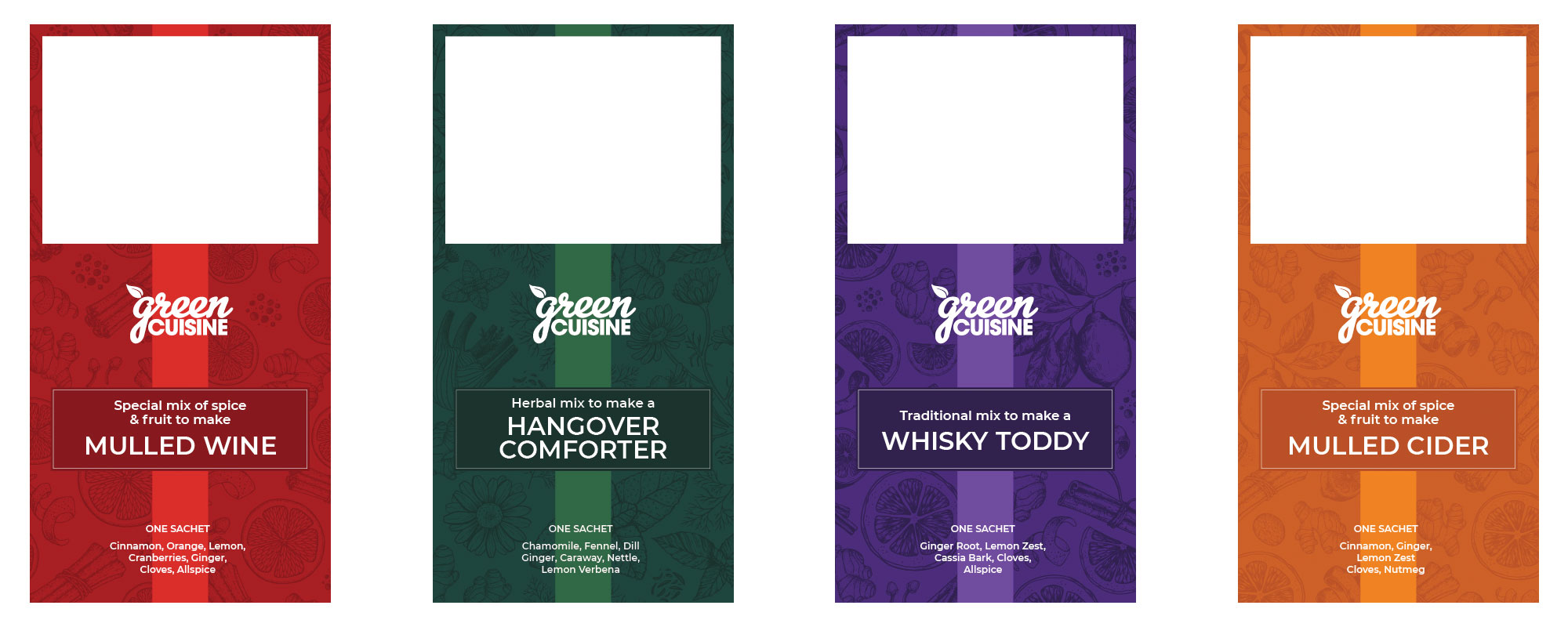
    Christmas Packaging Examples

    Initial artwork for the Christmas packaging. This shows the space on the labels for ingredients, barcodes and mandatory information, such as name of manufacturer, date, batch numbers etc.

    Christmas Packaging Design Example

    Christmas Packaging

    Above shows the original design visuals and additional examples of labels for the extended range. Getting the Christmas packaging right for your seasonal projects is so important as they will be fighting for shelf space before we even get to whether the customers will find them appealing. These strong, simple, but timeless packs have proven to be hugely popular for those browsing farm shops looking for low cost items for gifts. The product itself is ideal, as it embodies great Christmas traditions of celebration and togetherness, but also has a long shelf life, making the perfect gift.

    Please check out some other packaging design examples here, or get in touch if you have a specific packaging design project and I can send you examples of previous work.


    Latest News, Projects and Articles

    For more news, projects and case studies click here >

  • Easton Farm Park Logo

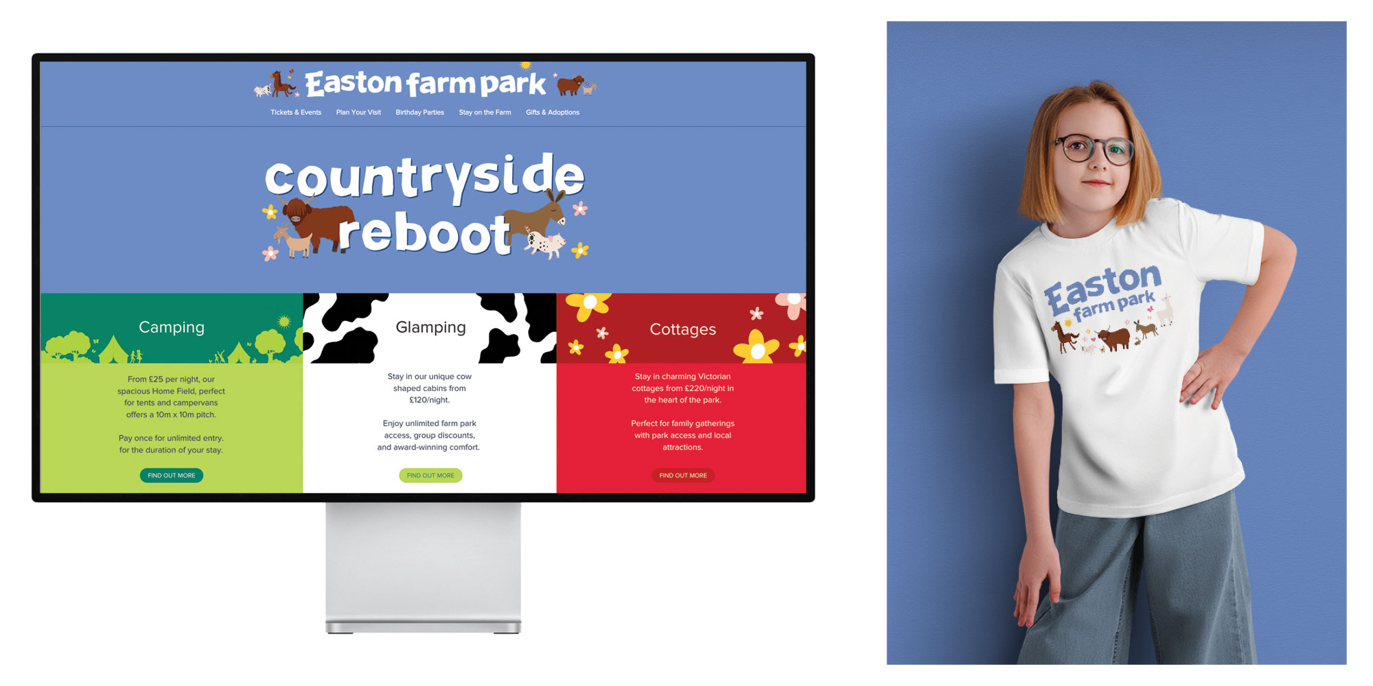
    Easton Farm Park have refreshed their logo in order to strengthen their visual identity and give the brand a new fun look. Easton Farm Park have been welcoming visitors now for over 50 years and are one of the most important visitor attractions in Suffolk.

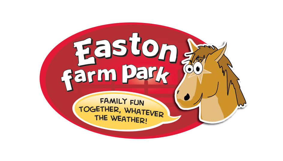
    Old Logo Design

    Old logo

    Easton Farm Park

    Main Refreshed logo

    Easton Farm Park Logo Refresh

    Simple Refreshed logo

    The new logo design is a simplified version of their original logo, dating back to the 1980s. We chose to just use the text from the logo in order to give it a simple, uncluttered, look which is clearer when used on adverts and social media.  We also chose to remove the existing red oval which didn’t offer a friendly, inviting feel to the brand.

    Logo design examples

    Examples of the main simplified logo

    New Brand Colour

    Once the decision had been made to drop the red oval, it was a great opportunity to look at a more appropriate and considered brand colour. With Easton Farm Park’s extensive work in conservation, we thought this should be reflected in the colour and the obvious choice was that of the cornflower, an increasingly rare plant only found in the arable fields in Suffolk and Surrey.  The colour of the cornflower is a magnificent and quite unique blue, ideal for the Farm Park. We developed a colour palette based around the blue, its a green for contrast and a darker blue to be used when appropriate.

    Main logo design

    Examples of the main logo and the new brand colour

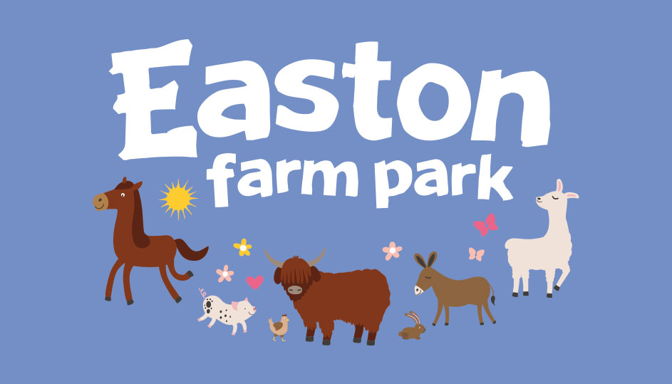
    A part of the original logo was the Suffolk Punch character.  As part of the international breeding programme, the Suffolk Punch has been very important to Easton Farm Park for over 50 years with the farm helping to keep this magnificent breed alive.  (Did you know, there are more rhinos in the world than Suffolk Punches?)

    When used on the Farm Park marketing material, the simplified version of the logo works well as it is supported by the farm characters.

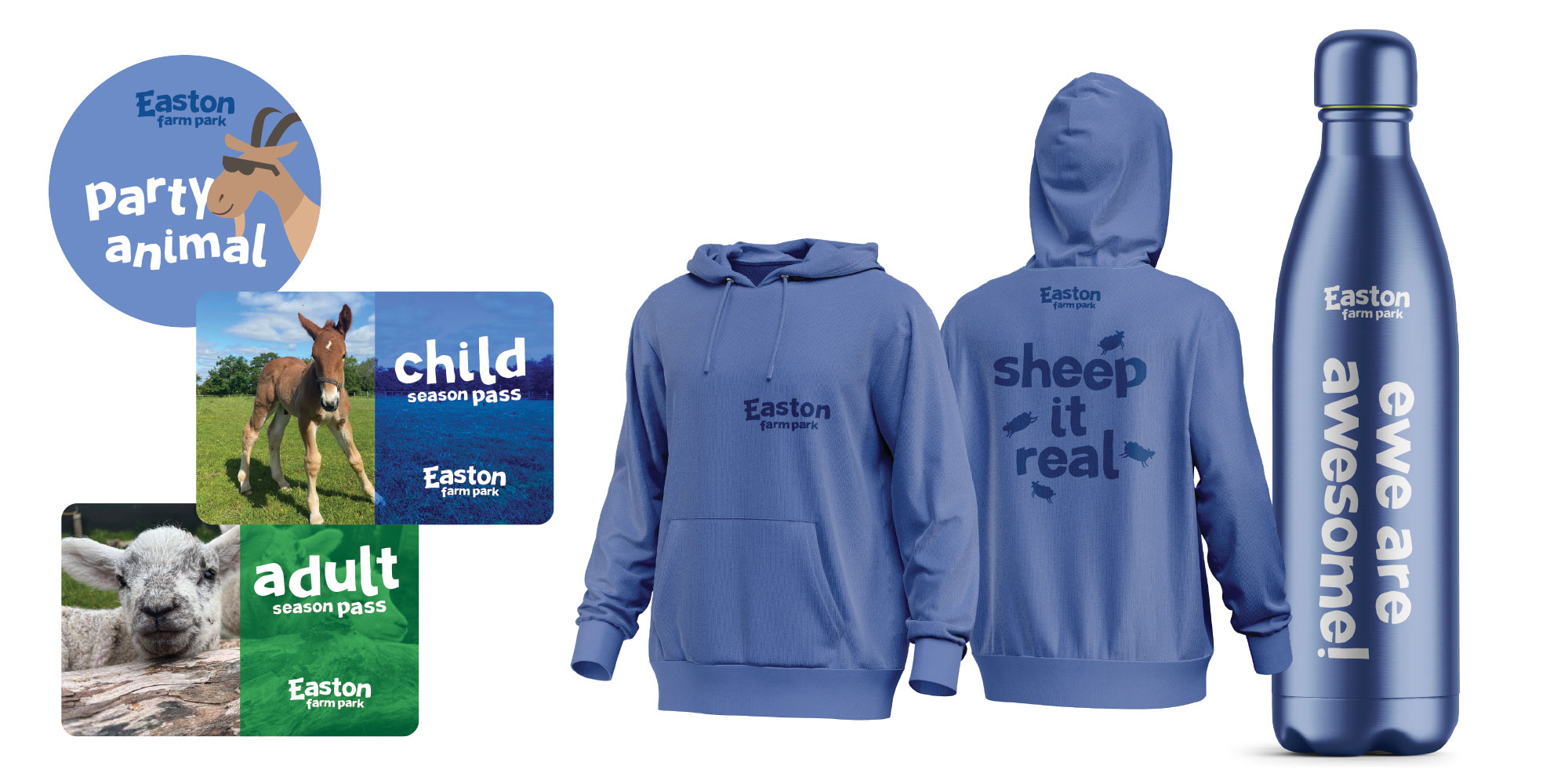
    Social Media posts showing examples of the new bespoke Easton Farm Park typeface and how this can bring all marketing elements together

    Easton Farm Park Logo Typeface

    Along with the logo, a unique typeface has been generated from the characters used within the logo.  This will enable all future marketing material to have some consistency, irrespective of the style used.  With so many activities and events happening at the Farm park, it is a great way to bring all the elements together.

    If have a log that you feel could do with a refresh but really don’t want to do a complete redesign, then get in touch and I can send over some ideas of how we can use the existing elements, but make them work for a new generation.


    Latest News, Projects and Articles

    For more news, projects and case studies click here >

  • Suffolk Magazine Design

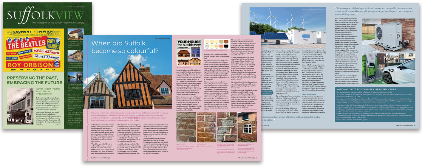
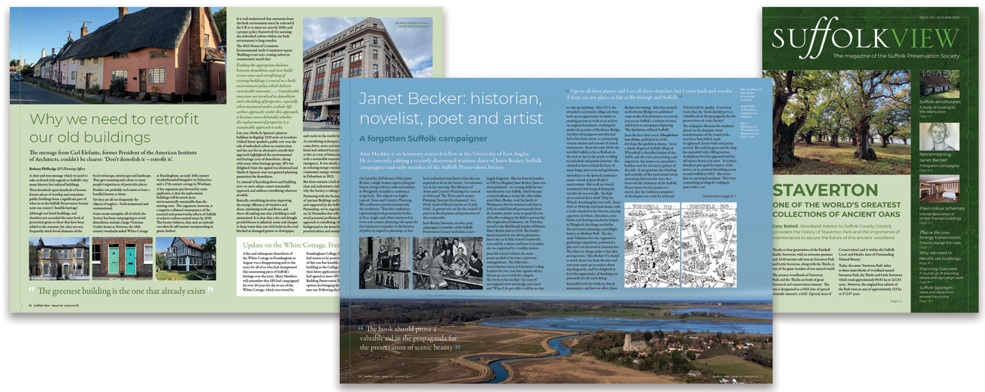
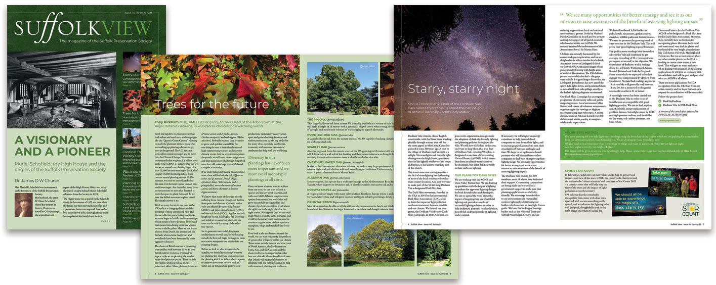
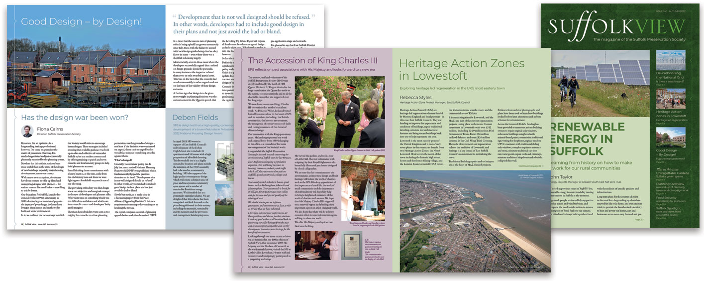
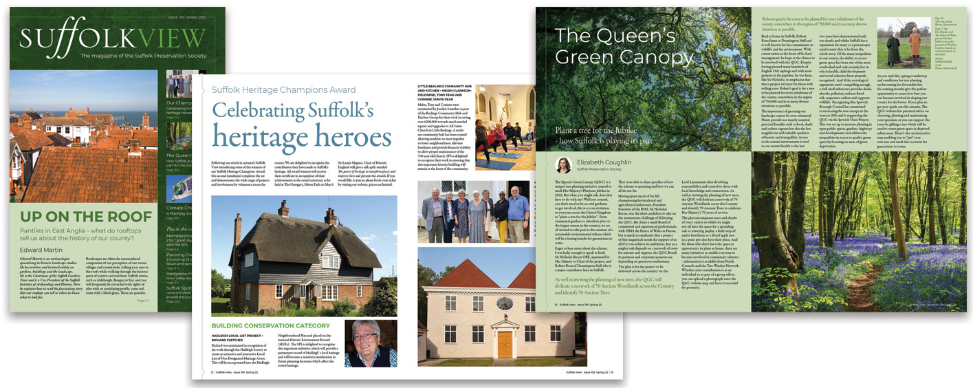
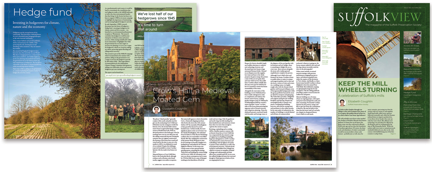
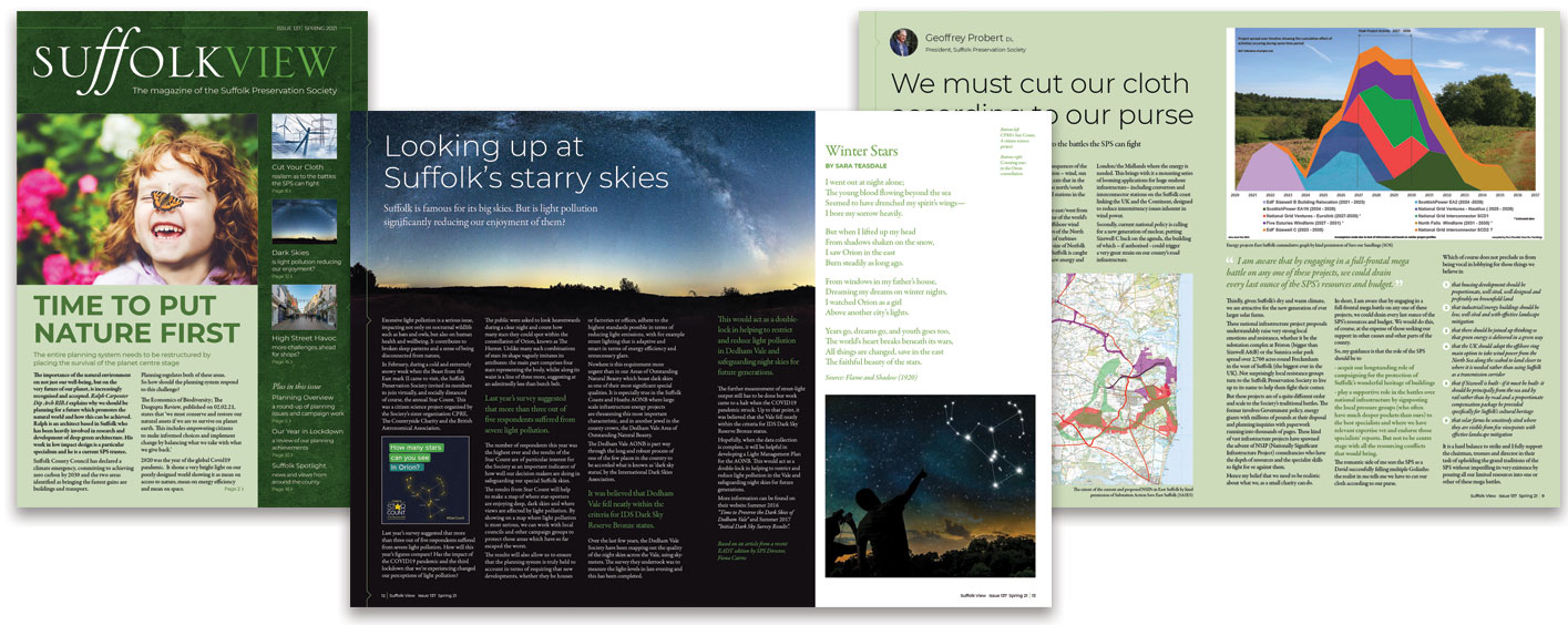
    This Suffolk magazine design project is on behalf of the The Suffolk Preservation Society. They produce a bi-annual magazine to highlight their campaigns and communicate how we can help maintain the beauty and distinctive character of the Suffolk landscape and it’s historic buildings.

    Suffolk Magazine DEsign

    As part of their membership, all supporters receive a magazine, available in both printed and digital form. The magazine covers planning news, the work of the individual county campaigners as well as a huge variety of articles covering historical information and detailed developments impacting Suffolk.

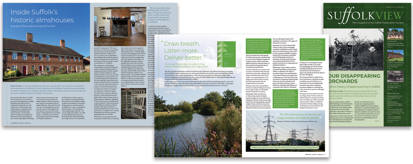
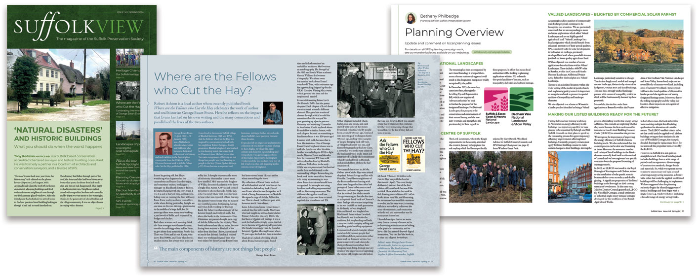
    Examples below show the different types of articles that have been part of the magazine over the last 4 years since the initial magazine design work.

    Suffolk View Spring 25

    Suffolk Magazine Design Autumn 24 publication

    Suffolk View Spring 24

    The Suffolk magazine design included a fluid three column layout and a colour pallet based around the three brand shades of green. In order to add more colour to the designs, spreads used full colour images where possible and background shades drawn from the main image colours.

    Space was included on the right hand page for any accreditation or information about the images and graphs. This allows the layout to be more like a magazine, rather than a stuffy newsletter.

    Suffolk View Autumn 23

    Suffolk View Spring 23

    Suffolk Magazine Design Autumn 22

    Each publication was included on their website in digital form, including links to all relevant resources mentioned in the articles. The interactive PDF also included page links and an interactive contents section on the cover.

    The back issues are all available and prove to be a wealth of information and a living document on how the SPS are fighting any unnecessary changes to Suffolk as the county faces increased pressure from energy producers and developers.

    A case study on the initial design and process can be found here >

    Suffolk View Spring 22

    Suffolk Magazine

    Suffolk View Spring 21

    Suffolk Magazine Design

    If you have a company or organisation that produces a publication for you customers or members, then having some design input can really help transform these into something that is valued. With print media becoming a more and more important part of any marketing campaign, a well considered and targeted magazine could your way to reach your clients in a meaningful and lasting manner. If yiu have any queries on how the process works, then please get in touch.


    Latest News, Projects and Articles

    For more news, projects and case studies click here >