Creative Platform and Identity Design for Easton Farm Park
Working with the wonderful Easton Farm Park is always fun. They’re a great Suffolk day out where you get to spend time on a working farm meeting all their animals. It is a valuable part of the Suffolk tourist network providing a year round day out for families. Here they can get away from all the distractions of small screens and experience the great out doors and connect with the natural world.
We designed a new identity design which involved firstly developing a simplified version of their iconic logo allowing it to be used on new media and a new range of products. As the logo is so recognisable to their Suffolk visitors we wanted to retain it if at all possible. The challenge was then to use the old logo in a new and exciting way.
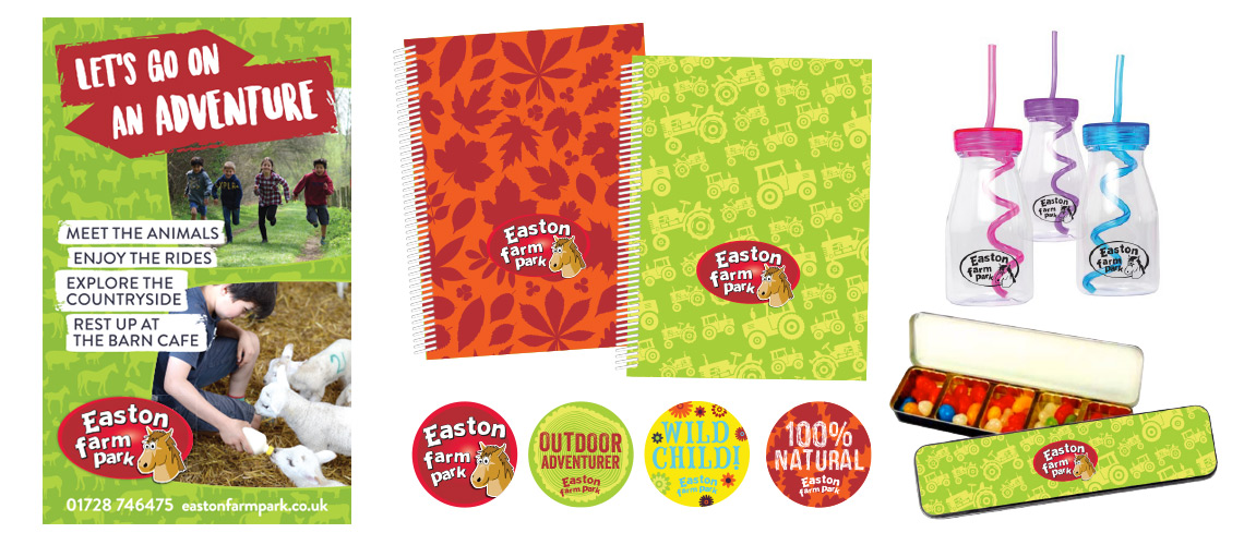
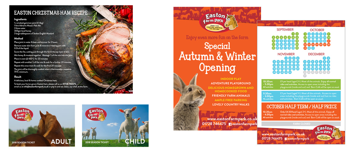
In order to do this we developed a new and exciting creative platform giving them a distinctive visual style on which they can base all their marketing activity, giving them a new cohesive brand across all channels. The new style introduces a number of brand patterns and a new colour pallet. The colours take their influence from the seasons allowing Easton Farm Park to tailor their material to the time of year.
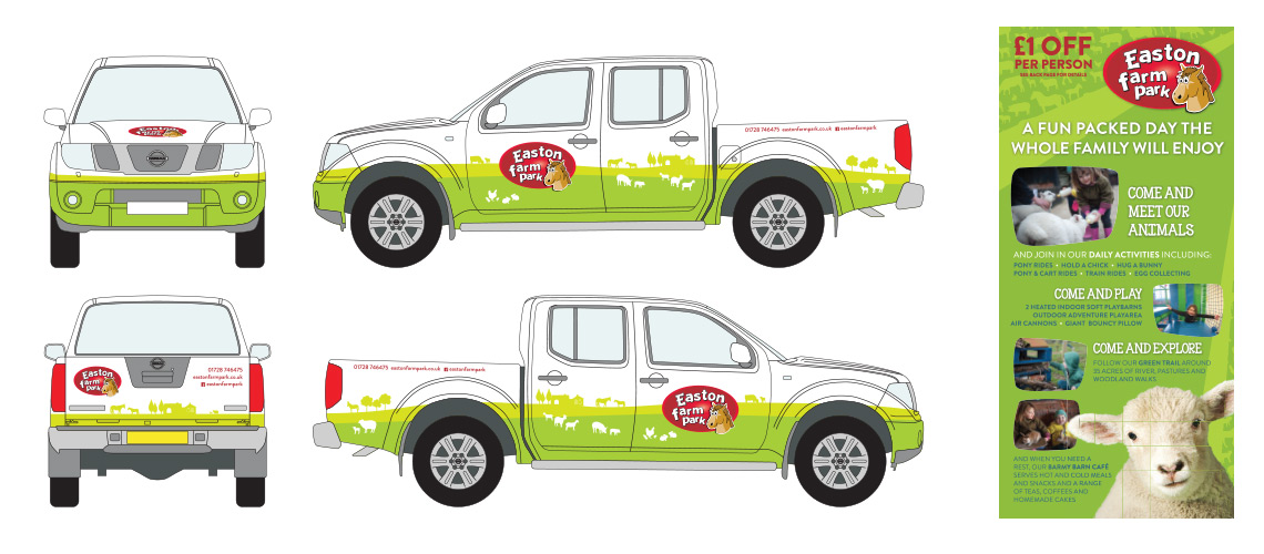
To date, we have used the new creative platform on all their printed material and new product range and are looking to roll it out over their social media and website soon. One very exciting project was designing the graphics for their new shiny pick up truck. Check out the project here >
If you haven’t been to Easton Farm Park, or haven’t been for a while I strongly recommend you go. Its a great place to catch up with friends and the Barn Cafe is excellent!
Get in touch about your project and how you can develop a new creative platform
If you have a corporate identity project and need some help, get in touch. As you can see it is perfectly possible to creative a fresh visual style without having to completely redesign your logo.