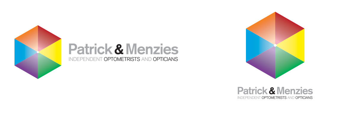
The new Patrick and Menzies logo was designed to take the business into a new exciting age of colour and interactivity.
Unusually for an opticians, the logo doesn’t use glasses as a motif. At Patrick and Menzies, they believe eye care is so much more than which prescription glasses you need and wanted their brand to reflect this. An overall approach to eye care, including the latest anterior eye imaging and retinal scanning techniques are seen as essential parts of a long term care plan. They also use various colour tints (colorimetry) to manage migraine and glare sensitivity.

Some people when looking at the logo will see a cube, some a colour wheel, some 6 triangles, some the top of an hexagonal pyramid. The motif is engineered to explore the individual nature of eyesight and how we all experience the world around us in a different way because of how we ‘see’.
Use of the colour wheel allows Patrick and Menzies to take individual elements and use it in a wide range of literature. Many other high street opticians have attempted to base their brand around a particular colour. The colour spectrum is such a fantastic subject. The new logo celebrates this and how wonderful our eyesight is. Not limiting themselves to one colour allows the Patrick and Menzies literature to be available in a wide range of colours and be different each time the customer encounters it.

The use of colour also echoes a new trend with Patrick and Menzies customers with many now using the colour of frames and individual styling to make a statement. Some colours will suit and enhance your look and the use of frame colour helps to enhance eye colour.
The logo shape and use of bold colours is also designed to engage children as Patrick and Menzies do a wide range of work with children and vision in learning.
The logo design process
We wanted to make the logo design project as fun and as engaging as possible for Patrick & Menzies. The business is lucky to have some very switched on and passionate staff, so it was important to include them as much as possible. In order to do this we produced a number of logo quiz sheets to get the staff thinking about logo design and corporate identities and what they feel works best. We canvased their ideas and this formed the basis of the brief.
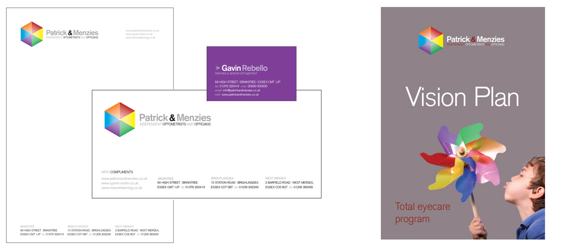
A number of designs were produced and these were shown to the staff to gather their opinions. Various logos were then taken forward and shown in a number of different scenarios to see what we felt best suited the material and platforms. After a number of tweaks, we agreed the final logo and this was rolled out on various key touchpoints.
We enjoyed the fun nature of the final logo. It was designed to ask questions about vision and how we see things. Is it a simple coloured hexagon? Do you see it as a point viewed from above? Is is an isometric square? Whatever your first impression, it will then take on a different shape the more you look at it.
Do you have a similar logo design or brand identity project? Get in touch and I’ll happily talk though the process and how I can help.