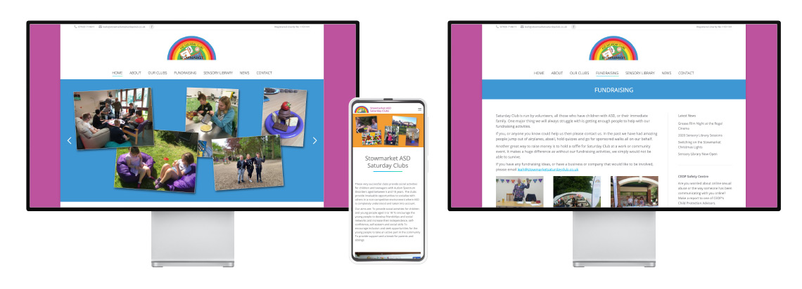
A good user experience is crucial in public spaces and this is screen UI design project aimed to make the process of renewing, borrowing and returning library books as clear and as simple as possible.
Good UI Design in environments such as libraries enables the user to complete tasks themselves reducing the strain on staff and other resources. The visitors need to be able to operate the system with confidence and understand the different processes, or they will create more work for the library employees.
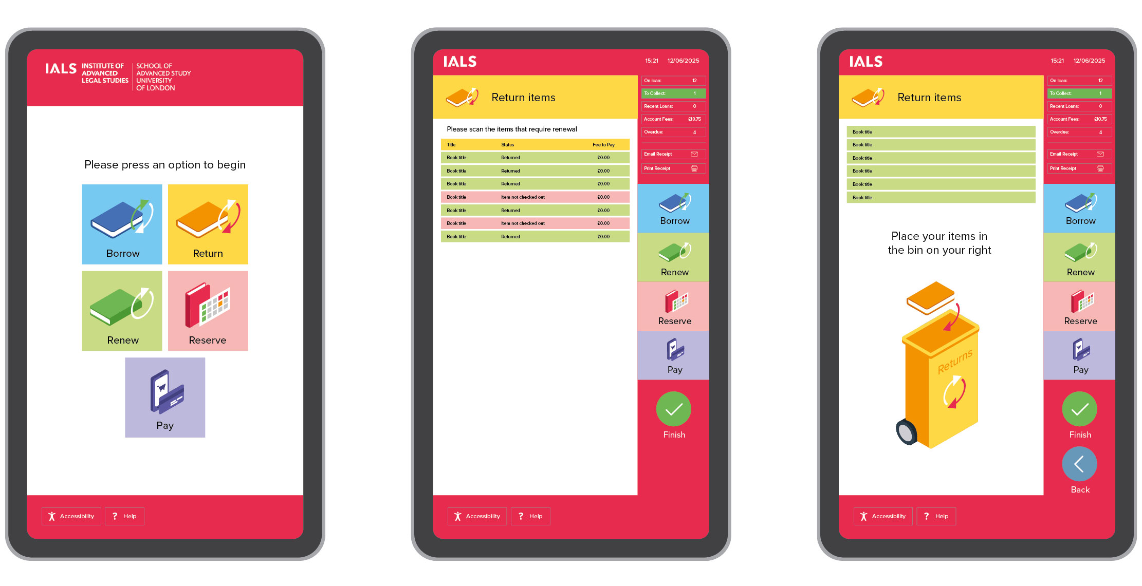
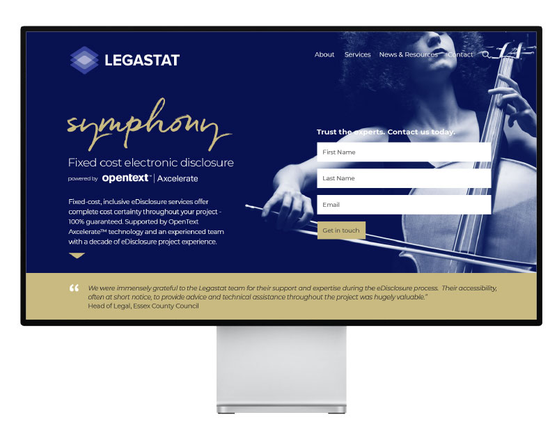
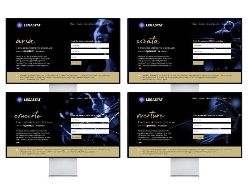
Screen UI Design Case Study
The library screen UI design is being user tested with the intention of rollout within the next 12 months. Reports from user groups have helped inform colour and layout choices to make sure the UI design is optimised from day one of launch.
Simple icons pictorially demonstrate the process as as well as text and colour schemes which account for many different learning styles. The system is designed to allow for multiple language choices and provide a large print option.
Using touchscreens, the system can be linked to payment providers giving the operator the tools to purchase other services or pay late fees. Once linked to other libraries, the system will also allow users to reserve books at different locations.
If you have a public or internal system that you feel isn’t performing and causing confusion to users, then get in touch as see how a freelance graphic designer could help transform your old system without huge redevelopment costs. It is often the way that an existing system can be optimised just be changing the UI without touching the main functionality.
We can work with basic sketches to establish the main framework and then work those ideas up into visuals in order to consult with all the stakeholders. All this can be done independently to the live system ensuring once development starts, most questions have already been answered. I can then work with the system tech teams to build a working demo and often then accompany any testing teams to view how the users interact with the system. Any bugs or possiblke changes to the efficiency of the design can be made on site.