Legastat brand development project for a London based legal services provider.
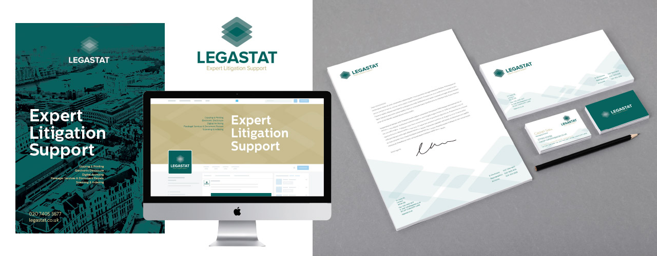
The project was to totally redesign their logo and corporate identity. The old identity had not been refreshed since the 1960s and didn’t reflect their new digital services. Legastat are well known and well regarded within the legal professional and are considered one of the countries leading litigation support companies. They have an iconic building in the heart of Chancery Lane and Lincoln’s Inn Fields which everybody within the legal sector is aware of. The danger was, people might confuse ‘iconic’ with out-of-date so we began a process of exploring their logo and their visual identity. We felt it was important to experiment with a few ideas, each moving further away from the existing brand identity. This enabled us to discover what was crucial about how Legastat currently present themselves and what elements need to be retained.
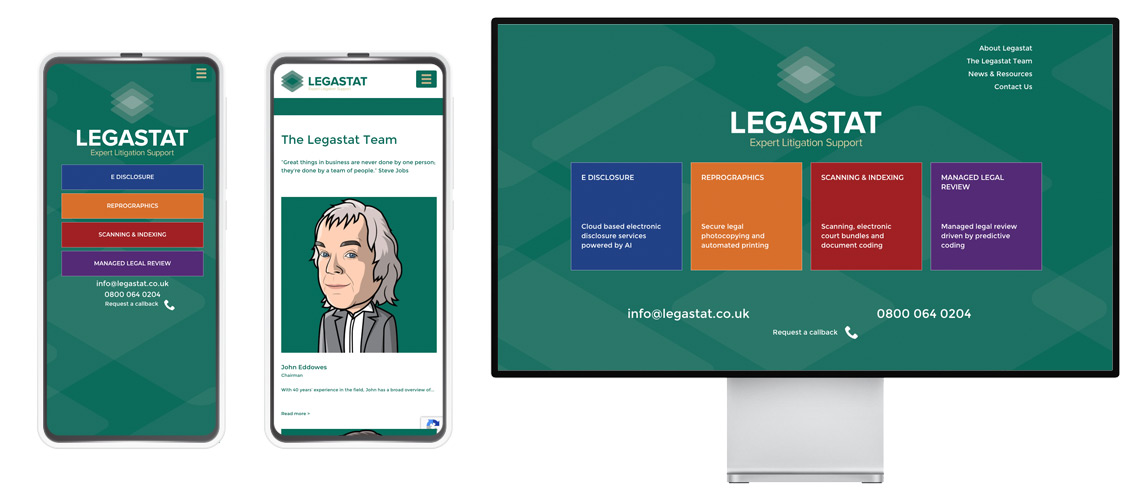
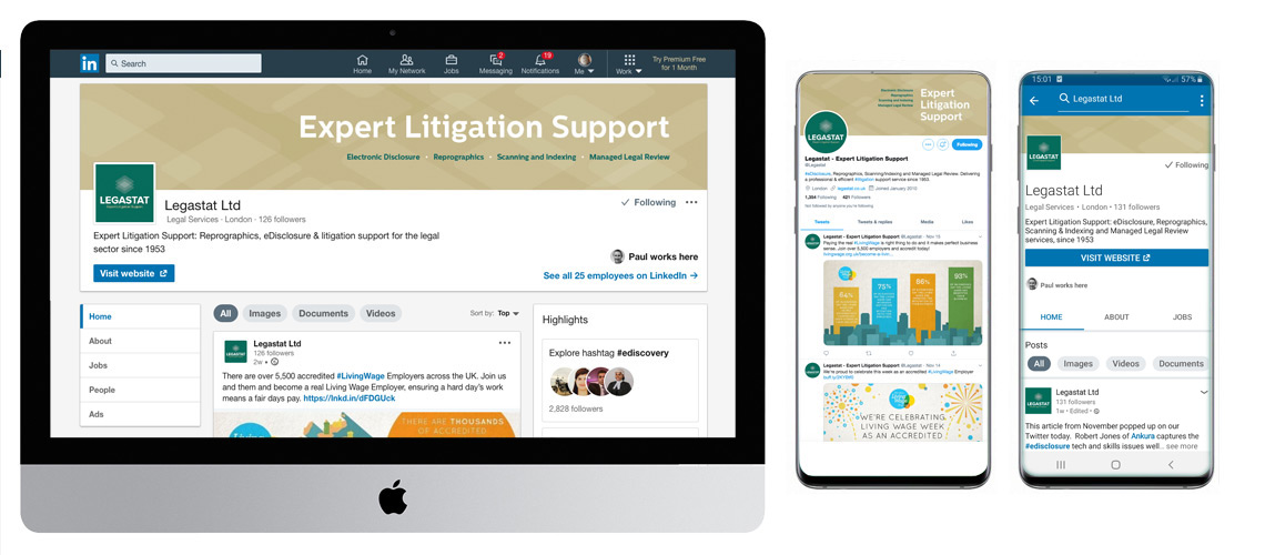
Website design for Legastat. To view site click here >
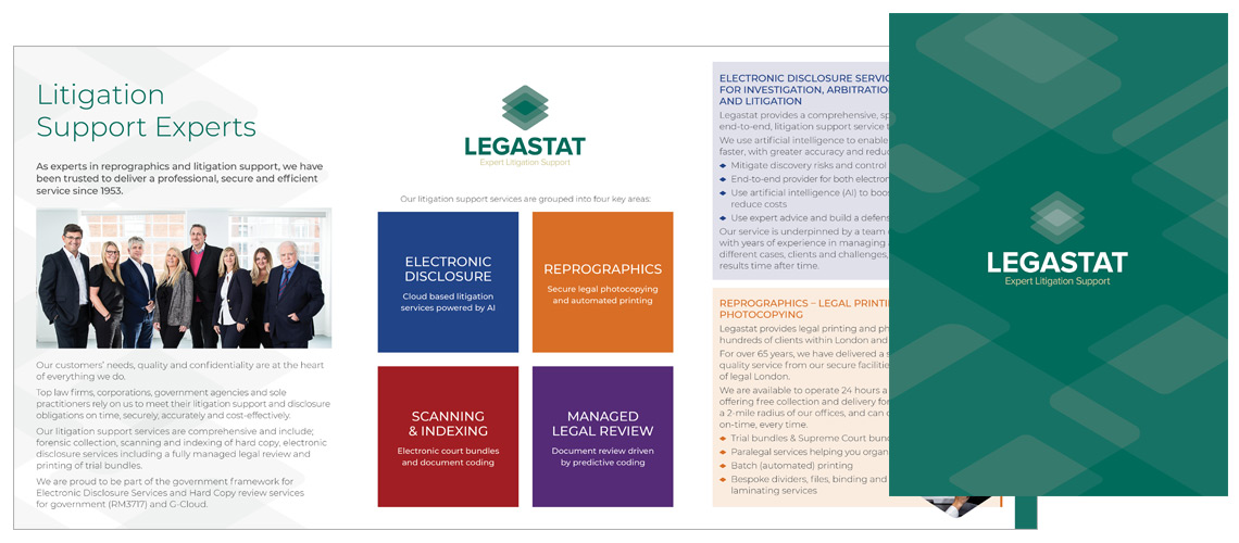
The new Legastat brand development moves the business into a new digital age. The supporting symbol combines the fundamental historical basis of their business, reprographics, with a new twist suggesting new technology based services such as digital archiving. The overarching proposition is demonstrate Legastat specialise in all aspect of legal documentation.
As green is such a dominant colour in the history and understanding of the business we have chosen to launch the new identity using similar, but richer green. Once established, this strong colour will be supported by a varied colour pallet to enable Legastat to use more variety in their promotional material.
A bold substantial font carries a sense of authority. The most important aspect of the identity is the name and clients positive relation to it. Their clients know Legastat and need to be able to identify them quickly and easily. The bold font also allows us to add colour to the letterforms adding an interesting new dimension. We also added the descriptor line ‘Expert Litigation Support‘ to help communicate the service to new business.
The new brand identity was launched in Spring 19. If you have a similar project and need to work through ideas to establish a new brand identity, then get in touch and I’ll happily discuss in more detail the process behind the Legastat brand development.