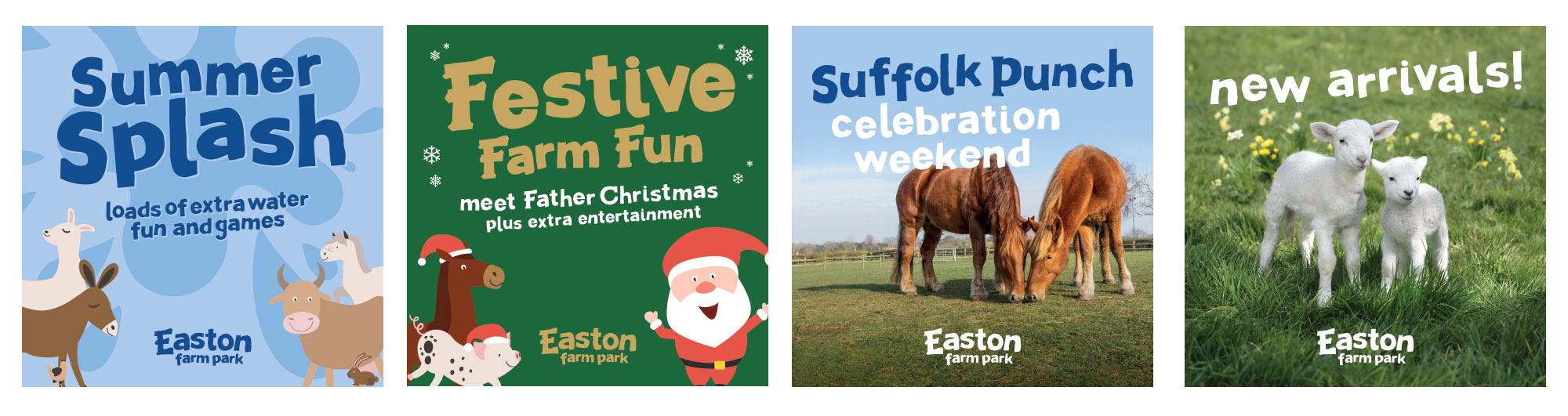
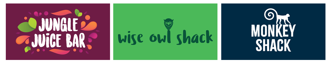
This is a case study for a cafe logo design for the Willow Barn Cafe based at Easton Farm Park near Woodbridge in Suffolk. The cafe is located at the Farm Park, but has become a destination in its own right, attracting visitors from the surrounding area who who use the cafe as a handy place to meet up.
The logo reflects the willow plantation at the farm, next to the picturesque Deben river. Here the willow is cultivated and used in the manufacture of high end cricket bats which are then exported across the world. The cricket bat silhouette can be found in the logo which then forms part of the tree.
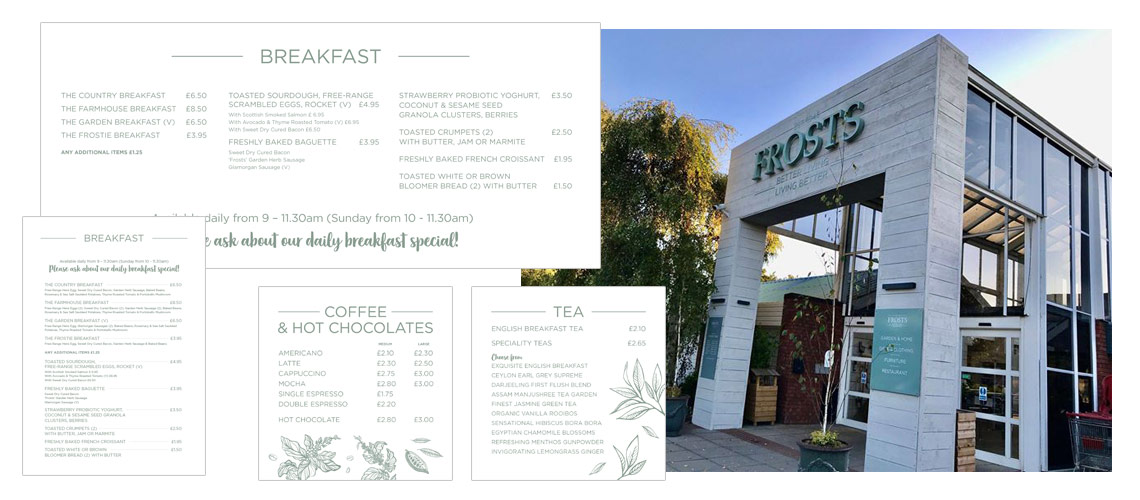
The cafe logo design is then used on signage and menus, along with external advertising and posters. Above shows their spring menus which are supplied as PDFs for the cafe to print on demands. It can also be uploaded to the their website to give visitors an idea of what the cafe offers.
Cafe Logo Design
In order to separate the cafe from the farm park and help become established as a place to visit, even without children, it has its own colour palette and typefaces. The farm itself has now moved to a more child friendly brand giving the opportunity for the cafe to attract wider demographic with those looking for a great cafe with homemade food to meet friends during the day.
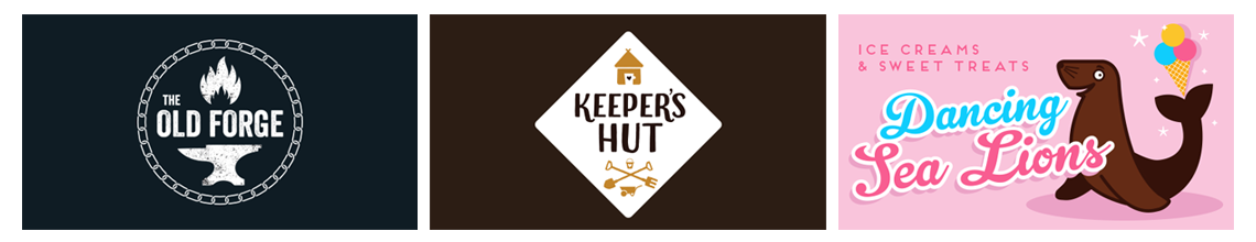
Above shows examples of the signage used in the farm and cafe. Left is the coffee menu, plus the blackboard to display the specials, and on the right is a sign explaining to the farm visitors how the cafe is changing to allow entrance even without tickets to the farm park.
The logo is just the start of the brand, and having a Suffolk freelance graphic designer as part of your team will give you the continuity and expertise of a marketing agency for the fraction of the cost. Please get in touch if you have any questions about the logo design process and I’ll be happy to have a no obligation video call with you to explore your options.