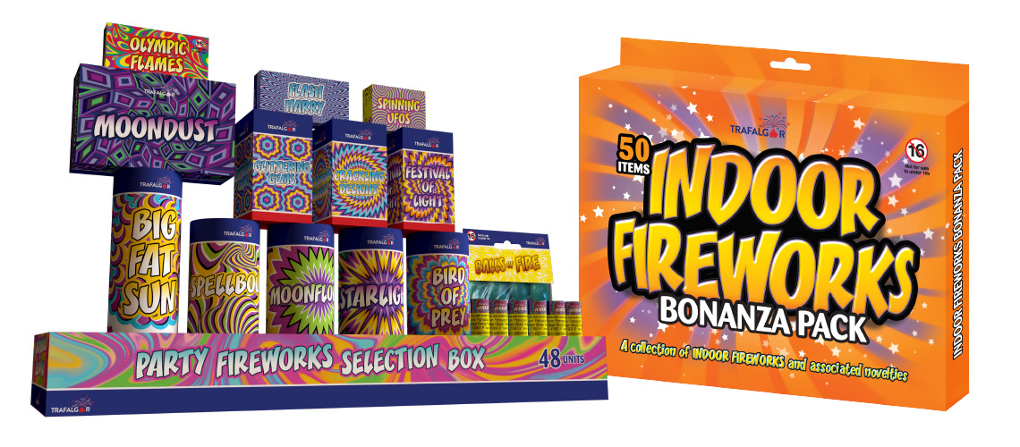
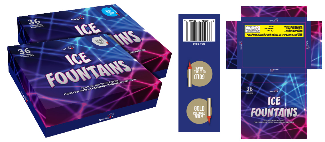
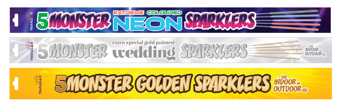
Sparkler packaging designs for Trafalgar Group Trading. These packs needed to look as part of a family of products, but retain their own individuality. The range of sparklers include traditional Bonfire Night versions, coloured party sparklers and wedding sparklers. This makes them an all year round product which many smaller retailers are now stocking. With the design available, this has encouraged retailers to stock the entire range and not just limit sales to October and November.
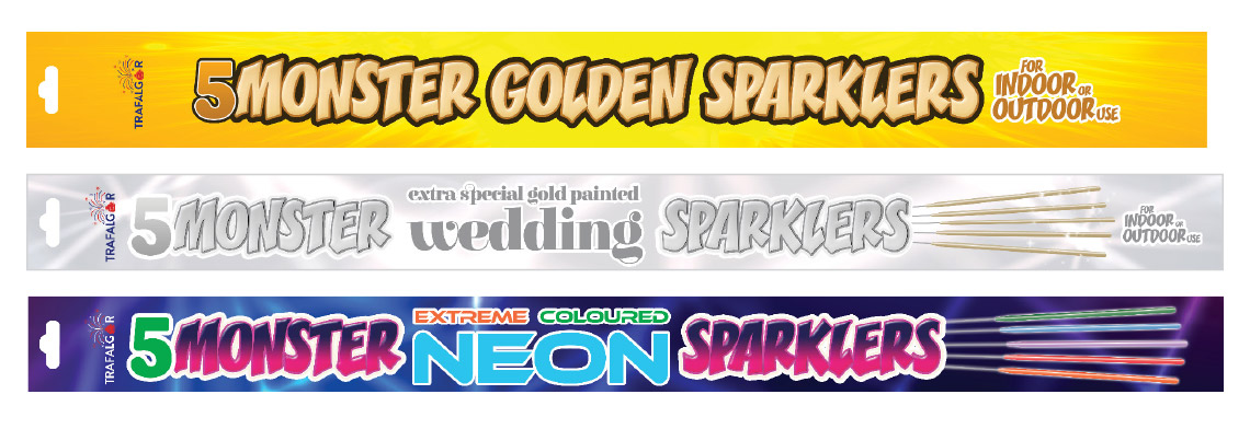
Examples of the Monster Golden Sparklers, the traditional Bonfire Night sparkler. The Monster Wedding Sparklers with a suitable Wedding style pack and the Neon coloured version with a bright colourful party pack.
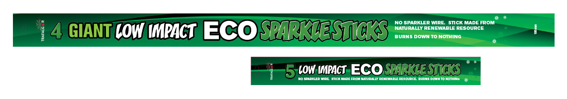
The new low impact sparkler made with a wooden stick and not a wire.
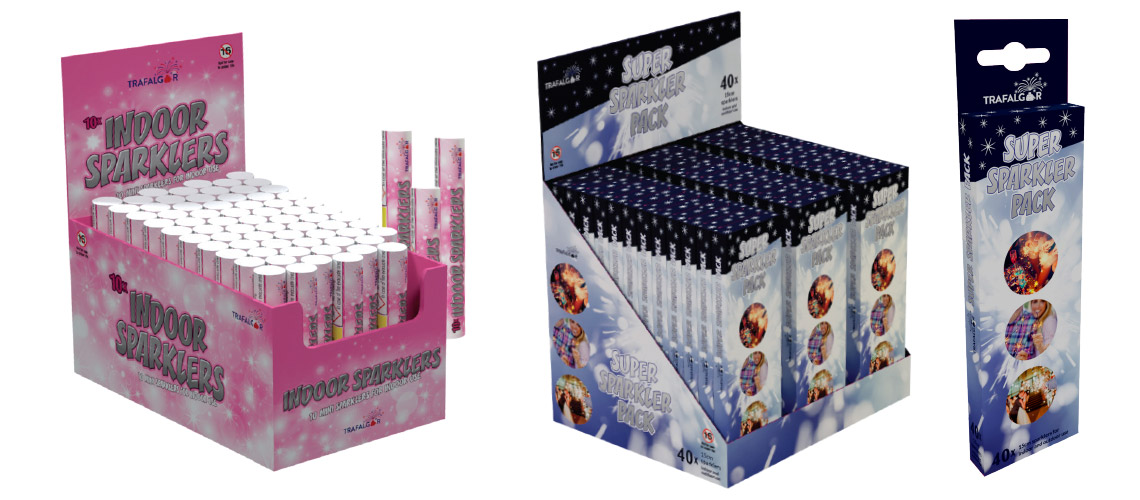
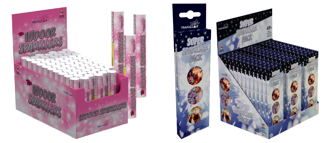
Examples of the smaller sparkling packaging design. These are 100mm indoor sparklers designed for things like cakes and desserts and the 150mm sparkler packs designed for celebration evenings such as birthdays and weddings.
As these sparkler packaging designs are produced and printed in China it was important the artwork be ready to go with minimal input from the printer. The main elements such as the product title were all outlined to ensure there were no problems with the fonts. The warning labels used a common typeface to enable the Chinese factory to add or amend CE numbers. As the lead times in producing and shipping the products is large, we needed to account for any legislatorial changes. The warning labels also all have to adhere to regulatory standards. This means they appear with a minimum point size and have accompanying warning diagrams.
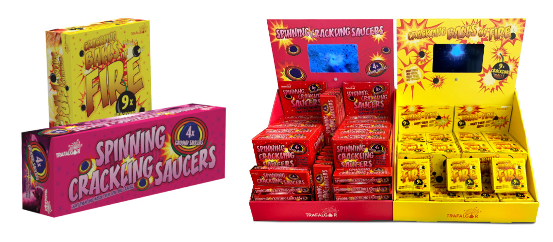
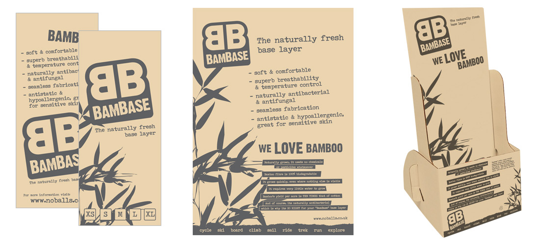
The CDUs (Counter Display Units) were produced from cutter guides provided by the Chinese supplier. To make sure everyone understood the design, 3D models were produced prior to the printing. This overcame any language issues and acted as a clear instruction on how we expected the final product to look.
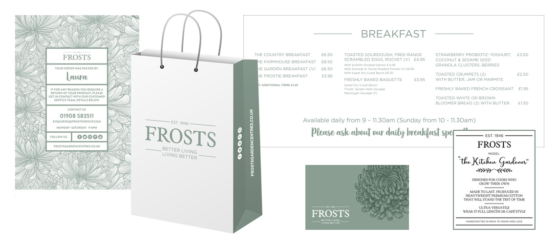
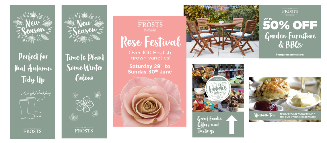
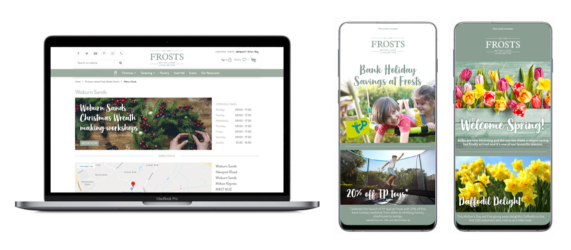
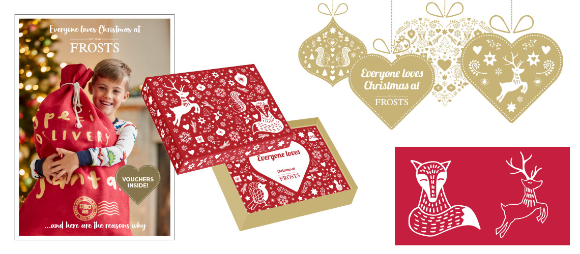
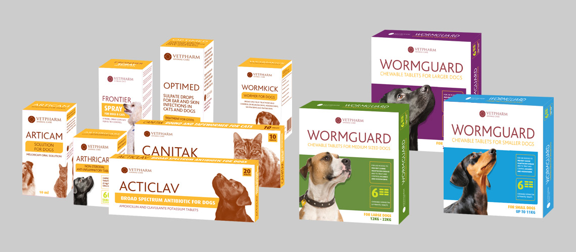
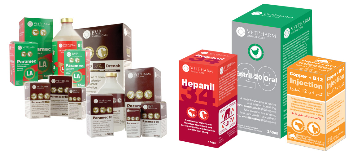
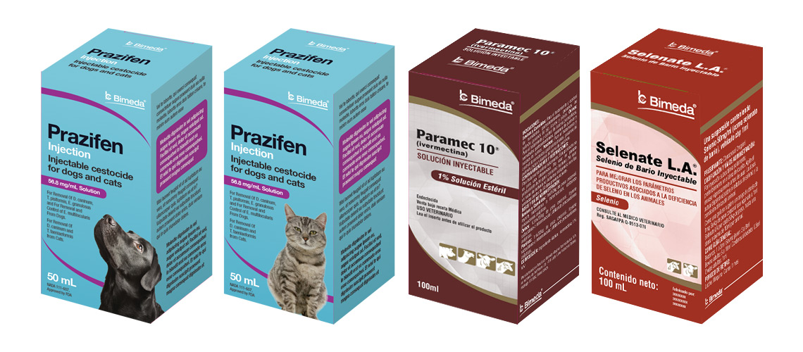
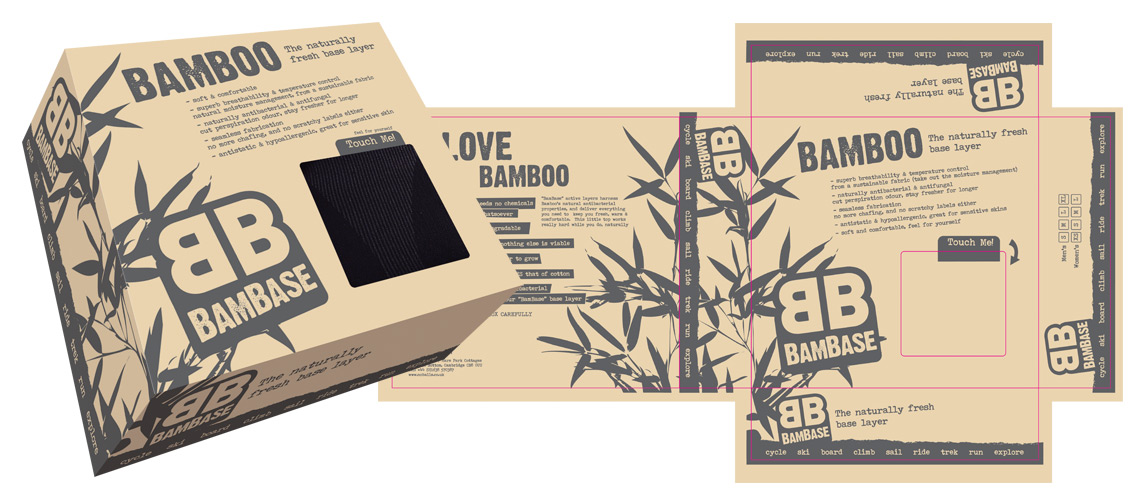
I have other examples of packaging design. If you have a packing design project and need a freelance graphic designer to help design or artwork your products, then please get in touch.