Runaway Coast were a high end homewear retailer based in Aldeburgh, Suffolk. They produced and sold to both to consumer and trade, a variety of bedding, cushions and other home products. Working with Runaway Coast Runaway we developed a fun and attractive brand which proved very popular amongst their local and national customers. The business expanded operations into London and various other pop up shops and trade customers.
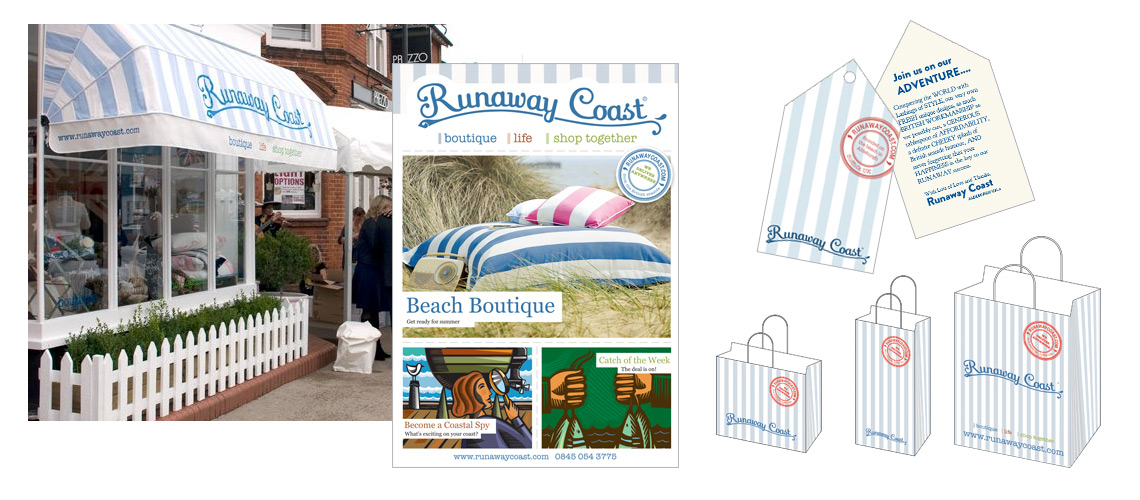
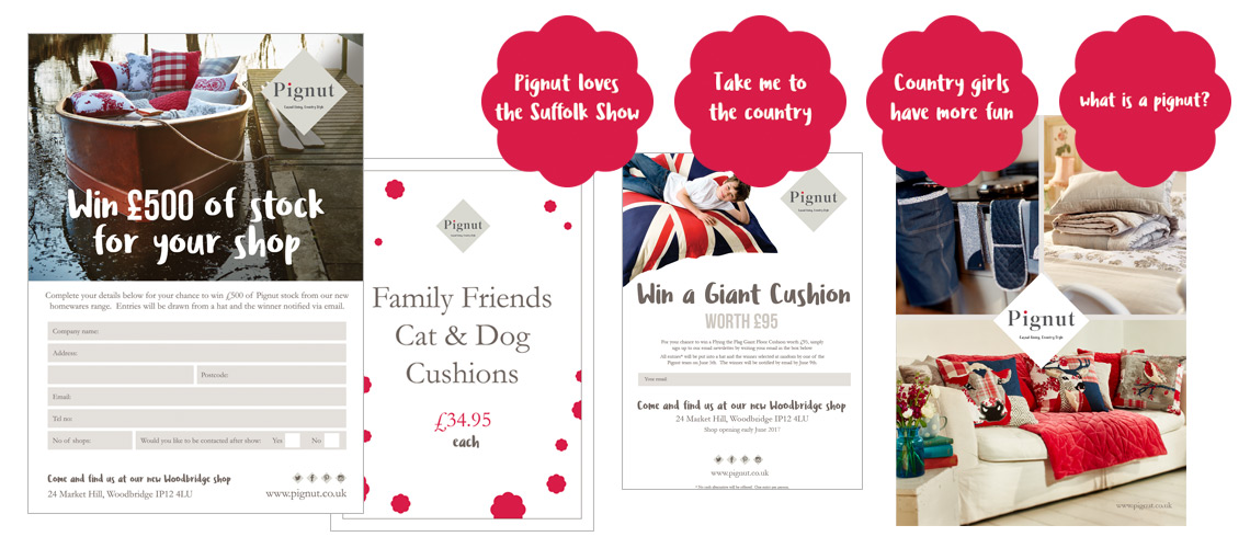
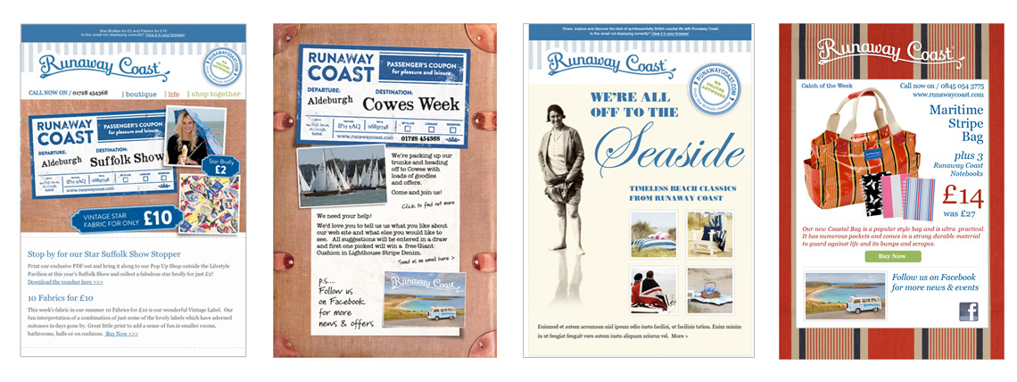
The brand identity was developed using an existing logo. We designed a signature style for literature and the retail outlets using their Lighthouse Stripe fabric. This was the best selling bedding range and had quickly become synonymous with the brand. Using the stripes on bags, leaflets and adverts gave the brand instant recognition and provided a useful tool to bring all the elements together. It was also valuable that using this brand pattern was simple and therefore cost effective to print.
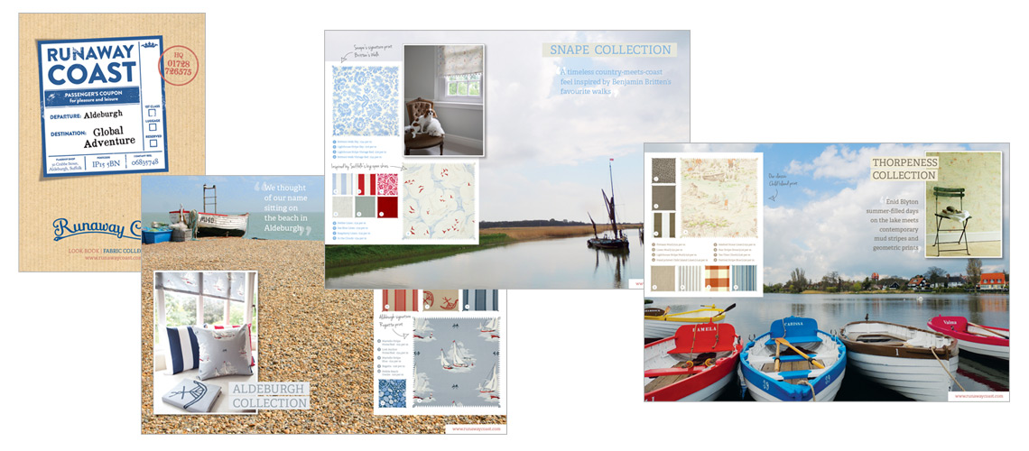
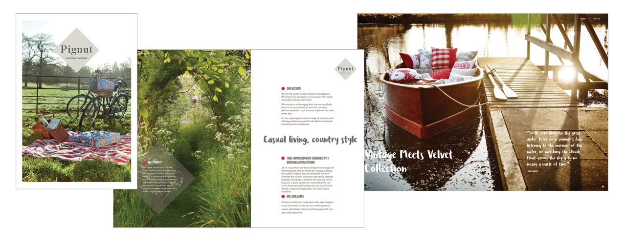
We wanted to base the activity and the look of the brand material around the fun, memories and the beauty of the Suffolk coast. Rooting the brand on the Suffolk Coast gave it a strong sense of identity and helped promote the narrative behind the company. We borrowed heavily from established iconography and imagery found in coastal designs to influence the brand style. Memories of coastal holidays provided a very strong, positive message and using this helped the brand. Runaway Coast was all about presenting themselves as fun and friendly and the depth of material provided by coastal objects such as postcards and travel labels were wonderful to use in the designs.
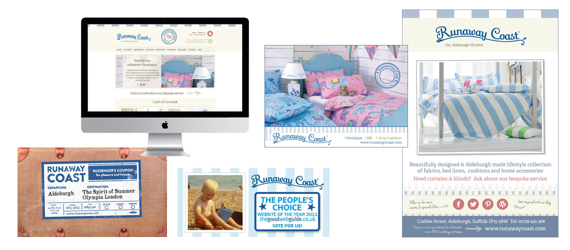
The brand was also influenced by what the coast represents. The sense of freedom and escape the Suffolk coast offers was something else we wanted to weave into the designs where at all possible. Using photographs showing the space and natural beauty of the coast we helped convey these aspects in literature and point of sale.
If you have a brand which needs a similar narrative or feel your story isn’t coming through in your brand design, get in touch and we can discuss some options. As you can see from the examples, we worked hard to make sure the brand message was communicated on all elements.