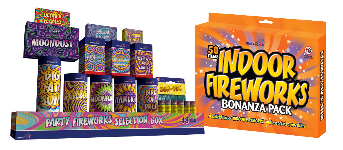
This packaging design project for Trafalgar Fireworks involves many individual products and also their counter display point of sale units.
The products needed to be brash and bold to attract the audience wanting these novelty products. These are sold all across the UK in a variety of outlets. These range from small ‘corner shop’ retailers to large chains such as Hawkins Bazaar and John Lewis.

All the packaging use similar images and a common typeface to help bring the products together as a range. Although not essential as most items are stocked independently of each other, this does allow Trafalgar Fireworks to market the range more effectively. We have found this helps push new lines into stockists with them being familiar with previous products.
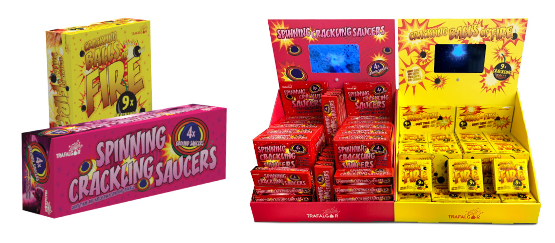
Counter display units come with all the products inside with a perforated rip top to allow quick simple display. The CDUs also come with a header card to give the product extra visual impact. The Balls of Fire and the Spinning Saucers are new innovative products imported into the UK market for the first time. In oder to help communicate how these products work, we developed a CDU design with an integral video display.


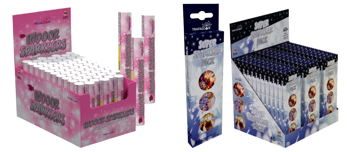
An additional challenge is the variety of different printing and artwork techniques required. Sparkler products for example are foil packs and the CDUs often involve complicated cutter guides.
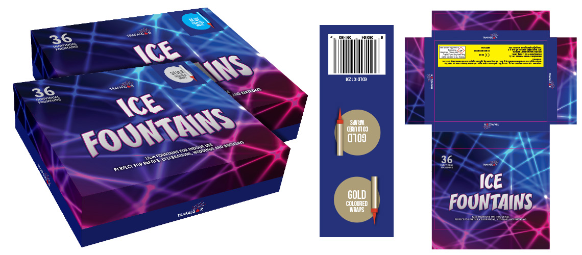
We also need to carefully consider how to save money during production. With bulk products such as these, every penny counts. In order to help keep costs down we introduced ways of printing products that involved using common elements and either over printing variations or using stickers for product modifications. An example of this the the Trafalgar Fireworks Ice Fountains, of which there are four colour options, gold, silver, blue and pink. Rather that print four separate boxes, we designed a single common box and a range of stickers. The stickers contained all product specific information, such as the colour, product reference number and bar code. The stickers were designed with a clear swatch and image to easily identify the product option. The sticker was then designed in such a sway that it wrapped around the box in order to display the product colour both on the top of the box and the side giving the retailer a choice on how to stack the item. The bar code then appears on the back of the box so not to obscure the customer information.


As most products are printed at source in China, it was important to make the artwork as simple as possible. The basic rules to follow are
- No embedded fonts. All fonts must be outlined as the systems used by the printers will often have font issues due to their age
- Send files with and without the cutter guide embedded. This enables the factories to make small adjustments. It is often the case that the original factory sourced to print the products will no longer be able to complete the order, so an alternative company is found.
- Make sure the artwork is complete. It is tempting sometimes when time is against you to send artwork to print and have the printer add in the final information prior to production. This however can lead to complications and its difficult to get a proof from the factory before they go to print. With fireworks, this is especially important and there is a lot of regulatory information to be added, and if this is incorrect, it will cause the whole batch to un-sellable.
As well at this packaging design project yu can check out the brand identity design project case study here > The packs can also be found on their ecommerce website (see the case study here >)
For more examples of packaging design projects, or if you have any questions about the Trafalgar Fireworks project, please contact me >