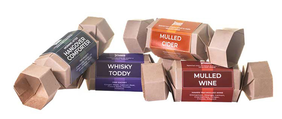
This highlights a fun Christmas Packaging project for an East Anglian based supplier of herbs and spices. As part of their Christmas Range, they developed a cute Christmas cracker style pack for sale in farm shops and food courts. A simple, low cost item that is so important for these retailers, they can be easily merchandised in the food section, displays and even at the point of purchase.
Designed to be easily differentiated, they use bright, bold colours, but still feel appropriate for this time of year. The front displays the product name in a traditional style label with a hint of a ribbon. Using the six sides of the cracker to our advantage, we are able to separate out the logo, the name and the ingredients, giving each element space to communicate. The background uses traditional Victoriana style line illustrations hinting at the mix of spice within the packs.
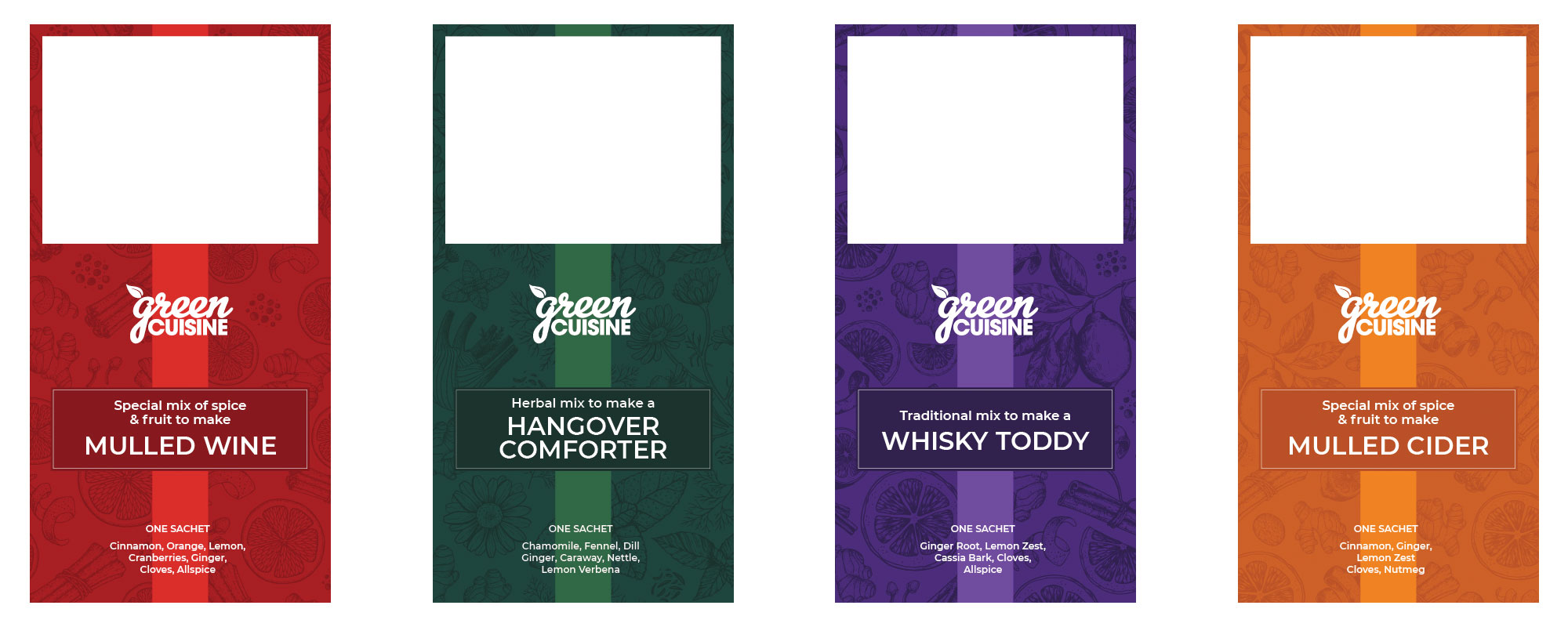
Initial artwork for the Christmas packaging. This shows the space on the labels for ingredients, barcodes and mandatory information, such as name of manufacturer, date, batch numbers etc.
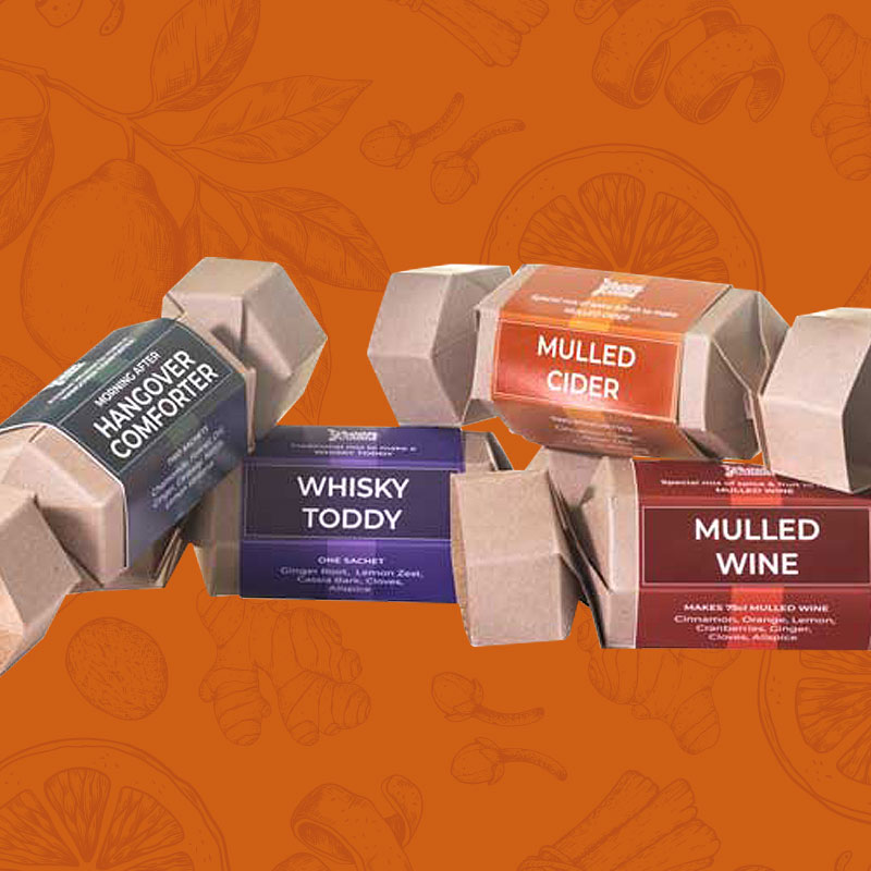
Christmas Packaging Design Example
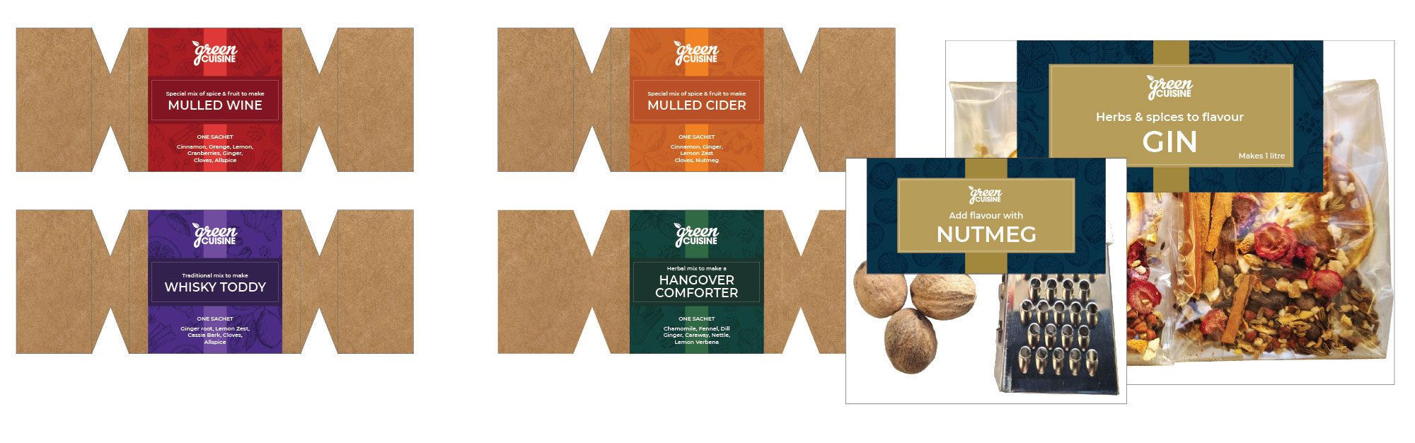
Above shows the original design visuals and additional examples of labels for the extended range. Getting the Christmas packaging right for your seasonal projects is so important as they will be fighting for shelf space before we even get to whether the customers will find them appealing. These strong, simple, but timeless packs have proven to be hugely popular for those browsing farm shops looking for low cost items for gifts. The product itself is ideal, as it embodies great Christmas traditions of celebration and togetherness, but also has a long shelf life, making the perfect gift.
Please check out some other packaging design examples here, or get in touch if you have a specific packaging design project and I can send you examples of previous work.
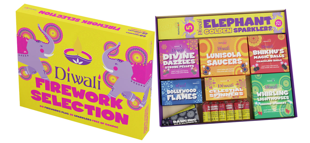
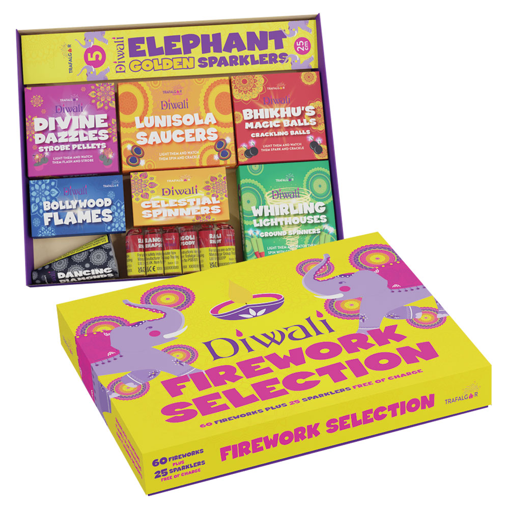
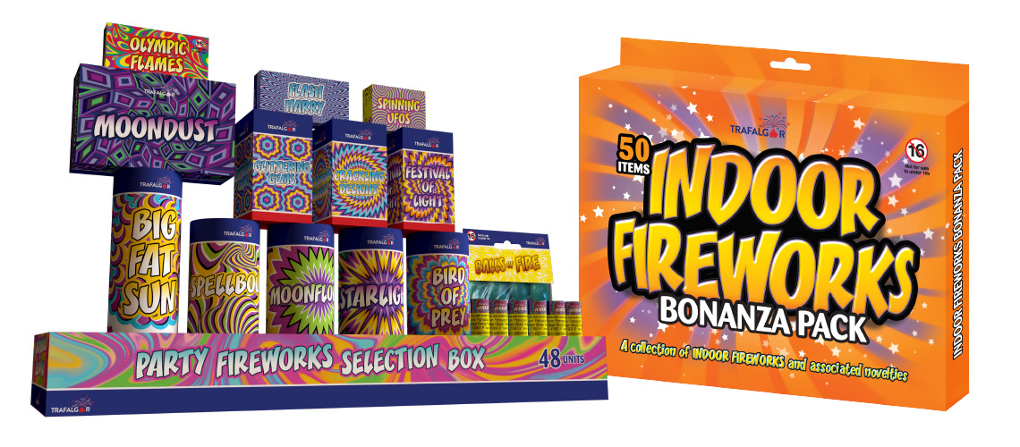
This was a packaging design project introducing a new Diwali fireworks selection box for retailers such as garden centres, small to medium shops and supermarkets. It uses a bright outer box which contains many smaller boxes which hold the individual fireworks.
Diwali celebrations have become an important chance for retailers to offer products that help good defeat evil. Important products are the sweets shared and the gifts that are exchanged. Crucial to the celebrations are Diwali Fireworks that help light triumph over darkness.
Unlike the Indoor Fireworks box, there was no inner card holding the boxes in place, so each box had to be carefully constructed so they held each other in place to help keep the products stable during transportation.
Produced in China, the Diwali Firework pack is a unique product, so no cutter guides previously existed. All inner products and sizes were tested using mockups and test prints prior to going into full production. There was a fair amount of experimentation involved before the final layout was agreed upon, giving the box it’s integral stability and making it as small as possible to reduce shipping costs.
Each inner product was designed to have it’s own colour to add to the vibrancy of the product and the Diwali celebrations. The use of the mandala patterns and shapes allows some continuity between the items, but still allow a certain amount of individuality.
Diwali Fireworks
Diwali Firework Selection Packs can be bought from Trafalgar Group Trading. Here you can purchase a wide variety of pyrotechnic products which are ideal for small retailers as they don’t require a firework sales licence. A few other Trafalgar Group Trading packaging design products can be found in this retail packaging design case study >
If you are looking to develop a unique packaging design project and need help with mockups to test the viability, please get in touch.
This Retail Packaging Design case study highlights a number of the latest products produced for Trafalgar Group Trading, an East Anglian based company that manufactures and imports gift and novelty products throughout the world.
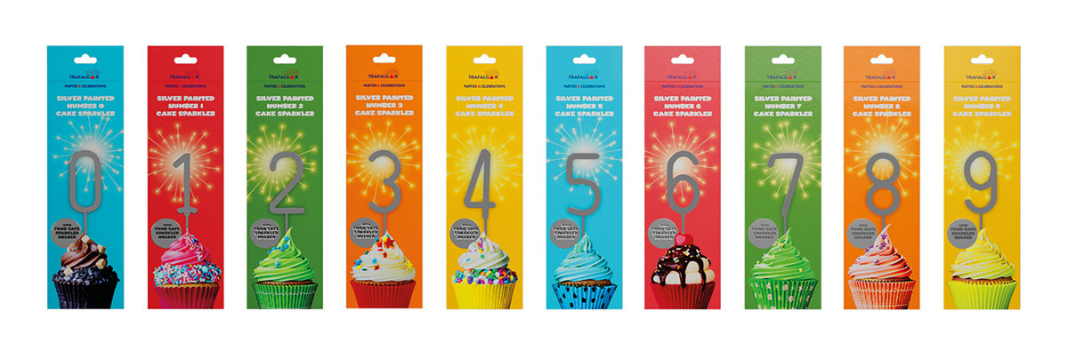
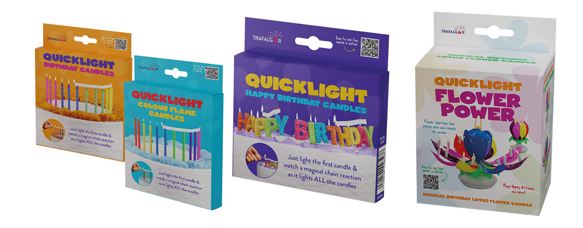
The Range of celebration Numbered Sparklers. Each number also has silver block number as a special process, making these a challenging 5 colour artwork project.
Many of these products have complicated cutter guides and box specifications making them a fun retail packaging design challenge. It has also been enjoyable making the range look cohesive across all products while ensuring each product stand up in its own right.
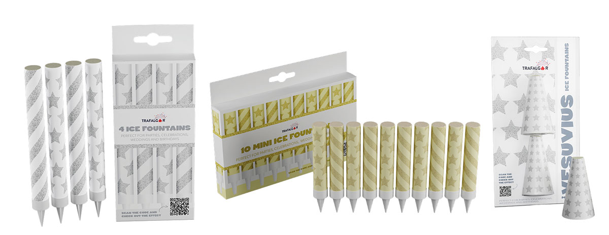
Ice Fountain range including product wraps
The use of typography and style give the products a style which retailers look for when stocking the entire range. It also helps sell products to retailers who would otherwise be unaware of certain products and are now willing to stock on the basis of recognising it as a quality Trafalgar item.
Hand Held Ice Fountains
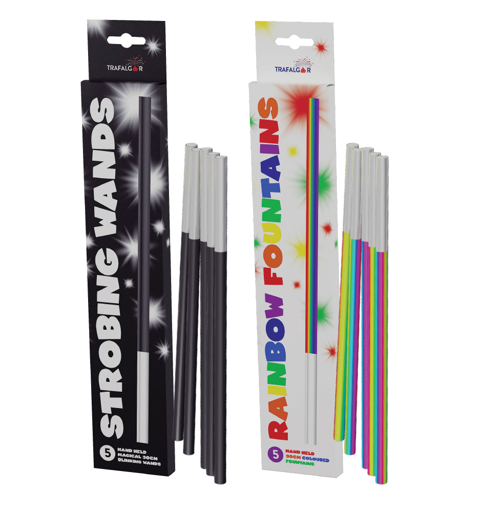
Range of Throw-Down Fireworks
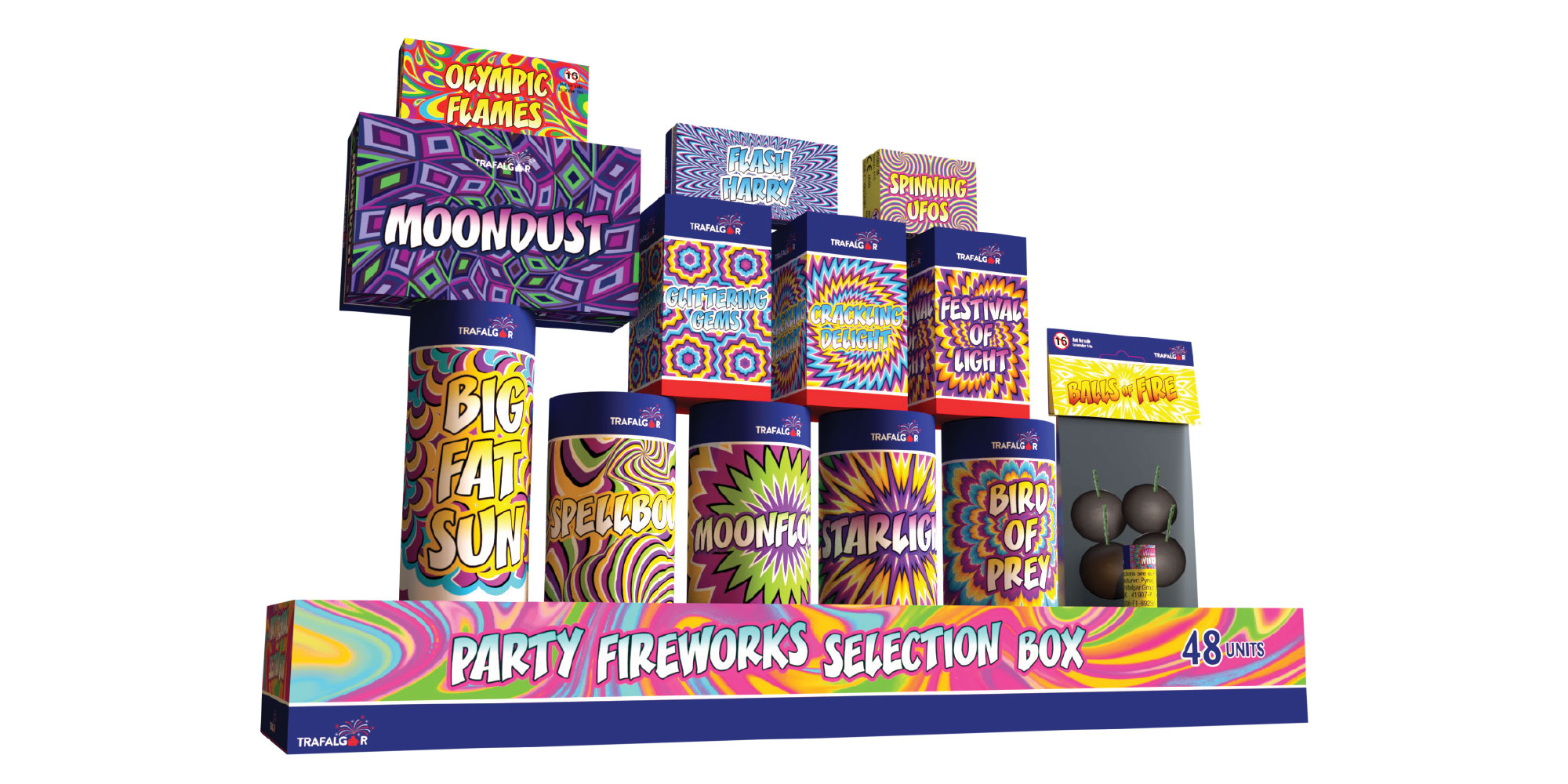
Party Selection box designed to be bright and LOUD!
As well as the products, some also required a CDU (Counter Display Unit), a form of POS Design that allows all the products to be quickly displayed within the store. Not only do these help with transportation, they also guarantee shelf space for products.
If you have a packaging design that you need help with, let me know. I have extensive experience in managing projects with UK based and international packing companies, ensuring the final products match your expectations. Packing design projects will often involve some kind of problem solving exercise, from building a net and cutter guide from scratch or non-standard printing techniques, so you will need a designer who understands these challenges and would be a positive addition to the project.
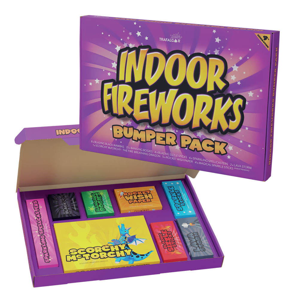
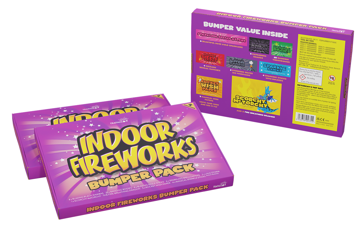
Now manufactured and shipped to the UK, the latest generation of this hugely popular product showcases this indoor fireworks packaging design project. Made in China for the UK based Trafalgar Group Trading, Indoor Fireworks have a long history of massive sales thanks to fond memories of gathering round the kitchen table and putting on a mini, indoor firework display.
The product itself has evolved and Trafalgar Fireworks have refreshed the contents to make it even more exciting and varied. These prove to be very popular in small to medium retailers as they can be sold without a firework licence. Larger retailers and garden centre chains have also seen success in stocking them,not only during peak seasons such as Guy Fawkes night or Christmas, but all year round.
This project is part of an overall ongoing refresh of the Trafalgar Group Trading products, which now include a massive range of sparklers, candles and even a unique Diwali firework pack.
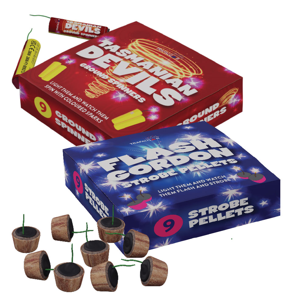
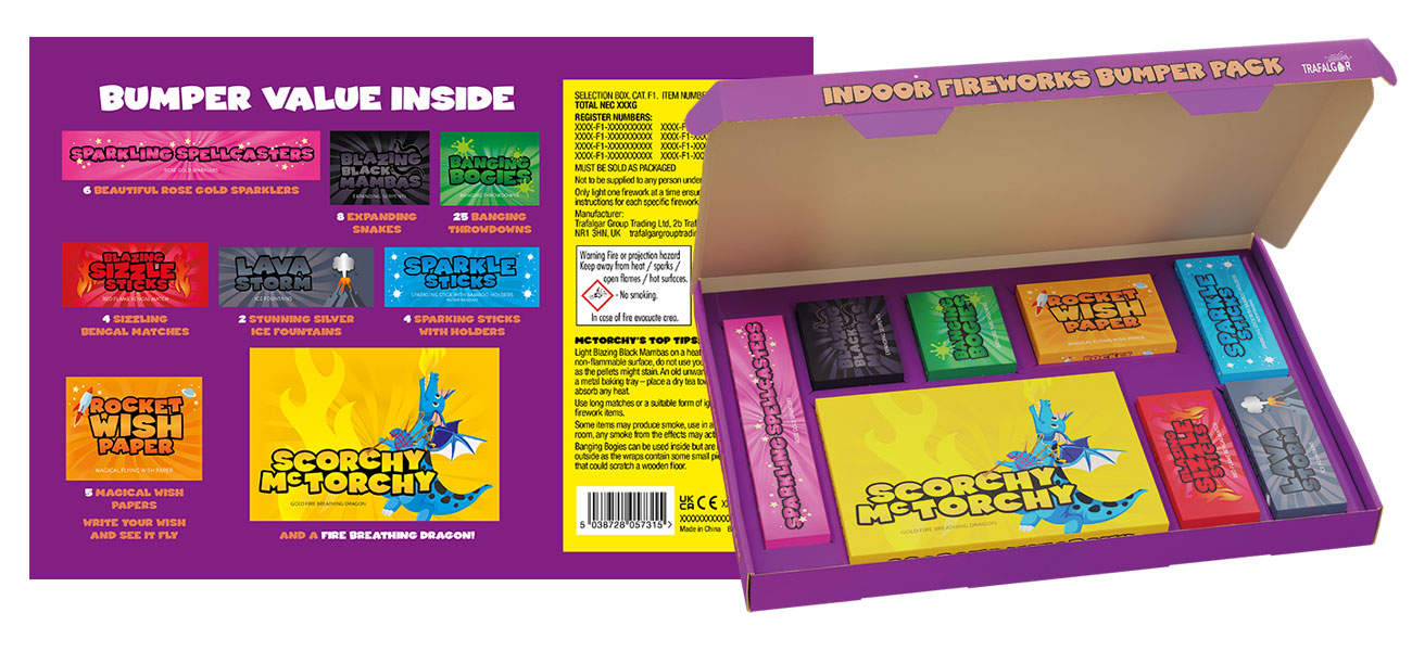
This was a fun project to work on as it was the first time the inner products where to be contained within their own boxes. We therefore were able to design a pack that was bright and colourful, had some continuity between the fireworks but gave the products their own identity.
The inside of the outer box showing the different products.
Technically, this was a challenging packaging design project to work on as it was an entirely new box concept that needed to be managed between the UK based client and the Chinese factories. Various mockup were made to ensure the products would fit and the inner boxes would be secure. Each inner box also has its own legal specifications that needed to be added to the reverse. Firework warning labels, for good reason, have to be very precise, nit only in their content, but also their layout.
Advanced sales have been excellent, with over 75% of the stock sold before the product even reached the UK. Many reprints and more variations will follow.
Fireworks Packaging Design
For more examples of the latest firework packaging design projects, check out the candle and sparklers or the new Diwali packaging
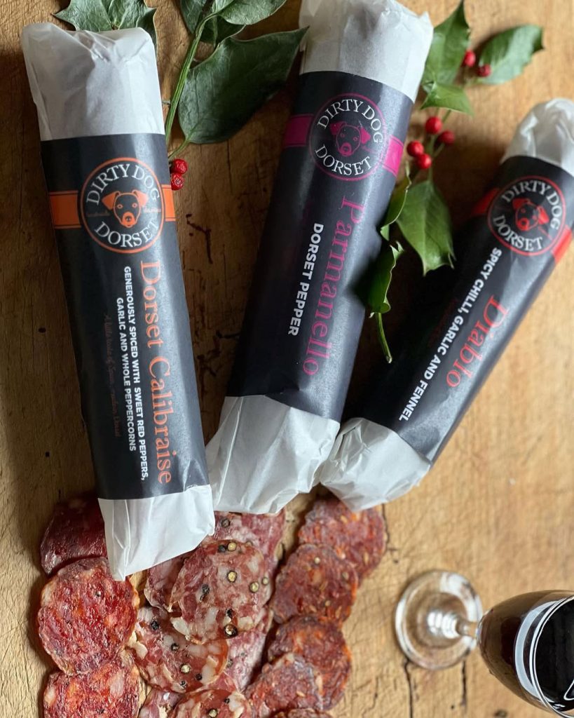
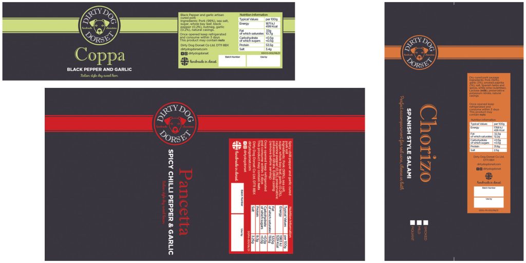
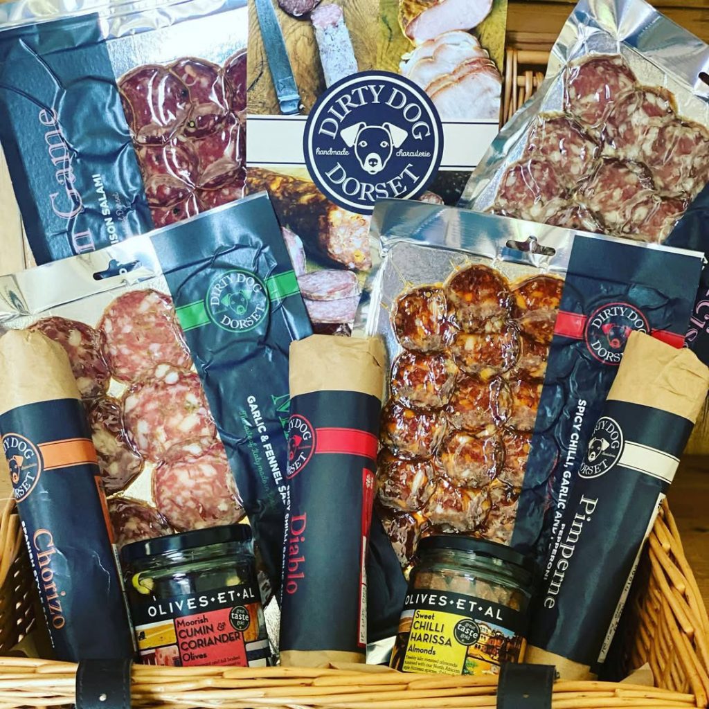
Case study for a charcuterie label design project including salami, pancetta and other cured meats. Dirty Dog Dorest cure their own meats from the HQ and supply many national and local restaurants. Using their own recipes and rubs, they have built a sold reputation for great charcuterie.
Dirty Dog Dorest also run their own mobile pizza restaurants where their customers can have their charcuterie on fabulous homemade pizzas. Being able us their own products is obviously a great way to keep costs down, but the quality of the product also adds to the taste and reputation of the restaurant resulting in many repeat bookings and great word of mouth recommendations.
Alongside their range of labels, I produced their brand design for use on their products and marketing material. For more details about the Dirty Dog brand design, click here >
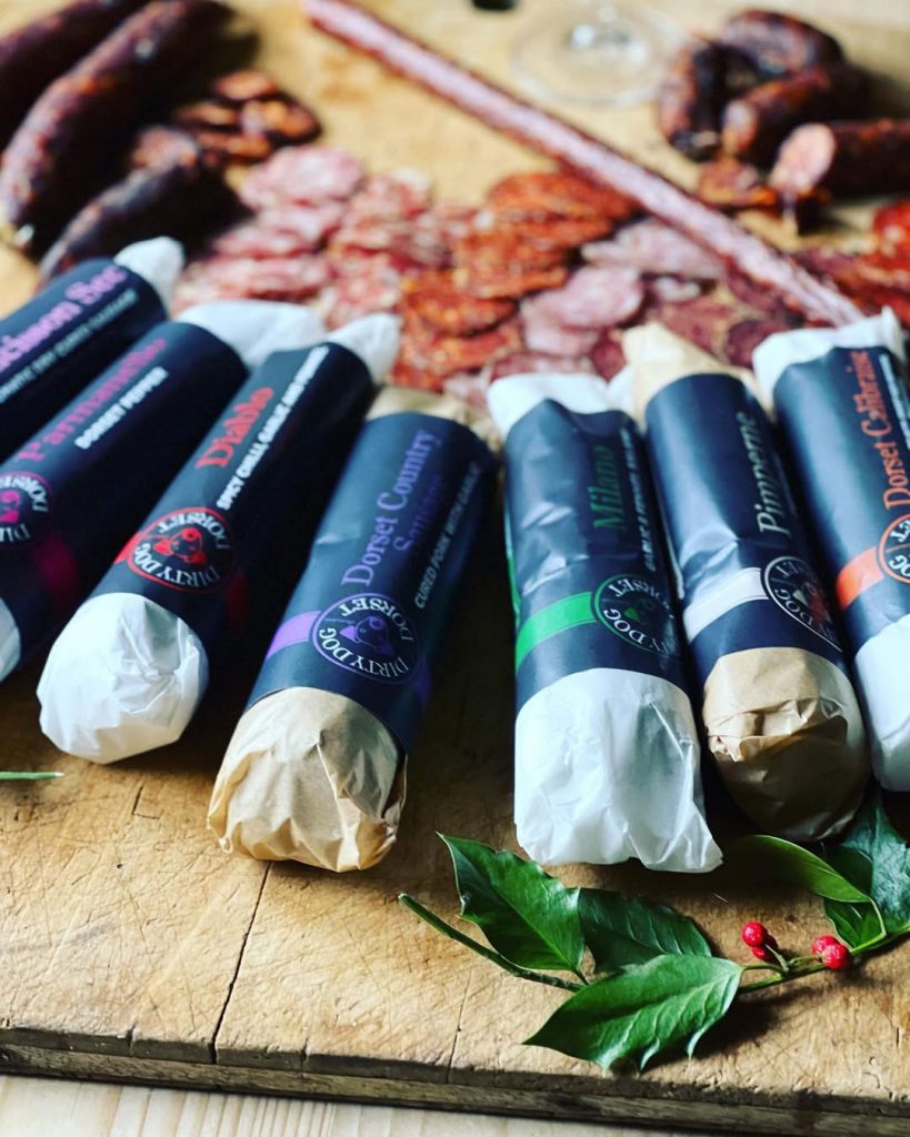
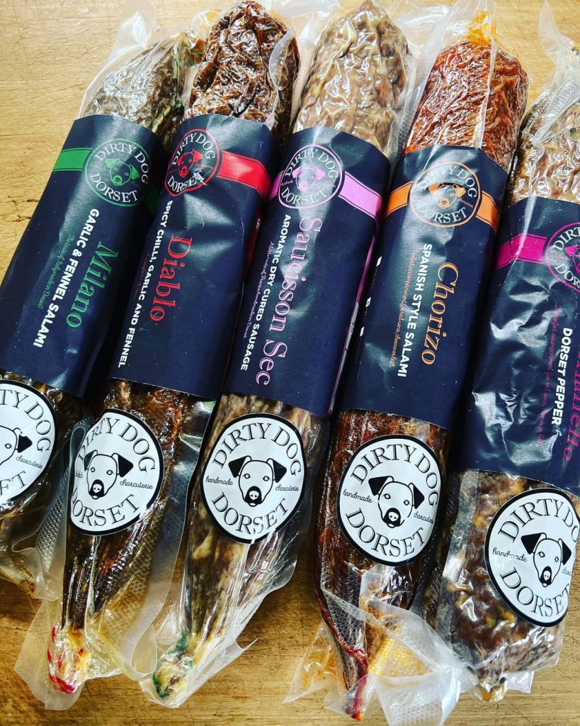
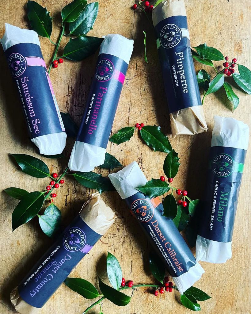
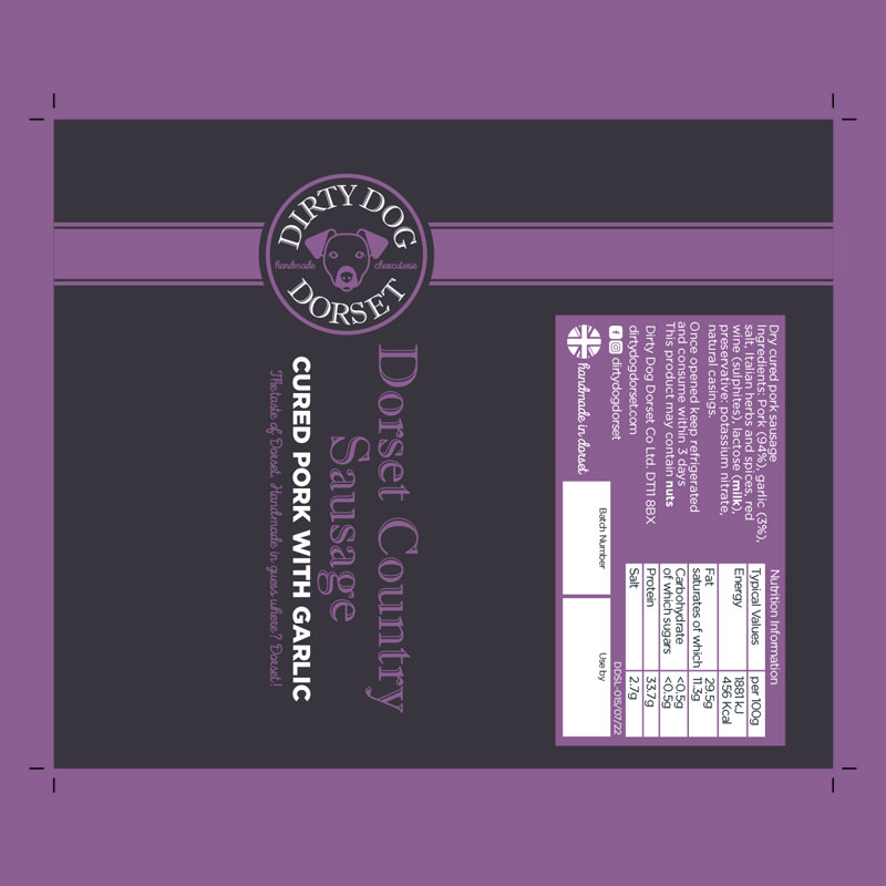
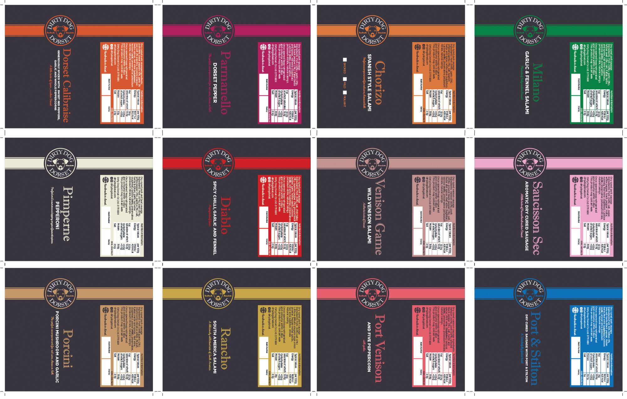
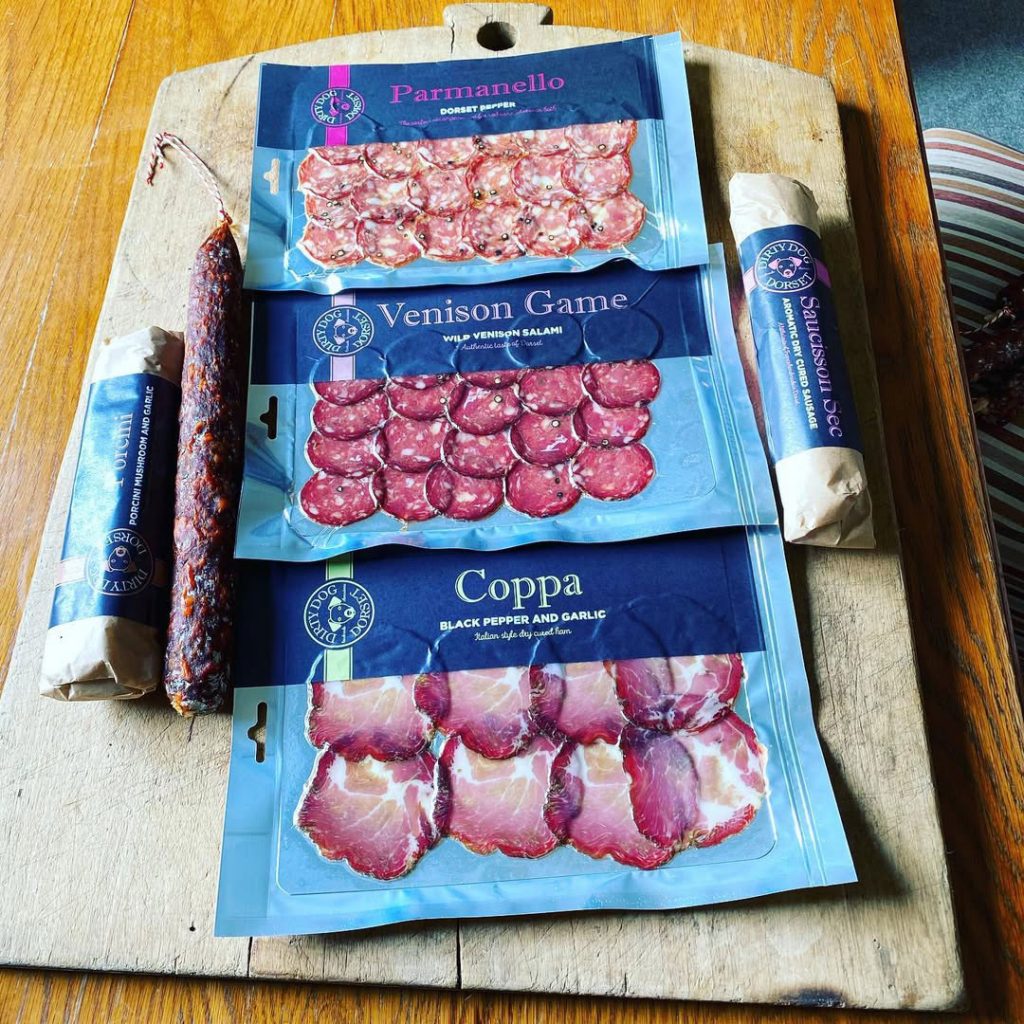
Label designs for the salami range, pancetta range, coppa range and their ready sliced products.
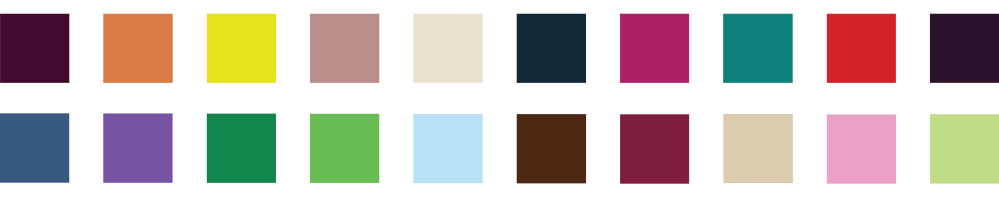
The logo was designed to be used in multiple colours to allow differentiation of products and flavours. A colour pallet was developed to ensure the flavour combinations remain constant over the different style of products.
Charcuterie Label Design Colours
Charcuterie Label Design project colours – these were used on the products to reflect the flavours
Examples of the complete salami range showing the colours.
With the logo being designed to dynamically change colour to reflect the product, the colour of the product is the dominant colour and overpowered by any brand colours. Using the colour on the rear of the label as part of the ingredients/statutory information allows for more of the colour to be displayed, no matter how the products site, especially important given a lot of these products are cylindrical.
Examples of how the colours are used on the pre-sliced deli range.
If you have a similar food packaging or charcuterie label design project, please get in touch for more examples and inforamtion on how we can work together.
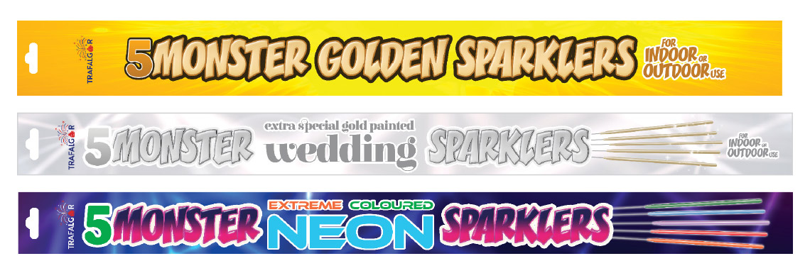
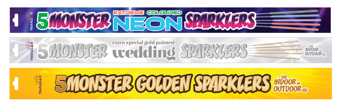
Sparkler packaging designs for Trafalgar Group Trading. These packs needed to look as part of a family of products, but retain their own individuality. The range of sparklers include traditional Bonfire Night versions, coloured party sparklers and wedding sparklers. This makes them an all year round product which many smaller retailers are now stocking. With the design available, this has encouraged retailers to stock the entire range and not just limit sales to October and November.
Examples of the Monster Golden Sparklers, the traditional Bonfire Night sparkler. The Monster Wedding Sparklers with a suitable Wedding style pack and the Neon coloured version with a bright colourful party pack.
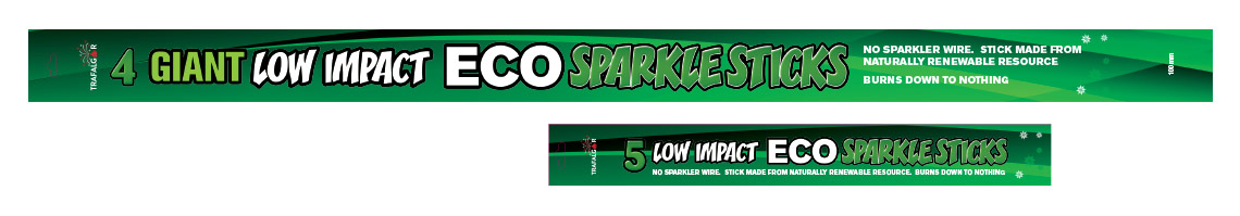
The new low impact sparkler made with a wooden stick and not a wire.
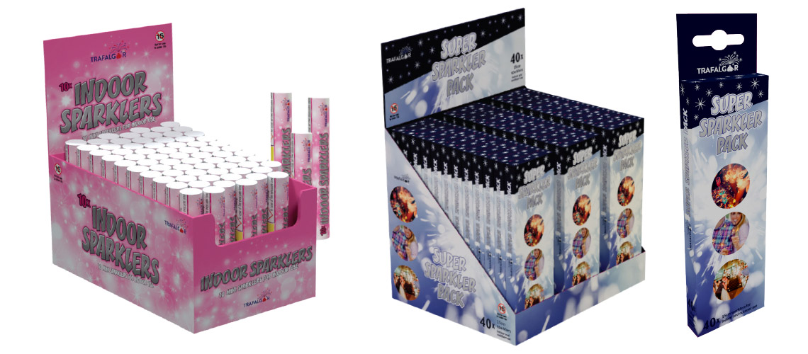
Examples of the smaller sparkling packaging design. These are 100mm indoor sparklers designed for things like cakes and desserts and the 150mm sparkler packs designed for celebration evenings such as birthdays and weddings.
As these sparkler packaging designs are produced and printed in China it was important the artwork be ready to go with minimal input from the printer. The main elements such as the product title were all outlined to ensure there were no problems with the fonts. The warning labels used a common typeface to enable the Chinese factory to add or amend CE numbers. As the lead times in producing and shipping the products is large, we needed to account for any legislatorial changes. The warning labels also all have to adhere to regulatory standards. This means they appear with a minimum point size and have accompanying warning diagrams.
The CDUs (Counter Display Units) were produced from cutter guides provided by the Chinese supplier. To make sure everyone understood the design, 3D models were produced prior to the printing. This overcame any language issues and acted as a clear instruction on how we expected the final product to look.
I have other examples of packaging design. If you have a packing design project and need a freelance graphic designer to help design or artwork your products, then please get in touch.
This packaging design project for Trafalgar Fireworks involves many individual products and also their counter display point of sale units.
The products needed to be brash and bold to attract the audience wanting these novelty products. These are sold all across the UK in a variety of outlets. These range from small ‘corner shop’ retailers to large chains such as Hawkins Bazaar and John Lewis.
Outdoor and Indoor Fireworks Packaging primarily for small retailers and novelty gift suppliers
All the packaging use similar images and a common typeface to help bring the products together as a range. Although not essential as most items are stocked independently of each other, this does allow Trafalgar Fireworks to market the range more effectively. We have found this helps push new lines into stockists with them being familiar with previous products.
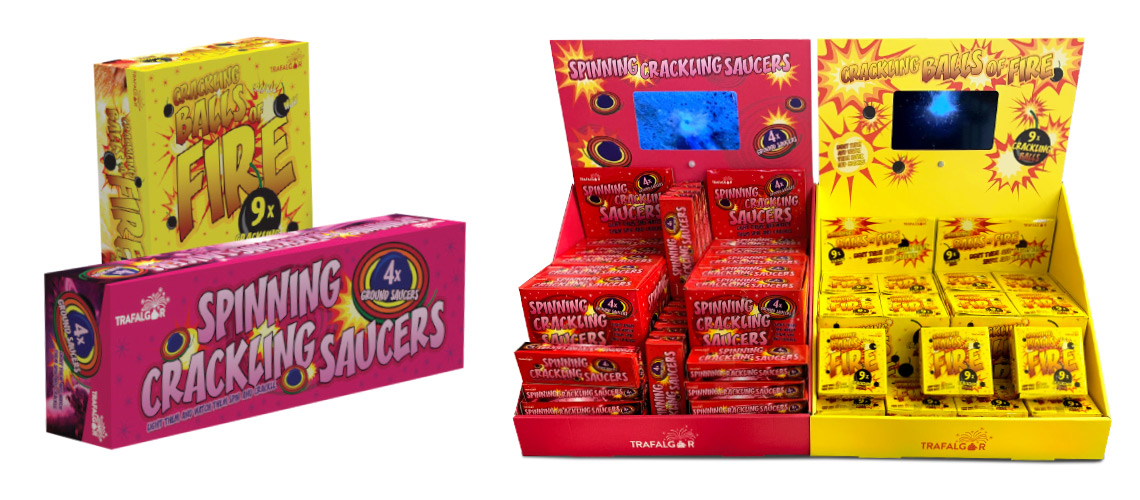
Counter display units come with all the products inside with a perforated rip top to allow quick simple display. The CDUs also come with a header card to give the product extra visual impact. The Balls of Fire and the Spinning Saucers are new innovative products imported into the UK market for the first time. In oder to help communicate how these products work, we developed a CDU design with an integral video display.
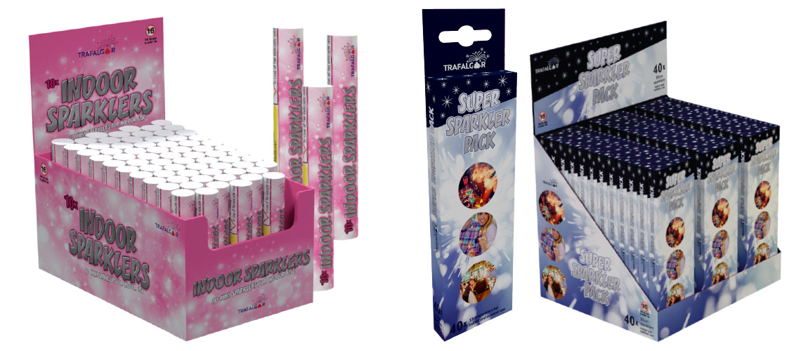
Novelty banging and spinning products with counter display unit with video display Indoor and outdoor small sparkler packaging and their respective counter display units.
An additional challenge is the variety of different printing and artwork techniques required. Sparkler products for example are foil packs and the CDUs often involve complicated cutter guides.
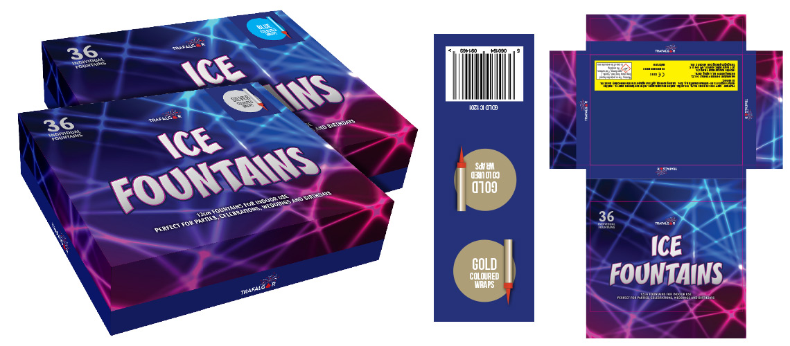
We also need to carefully consider how to save money during production. With bulk products such as these, every penny counts. In order to help keep costs down we introduced ways of printing products that involved using common elements and either over printing variations or using stickers for product modifications. An example of this the the Trafalgar Fireworks Ice Fountains, of which there are four colour options, gold, silver, blue and pink. Rather that print four separate boxes, we designed a single common box and a range of stickers. The stickers contained all product specific information, such as the colour, product reference number and bar code. The stickers were designed with a clear swatch and image to easily identify the product option. The sticker was then designed in such a sway that it wrapped around the box in order to display the product colour both on the top of the box and the side giving the retailer a choice on how to stack the item. The bar code then appears on the back of the box so not to obscure the customer information.
Ice Fountain packs with additional stickers. 4 different colour options are offered with a single box with stickers showing the colour of the product inside. Monster sparkler foil packaging with euro slot. Also sold in counter display units.
As most products are printed at source in China, it was important to make the artwork as simple as possible. The basic rules to follow are
No embedded fonts. All fonts must be outlined as the systems used by the printers will often have font issues due to their age
Send files with and without the cutter guide embedded. This enables the factories to make small adjustments. It is often the case that the original factory sourced to print the products will no longer be able to complete the order, so an alternative company is found.
Make sure the artwork is complete. It is tempting sometimes when time is against you to send artwork to print and have the printer add in the final information prior to production. This however can lead to complications and its difficult to get a proof from the factory before they go to print. With fireworks, this is especially important and there is a lot of regulatory information to be added, and if this is incorrect, it will cause the whole batch to un-sellable.
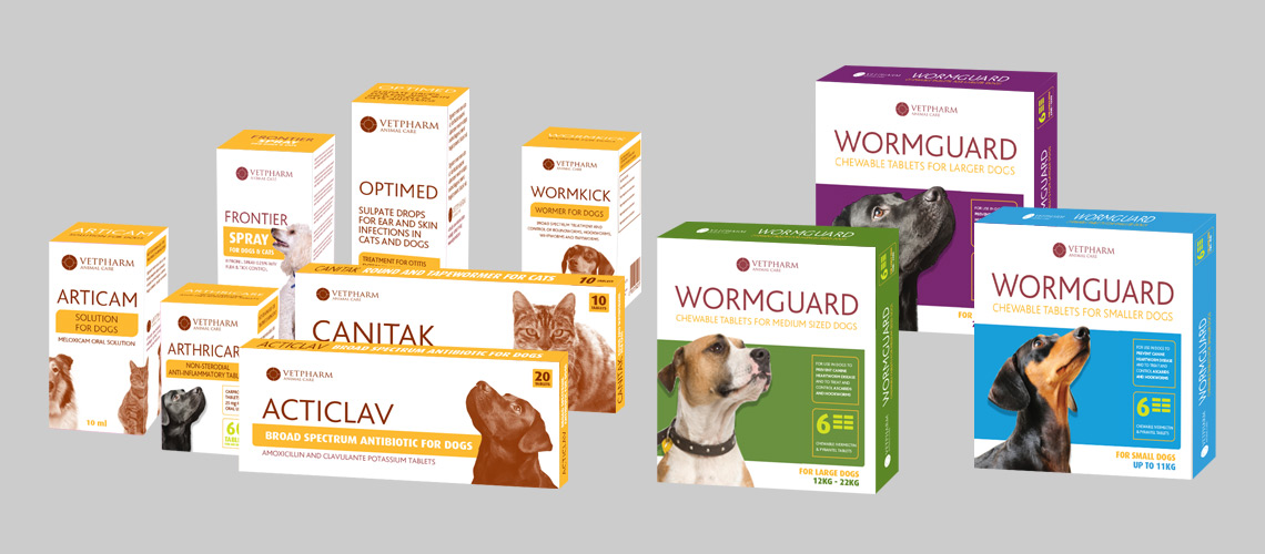
This start up company design case study for VetPharm Pharmaceuticals is a demonstration of how working with a business from the initial development meetings through to full launch and beyond.
Working with the VetPharm Directors, we produced a series of brand designs while they prepared the company for launch. All the directors were leaving positions within the pharmaceutical sector and would be under contractual embargo with regards existing contacts. Having the brand design and website ready to go from day one allowed them to begin to attract new contacts while honouring their contracts.
The project was typical in its nature in that those involved were experts at developing products and getting them to market, but hadn’t previously been involved in the design and marketing. Due to the sensitive nature of the relationship with their previous employer, they needed to make employ a new freelance graphic designer who would help understand their vision and work with them as they formulated the new company.
We began work by researching similar global businesses and examining their corporate identities. From the research we established that our new identity had to be flexible enough to reach a range of very different customers.
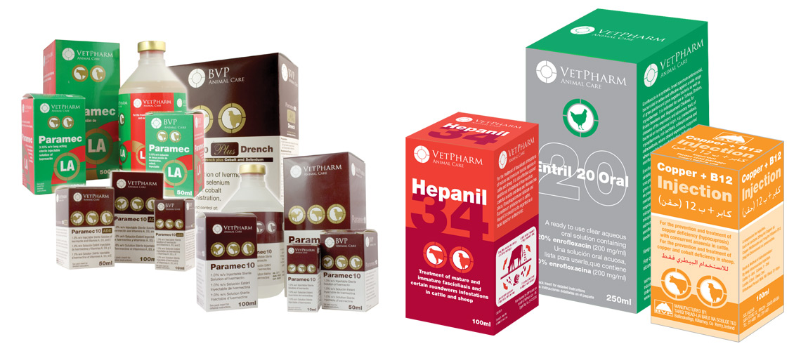
VetPharm went on to bring a number of original new products to market alongside mass produced animal health medicines such as Ivermectin. These products were sold on global market with particular strength in Vietnam/Korea, the Middle East and Africa. as well as commercial farming products, we developed packaging for the domestic pet market.
Alongside the packaging range, we produced sales literature, exhibitions, websites, including mini-sites to target niche products and I even helped art direct various photoshoots in their Uk and Irish production facilities.
As they matured, VetPharm introduced an in-house manufacturing department which was capable of inventing and testing new products. As moved away from the initial start up company design we explored the best way to sell to these countries and how the cultures responded to colour and design. For example, the African market responded to images of the animals on the packaging, primarily because a lot of the farming population are illiterate and the Middle Eastern market responded to metallic finishes and colours as they represented quality.
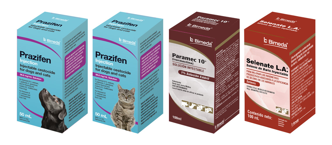
Being able to acquire the relevant export licenses for numerous countries, VetPharm emerged as a partner for many larger companies. After 10 years of successful growth, VetPharm was sold to US pharmaceutical giant Bimeda who continue to sell and develop the many innovate products. As part of the hand over, I worked closely with the Bimeda team in Chicago to convert all the VetPharm packaging over to the US design.
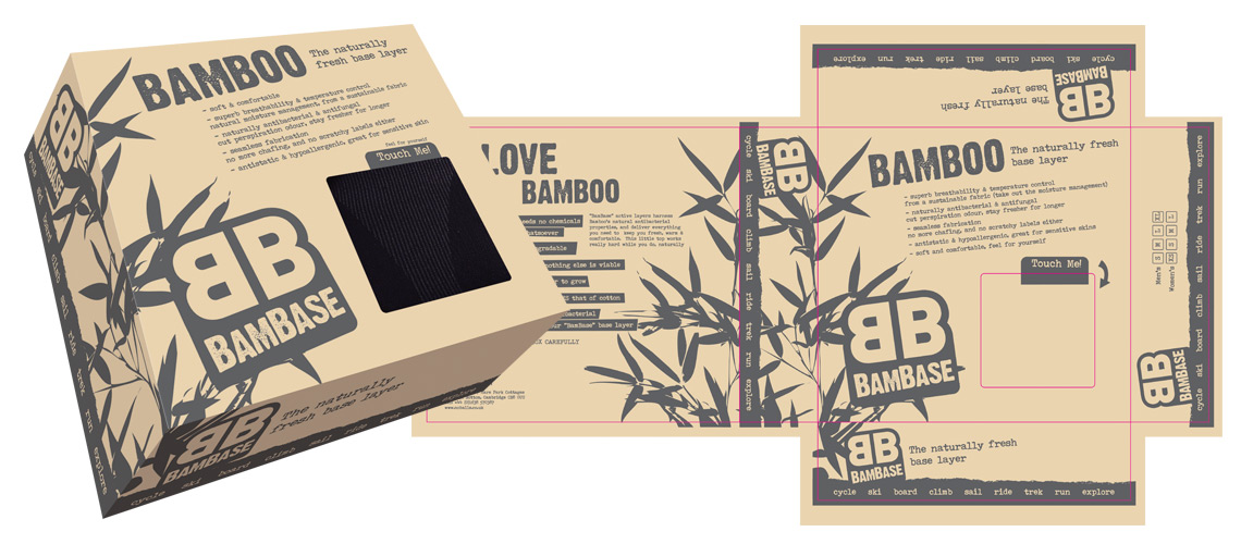
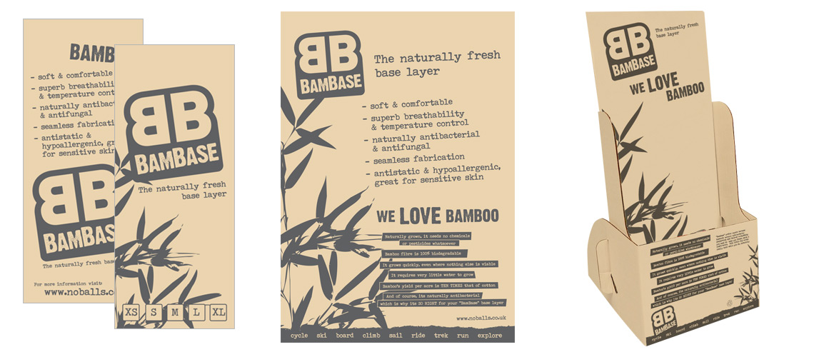
Bambase was a sub-brand specifically created to sell a range of bamboo yoga wear. Bamboo has some special characteristics which needed to be reflected in the design.
Bamboo is a fast growing plant making it ideal to farm for commercial use. It also requires very little water and combined with it’s natural defences which require no pesticides this makes it the perfect environmental choice. The design reflects this with a simple, single colour print onto recycled material. The obvious shape of the bamboo plant helps reenforce the natural product and gives the graphics an interesting, attractive quality. The use of the single colour print gives the design a strong brand identity which looks great on all media. It also helps in keeping the print costs down allowing BamBase to focus on the materials ensuring they are of good quality as well as sustainable.
Bambase Bamboo yoga wear box design and artwork
Bamboo yoga wear design project
As part of the project we produced packaging design that had section to remaining clear allowing consumers to touch the product. This was important as one of the great benefits of bamboo is how it feels. Larger products were accompanied by swing tags with the sizes added giving the shops the task of circling the relevant size. A series of posters and POS display units were produced to support in store marketing. These identified the benefits of bamboo and educated the consumers on why the product needed their attention.
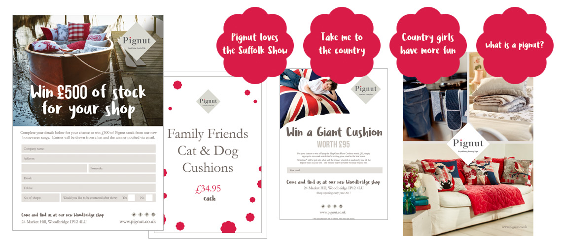
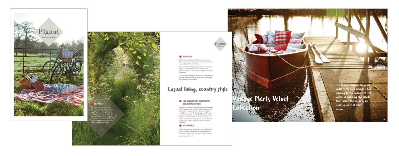
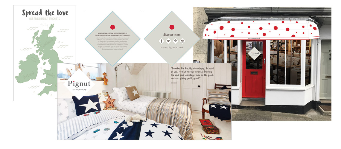
The project was to build on the brand identity work produced a London agency and ensure all the Pignut graphics and supporting material remained on brand as the company launched the business in Suffolk.
Taking the logo and the brand colours, we developed a number of projects including the opening of their new shop in Woodbridge, the design and print of their new consumer brochure, trade show promotional literature and all supporting documentation.
Trade and consumer show graphics, including leaflets, flyers and shaped stickers Pignut Consumer Leaflet Design
A balance between aspiration and accessibility
Pignut position themselves very much as an aspirational, but accessible brand and the graphic design had to reflect this. Using the flower and the shape from the logo as motifs to run throughout the visual identity we developed a creative platform to use on all material. Pignut invested in some great photography so it was important the design didn’t over power these and allow the products to sell themselves.
Strong use of the brand colours is seen throughout the designs. The font choices were of particular interest. There were three corporate fonts in use and it was important to retain a consistent message when using these. A robust font is used for headlines supported by a serif body font. These are complimented by a script style font to use in a more conversational way for quotes and requests. This allowed the visual identity to be more personal while retain some authority when needed.
Pignut shop visual and some of the internal vinyl graphics
Pignut graphics – style and detail
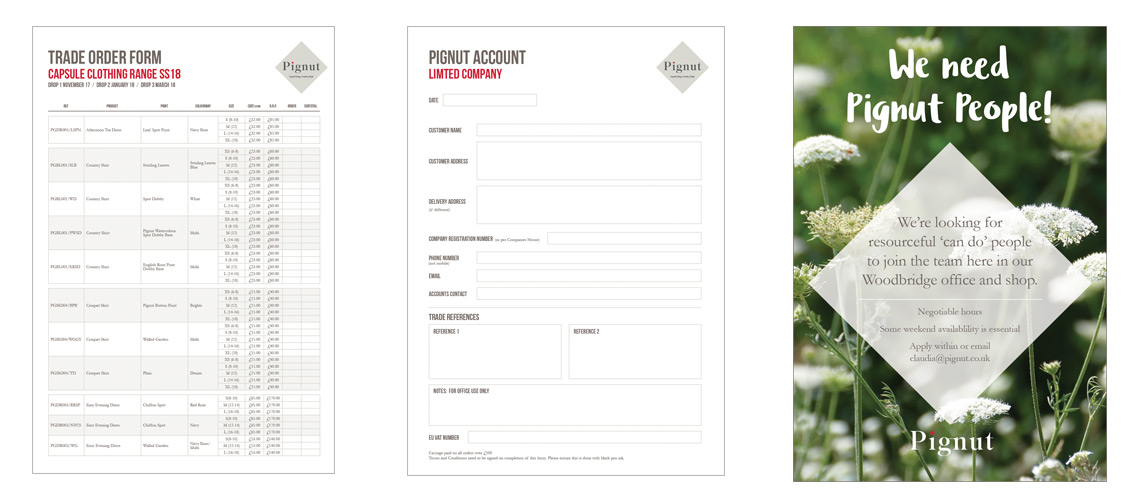
As the brand is all about style and detail, we needed to establish these brand values in the design. Time was taken to ensure all the Pignut graphics and documentation, even down to the most basic of order forms followed their visual style.
This continues through to their social media channels, press adverts and even the shop posters. This all adds up to a clear brand style which communicates their values.
Even the simplest price list and order form are styles to give brand consistency across all documentation. This shows a Trade Order Form, Account Application and shop recruitment poster.
If you have a similar project and would like to know more about how we brought Pignut to Suffolk, drop me a line. I have many other examples of Brand Development which might be of interest. Check out some other examples here >
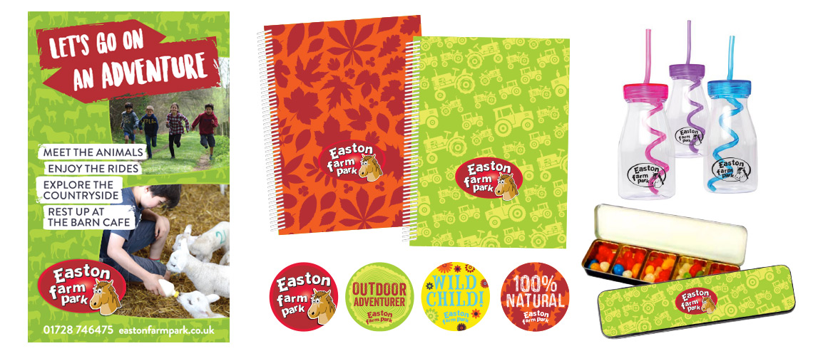
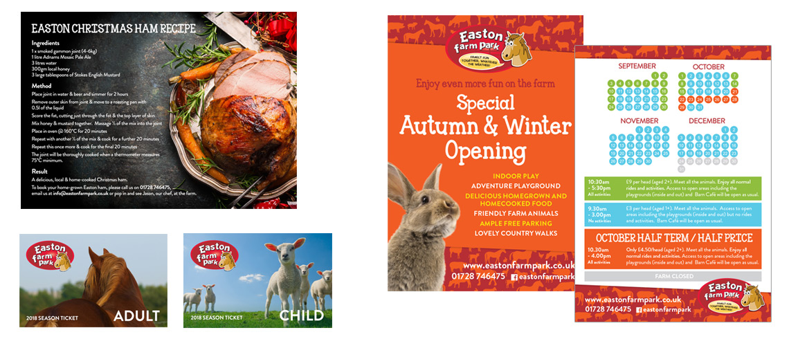
Creative Platform and Identity Design for Easton Farm Park
Working with the wonderful Easton Farm Park is always fun. They’re a great Suffolk day out where you get to spend time on a working farm meeting all their animals. It is a valuable part of the Suffolk tourist network providing a year round day out for families. Here they can get away from all the distractions of small screens and experience the great out doors and connect with the natural world.
We designed a new identity design which involved firstly developing a simplified version of their iconic logo allowing it to be used on new media and a new range of products. As the logo is so recognisable to their Suffolk visitors we wanted to retain it if at all possible. The challenge was then to use the old logo in a new and exciting way.
Creative Platform for Easton Farm Park. Adverts and products with new colour pallet and brand patterns
In order to do this we developed a new and exciting creative platform giving them a distinctive visual style on which they can base all their marketing activity, giving them a new cohesive brand across all channels. The new style introduces a number of brand patterns and a new colour pallet. The colours take their influence from the seasons allowing Easton Farm Park to tailor their material to the time of year.
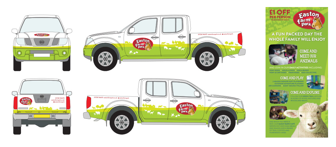
New visual style applied to vehicle livery and DL leaflets which are distributed locally
To date, we have used the new creative platform on all their printed material and new product range and are looking to roll it out over their social media and website soon. One very exciting project was designing the graphics for their new shiny pick up truck. Check out the project here >
A5 leaflet design showing the brand identity plus an of a Christmas postcard and season tickets using full colour images.
If you haven’t been to Easton Farm Park, or haven’t been for a while I strongly recommend you go. Its a great place to catch up with friends and the Barn Cafe is excellent!
Get in touch about your project and how you can develop a new creative platform
If you have a corporate identity project and need some help, get in touch. As you can see it is perfectly possible to creative a fresh visual style without having to completely redesign your logo.