Investment Bank KXV’s brief was to design a simple, bold design that enabled them to make an impact at investor conferences.
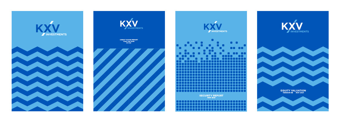
The logo design introduced the simple diagonal line mechanism demonstrating investment. The strong shapes help communicate their confidence and their ambitious approach to investment banking.

We designed the colour pallet to change from year to year, with the 2020 being the two tones blue. The plan is then to select a new colour for the following years to keep the brand fresh in the mind of investors. The logo was designed with this in mind so can be used on white, or reversed out of any solid colour. KXV hope this flexible approach will enable them to appear more dynamic than their larger investment bank rivals.

One of the main criteria for KXV Investment Bank was to move away from stock images and only use ‘real’ customers when showing testimonials or campaign messages. The strong shapes used on the brochure covers allow for this. Each cover of a report or presentation has it’s own shape design with a nod to the contents. These examples show a simple ‘tech’ pattern for a report on cyber security and a zig zag pattern for reports on market fluctuation and opportunities.
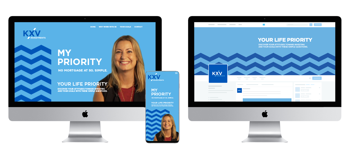
We developed a campaign based on the individual priorities of the customer called ‘My Priority’ where KXV asked a number of customers why they felt they wanted help with their investments. This enabled us to use the real customers to give the campaign an real world feel and show people future customers could identity with.


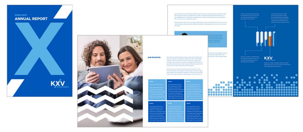
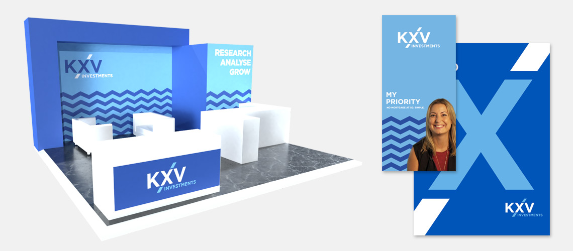
Exhibition stand design and supporting corporate literature design
If you have any queries, or wish to contact me for more examples, please drop me a line. There are many more examples of brand and logo design on the website, plus many more which have been commissioned by marketing agencies and marketing consultants. Due to rights reasons, these are not shown on the website but these design case study examples can be shown via email.