Category: Logo Design

Logo design examples from Steve Crooks, Freelance Designer

  • Trafalgar Fireworks Logo Design

    Trafalgar Fireworks Logo Design

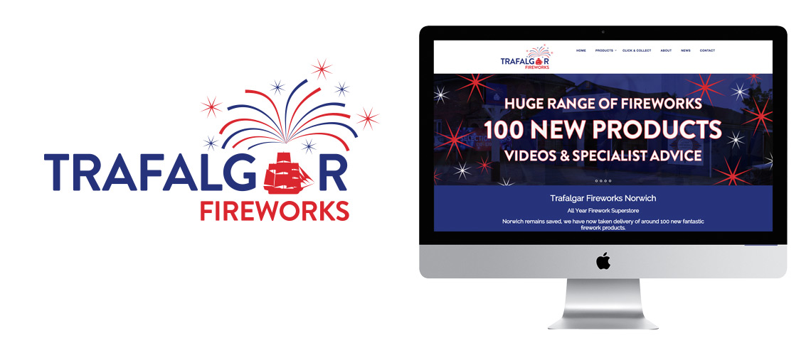
    Trafalgar Fireworks Logo Design for their new flagship superstore in central Norwich.

    Trafalgar Fireworks are new firework shop in the heart of Norwich. The owner of the business has a long history with the import and sale of fireworks for the trade, but Trafalgar fireworks are new retail start up business.  As part of an this project we have also completed an ecommerce website (see the case study here>) and a complete range of packaging designs (see the case study here>).

    The Trafalgar Fireworks logo design focuses on the red, white and blue of the union jack as the battle of Trafalgar is celebrated as a great British victory It also links to Lord Nelson’s association with Norfolk and the stores location in Trafalgar Street. The classic silhouette of the warship is used within the logo to replace the ‘A’ to give the logo a unique form and keep the design compact. The solid vector approach is designed to convey authority and help move the visual identity way from other import brands which have a very flamboyant Chinese interpretation of western design tastes.

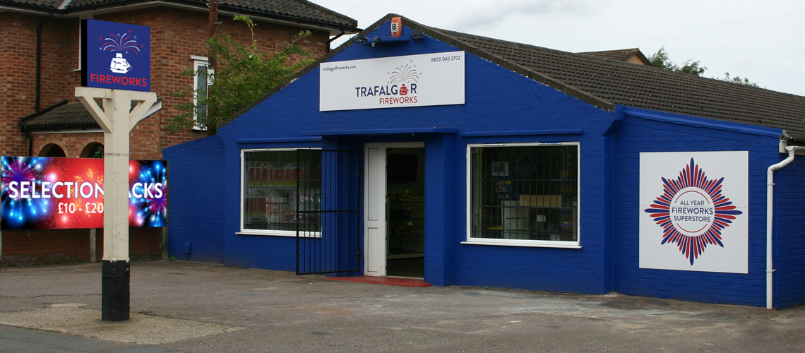
    We also developed a supporting graphic to use alongside the Trafalgar Fireworks logo based on Nelson’s famous Breast Star seen in may of his portraits. This can be seen on the store front below.

    Trafalgar Fireworks Logo Design

    Trafalgar Fireworks Logo Design Variations

    Examples below show how the Trafalgar Fireworks logo design is used in different colourways. In allowing the logo to be used with a blue and red background the brand material retains a strong identity while introducing some flexibility in how the logo is displayed. Variations of the logo can also be used with just the ship icon.

    Alternative Trafalgar Fireworks Logos

    Care was taken to paint the Trafalgar Street store the same blue as the logo helping with the overall visual identity.  All the supporting brand material and promotional activity continues this scheme.

    Trafalgar Fireworks Shop

    Research after the first year’s trading revealed Trafalgar customers clearly identity the brand in press and online adverting. They also perceive the brand as a UK company who understand their market and not just a firework importer. This has been very important as Trafalgar Fireworks have worked hard to demonstrate they really understand the market and offer valuable advice. We are now working on new ideas to build on their reputation as Norfolk’s premier firework provider.

    If you have a retail business or are thinking of starting one, then I can help with all your logo, visual identity and brand designs. If you want to discuss the process with me and how we go about starting such a project, please get in touch and I’ll be happy to help.

  • Logo design for Insurance Broker Liability and General

    Logo design for Insurance Broker Liability and General

    Insurance broker logo design for local Suffolk business Liability and General. 

    Liability and General were a start up business looking to partner with an experienced local graphic designer to provide them with designs and advice.

    Insurance broker logo design for Liability and General Liability

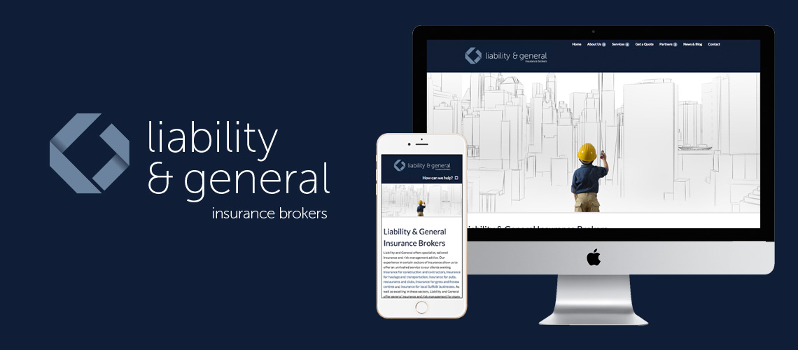
    The logo was designed to be used in positive and negative.  This gave Liability and General the opportunity to use a strong blue brand colour while also being able to use the logo on a white background.  The typeface choice gives the logo a crisp, precise feel. We developed two versions of the logo with the copy in a single or double line to allow for different applications.

    Between us, we looked at various international, national and local insurance companies to examine where Liability and General fitted. What we felt worked best was a strong, identifiable icon that positioned the company very much central to the sector.  The shape plays with the L and G of the name to form a simple but effective symbol.  This symbol is designed to look traditional at part of the clinical look favoured by many of the large insurance brands. This gave Liability and General instant acceptance as an established business. The symbol can then be used in isolation on social media profiles.

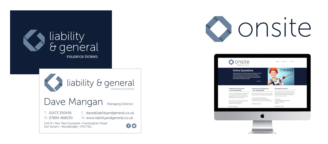
    The shape also allowed us to explore sub-brands such as Onsite, a specific campaign aimed at the building trade. The Onsite brand takes the visual style of Liability and General insurance broker logo design and tweaks it for a specific audience. This included sales leaflets and its own mini-site.

    Liability and General Case Study including Onsite Logo

    Alongside the insurance broker logo design we produced a distinctive brand style using children in adult trades. This gave the Liability and General promotional sales material a fun twist which allowed them to stand out in a very competitive market.

    This video was designed to promote their specialism within the construction sector. It incorporates an animation of their logo which helps bring the brand to life. For more detail on the video production project, click here.

    Insurance broker logo design

    Are you starting up a business looking for help or a company after an insurance broker logo design?  Get in touch and I can help with your logo design, brand identity and a raft of other services. I’ve helped many start up businesses over the years and have seen many of them go on to do great things.

  • New Identity Design for Care Careers Suffolk

    New Identity Design for Care Careers Suffolk

    Identity Design Case Study: Care Careers Suffolk

    Care Careers Suffolk are a not for profit organisation that provide advice and guidance for those wanting a career in the care sector.  Their team travel Suffolk attending events such as school and college open days offering face to face contact for anyone interesting in a career in care.  This can be by providing examples of career pathways and how to gain relevant qualifications through schemes such as apprenticeships.

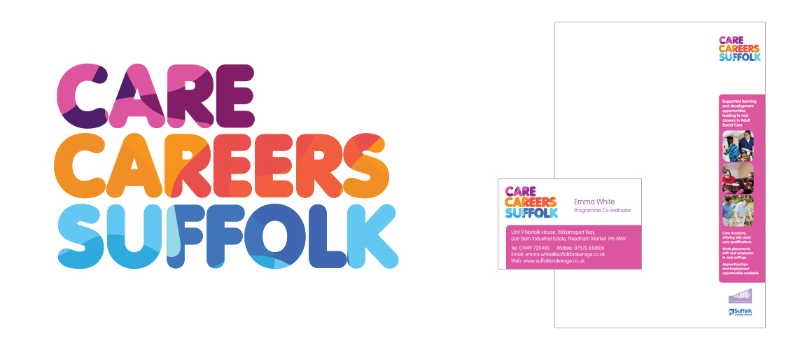
    Care Careers Identity Design - Logo, Letterhead and Business Card
    Care Careers Identity Design – Logo, Letterhead and Business Card

    It was important that Care Careers Suffolk had a bold identity to help them make an impact at events. We also decided it would be great to make the identity design as colourful as possible to show potential carers this is a colourful and exciting sector.

    The logo was uses a bold typeface allowing plenty of colour to be added. This colour is constructed by using number of overlapping stars in various tints of purple, orange and blue.  These stars build to give the logo texture and help convey the busy nature of the sector.  What we were very keen to do is communicate how diverse and exciting a care in career could be and overcome any negative connotations about the care sector.  In using the stars we are subtly implying care professionals are the hidden stars of our society, something we have used in other aspects of the identity design.

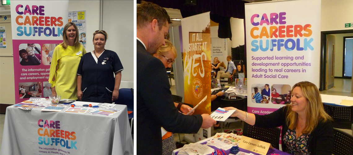
    The Care Careers team out and about using their new identity design as part of and event with a pop up display and information leaflets
    The Care Careers team out and about using their new identity design as part of and event with a pop up display and information leaflets

    The identity design has been used on a number of items such as leaflets as well as the Care Careers Website and social media platforms. I have also helped Care Careers Suffolk use the identity to set up their own Vimeo channel allowing them to publish helpful testimonials from care professionals.

    If you would like to discuss how I can can help with your identity design project, then please contact me and I’ll be happy to discuss ideas.

  • Logo Design for Patrick and Menzies

    Logo Design for Patrick and Menzies

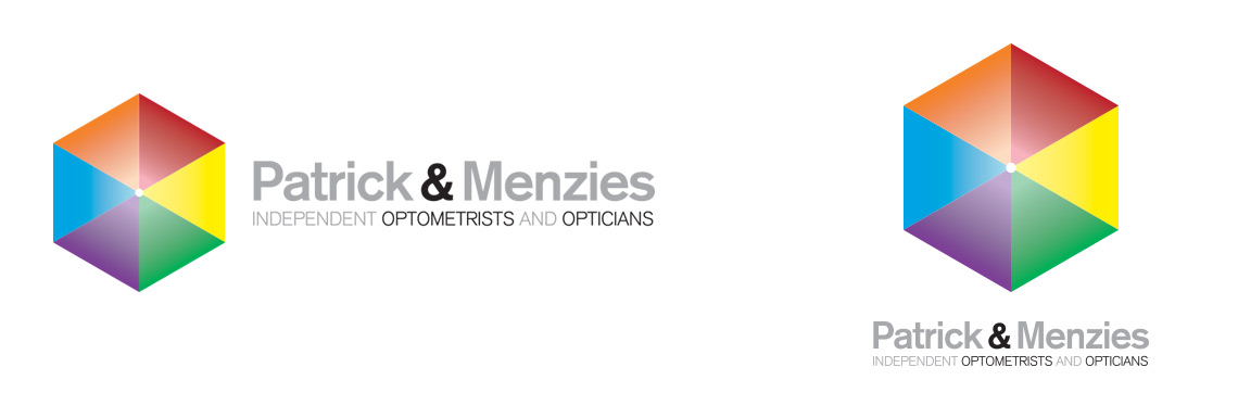
    The new Patrick and Menzies logo was designed to take the business into a new exciting age of colour and interactivity.

    Unusually for an opticians, the logo doesn’t use glasses as a motif.  At Patrick and Menzies, they believe eye care is so much more than which prescription glasses you need and wanted their brand to reflect this.  An overall approach to eye care, including the latest anterior eye imaging and retinal scanning techniques are seen as essential parts of a long term care plan.  They also use various colour tints (colorimetry) to manage migraine and glare sensitivity.

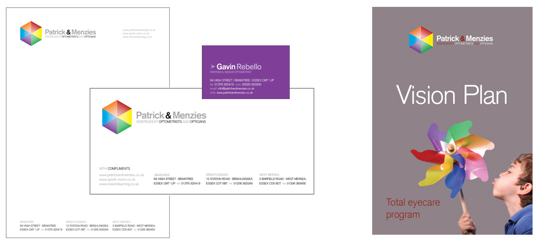
    Logo design and stationery

    Some people when looking at the logo will see a cube, some a colour wheel, some 6 triangles, some the top of an hexagonal pyramid.  The motif is engineered to explore the individual nature of eyesight and how we all experience the world around us in a different way because of how we ‘see’.

    Use of the colour wheel allows Patrick and Menzies to take individual elements and use it in a wide range of literature.  Many other high street opticians have attempted to base their brand around a particular colour. The colour spectrum is such a fantastic subject. The new logo celebrates this and how wonderful our eyesight is. Not limiting themselves to one colour allows the Patrick and Menzies literature to be available in a wide range of colours and be different each time the customer encounters it.

    Logo Design Items

    The use of colour also echoes a new trend with Patrick and Menzies customers with many now using the colour of frames and individual styling to make a statement.  Some colours will suit and enhance your look and the use of frame colour helps to enhance eye colour.

    The logo shape and use of bold colours is also designed to engage children as Patrick and Menzies do a wide range of work with children and vision in learning.

    The logo design process

    We wanted to make the logo design project as fun and as engaging as possible for Patrick & Menzies. The business is lucky to have some very switched on and passionate staff, so it was important to include them as much as possible. In order to do this we produced a number of logo quiz sheets to get the staff thinking about logo design and corporate identities and what they feel works best. We canvased their ideas and this formed the basis of the brief.

    A number of designs were produced and these were shown to the staff to gather their opinions. Various logos were then taken forward and shown in a number of different scenarios to see what we felt best suited the material and platforms. After a number of tweaks, we agreed the final logo and this was rolled out on various key touchpoints.

    We enjoyed the fun nature of the final logo. It was designed to ask questions about vision and how we see things. Is it a simple coloured hexagon? Do you see it as a point viewed from above? Is is an isometric square? Whatever your first impression, it will then take on a different shape the more you look at it.

    Do you have a similar logo design or brand identity project? Get in touch and I’ll happily talk though the process and how I can help.

  • Logo Design for Kisra Clothing

    Logo Design for Kisra Clothing

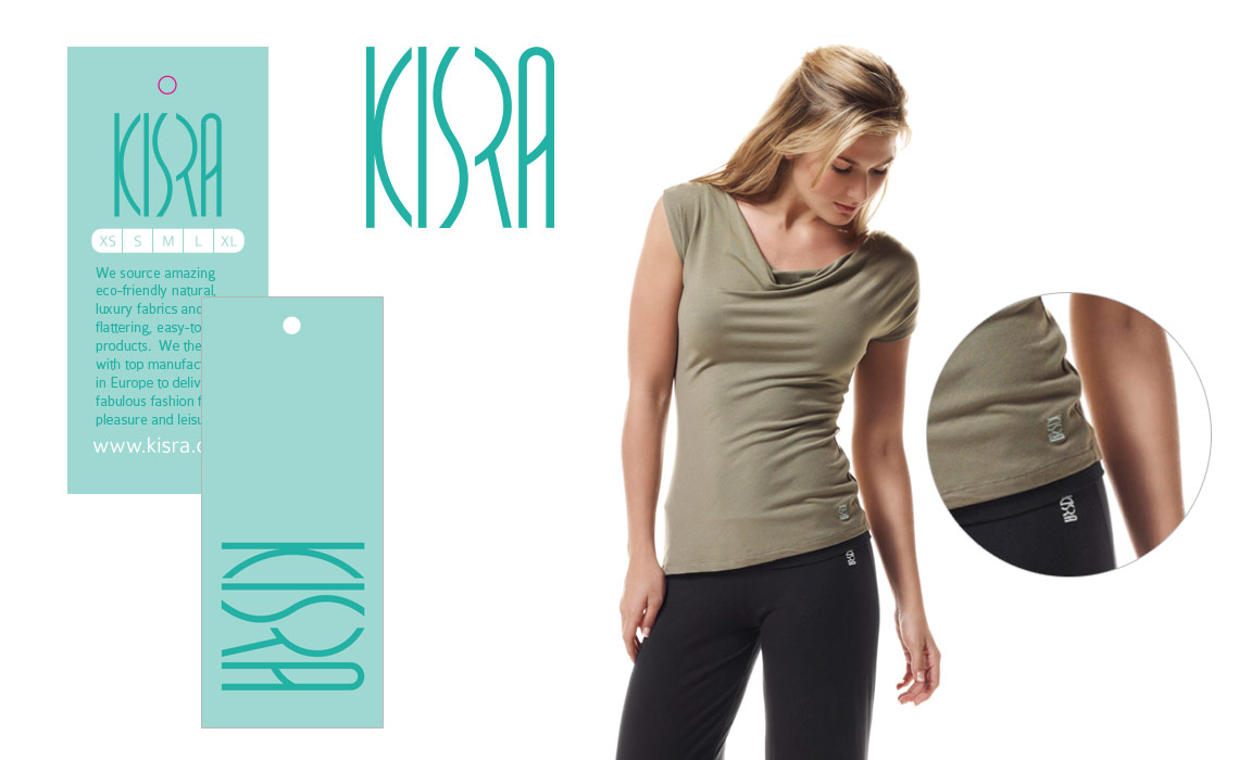
    The brief was to design a simple, text based logo for Kisra Clothing from No Balls which is easily embroidered onto bamboo garments. The logo had to be flexible and used in a variety of colours and finishes. It was also important that the logo be identifiable even at the smallest size as it was to be used printed on washing and care labels.

    The inspiration for the logo is the human body and how the Kisra clothing compliments the natural shapes and forms.  The logo also looked great at different angles giving the design a different dynamic on the clothing.

    Made from bamboo we also wanted the logo reflect the quick growth associated with the material. The logo design needed to look contemporary and echo the modern fabric, but not too ‘organic’. Customer feedback of the product resulted in a misconception the bamboo would degrade quicker than other natural fibres and for this reason we wanted the logo to have clean, crisp shapes to help communicate its technical nature.

    As part of the project, the files were supplied to the client to enable them to send to their worldwide list of suppliers.

    Kisra Clothing Logo Design

    Kisra Logo Examples

    As part of the No Balls brand, Kisra Clothing is sold through their online shop and through a network of distributors. In order to reach the distributors No Balls produced a series of advert designs and attended trade shows with their trade show exhibition design.

    For more logo examples, click here.  If you have a similar project and would like to talk to me about logo design, please contact me.

    For rights reasons, the examples shown on this website do not include projects undertaken on behalf of marketing consultants. If you would like to see more examples, email me with the type of business sector you are in and I will be able to show these projects via email.

  • Branding Project for Property Refurbishment Company

    Branding Project for Property Refurbishment Company

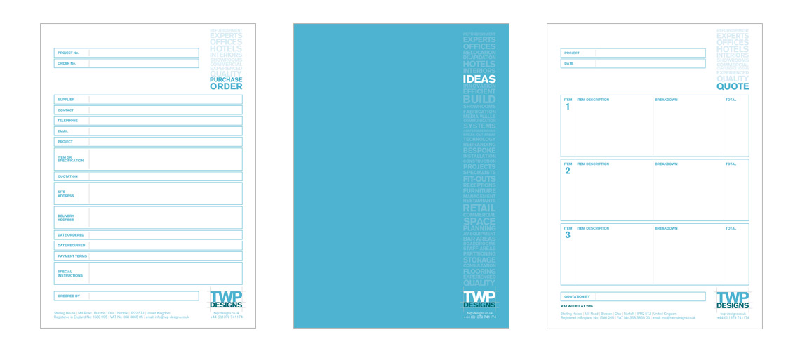
    This branding project for TWP Designs, a local Norfolk based refurbishment company, was designed to provide a consistent and targeted approach to all their offline material. They found their ad-hoc approach to document production was presenting them as disjointed and disorganised.  They were also aware that a number of their clients didn’t actually understand the services they offered.  For example, some customers would employ them to refurbish hotel bathrooms, not aware that they were able to offer a complete refurbishment service.

    TWP Branding Project Documents
    From left to right: Purchase Order pad, Cover for client proposals, Quotation pad.

    Branding Project

    We started by assembling all offline material, which the customer would see, right down to the most basic of documentation. We then experimented with various ideas to bring all these elements together.  The brand colour combined with a simplified logo gave the identity a vibrant, strong style. Choosing to use this colour made it a lot easier to set up internal systems which everyone could adhere to. There were a set of corporate guidelines that allowed them move away from the brand colour, but only for specific purposes.

    As well as the visual style of the new identity, we also introduced a word cloud to each document. This gave us them opportunity to highlight other services to customers.

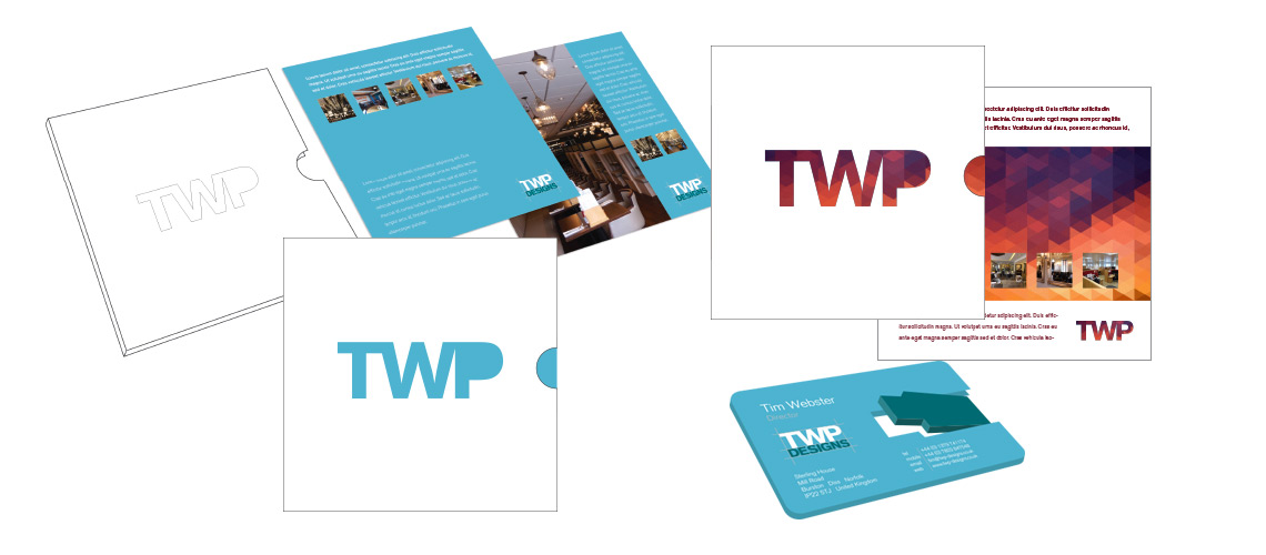
    TWP Branding Corporate Brochure Design
    TWP corporate brochure concepts and electronic business card

    The new visual style gave the business a way to communicate to their customers in an effective, rational way. It gave the company a more dependable feel, especially important in a sector that demands a real eye for detail.

    Do you have a business that needs to look at how it presents itself? I have other examples of this type of branding project, some of which for confidentiality reasons are not show on this website. Get in touch and I can discuss this, and other branding projects completed on behalf of creative agencies and marketing consultants.