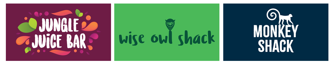
These cafe logo designs are part of a wider project for the Zoological Society of East Anglia. Banham Zoo and Africa Alive are much loved local attractions and a vital part of the conservation efforts to help many endangered animals. As they prepared to open their doors after a lengthy spell, they needed to convert a number of underused building to new food outlets. This would enable them to spread visitors out across the park by increasing their catering options. This would help lessen the queues for the main food outlets. The main food outlets were all converted to takeaway cafes. As well as limiting the queues, the new outlets would also help increase the average spend of each visitor. It would also increase the choices available and allow for future seasonal food offers.
Examples of Cafe Logo Designs for Banham Zoo and Africa Alive
I was tasked to design a number of cafe logo designs to each of the new outlets their own identity. With time and money in limited supply, the designs need to be quick, simple and effective.
Snack Shack and Ice Cream Hut logos for Banham Zoo and Africa Alive
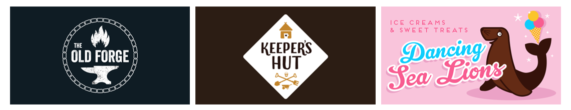
As part of the design process we needed to consider how the outlets would be used in the future. With any attraction, seasonality is key. The ability to quickly change a food offer would be an important step. This would allow the zoos to be flexible when opening during the winter. To enable this I designed a system of empty belly signage. This is where we have the main branding as permanent signs with temporary menu boards. The menu will then swap depending on the offer.
The Keepers Hut and Old Forge at Banham Zoo. Plus example of Menu Board
Giving each outlet its own identity has additional benefits. Signage can be used over the two locations providing cost effective printing. We can build on these brands and introduce offers which can be redeemed in each zoo. This will introduce familiarity with the outlets and help encourage visits to the sister zoo.
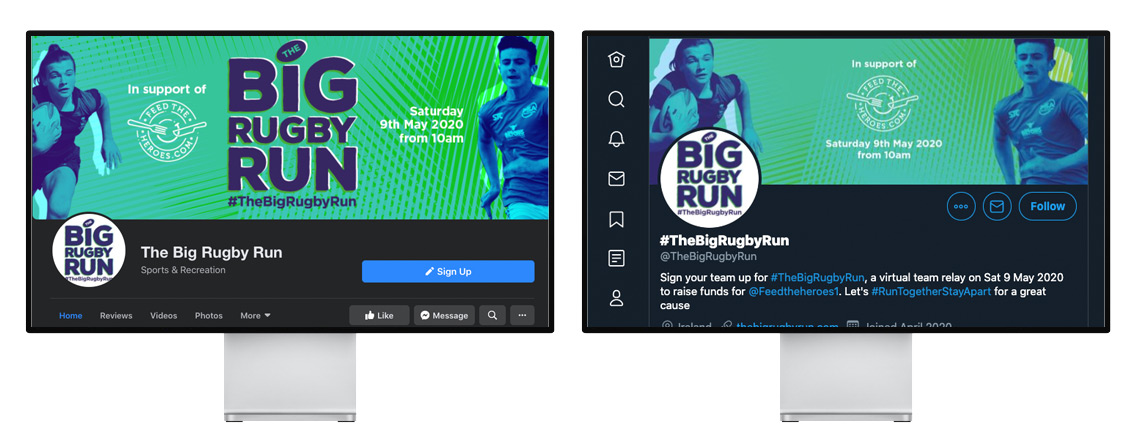
As a graphic designer it is good to be part of fundraising event design projects. We often get caught up in everyday issues, so to break away from and produce graphic design for good causes is beneficial for everyone. I was fortunate to be involved in the Big Rugby Run. This was a wonderful initiative from PSA Academies. This event invited rugby teams in Ireland to run a virtual relay and raise money for Feed the Heroes. Feed the Heroes provides essential meals to the frontline medical staff fighting the COVID-19 pandemic.
In 5 weeks, the Big Rugby Run managed to get 115 teams registered and hundreds of rugby players involved. To date, the fundraising event has raised a staggering €30,000.
High Profile Partners
As part of the event, the Big Rugby Run team attracted some big named partners. StatSports, McDonalds, The Curragh Racecourse and the Aviva Stadium all donated prizes. The prizes were used for a draw to provide an extra incentive to the rugby clubs. The draw also offered an opportunity for many other organisations, including PSA Academies to get their name in front of the clubs and their players.
Fundraising Event Pack and Logo Design
The first task was to design a simple logo. The Big Rugby Run logo uses a clear sans serif font with some added texture to imply movement. As this is aimed at a rugby audience, the typography puts emphasis on the BIG and Run to put the task beyond doubt. The rugby ball provides a little touch to help soften the overall impact. We added the hashtag below the logo as a way to bring the content together across all platforms.
The design style used a textured background as a visual tool to bring all the elements together. This too helped to provide movement in the design. We used real rugby players from the PSA Academies, giving them a simple monotone feel. Utilising a limited colour pallet helped focus attention on the content and not overwhelm the reader. It also helps imply a disposability to the design as this is a one-off event. It also allows us the opportunity to in the future to change the colour scheme to help differentiate the event from year to year.
Social Media Support
In order to promote the event in such a short timescale, they relied heavily on social media. In order to give confidence to those considering participating we made sure all social media elements reflected the design style. Using the background as a template, the Big Rugby Run team were able to produce their own social media graphics on the fly, but keep them consistent with the main elements.
Facebook cover and Twitter header for the Big Rugby Run
Fundraising Event Design Icons
In order help the visual communication of the fundraising event design, we designed some simple icons. These were used as a way to highlight the process and break up the explanatory text. Icons such as these are a great way to distill important information helping the overall communication.
If you have a similar project for a charity or non-profit organisation, then please do get in touch. These projects are always welcome and discounts will be given to those wanting to promote a worthy cause. Recent projects include helping the Zoological Society of East Anglia fund-raising, helping Stowmarket ASD Saturday Clubs with a website and supporting the John Peel Centre with their graphics.
The Zoological Society of East Anglia runs both Banham Zoo and Africa Alive. As part of a major fundraising drive following the COVID-19 lockdown, the ZSEA approached me to help with their ‘Be Amazing’ campaign. This campaign was designed to bring donors, ticket holders and fundraisers together to maximise their support.
As part of the campaign, supporters were encouraged to raise money for the zoo and ‘Be Amazing’. The funds would be used for the welfare and food for the animals while the zoos were closed to the public.
We used Givergy as the fundraising platform. This allowed ZSEA to run both donation pages and a competition pages. The competitions were all administered by the Givergy system giving the ZSEA the knowledge these were all covered by UK gambling laws and the winners chosen at random. For my part, I helped provide engaging graphics to support the competitions. These included some amazing people, such as people singing songs, ballet schools and local businesses donating prizes.
Support graphics for the Zoological Society of East Anglia Givergy fundraising site
With so many organisations fundraising during this time it was important to the Zoological Society of East Anglia to look as engaging as possible. In order to achieve this, and to help with the overall delivery of the items we split each project into two options. The first was general support for those fundraising on the zoo’s behalf. For these we used a framework based around the ‘Be Amazing’ message. For more complex projects, we designed an individual treatment to reflect the target audience.
One example of the bespoke project design was the material targeting the schools in the local area. While in lockdown, pupils were invited to draw an ‘Amazing’ picture. Using the frames provided, the pictures would be entered into a prize draw to win a trip to the zoo for their whole class. We also printed the winning picture onto T-Shirts for the entire class. Not only does this help to raise funds, it also provides a great good news story to promote with the winning class. To support the campaign, we produced social media graphics and a downloadable entry pack.
Be Amazing School Art Competition social media graphics for Banham Zoo and Africa Alive, plus the downloadable entry pack with instructions and sample frames for the pupils to colour in.
If you have a fundraising project which needs professional graphics to help maximise its impact, then get in touch. I have plenty of experience in not only designing the graphics for events, but also running them so understand the pressures involved.
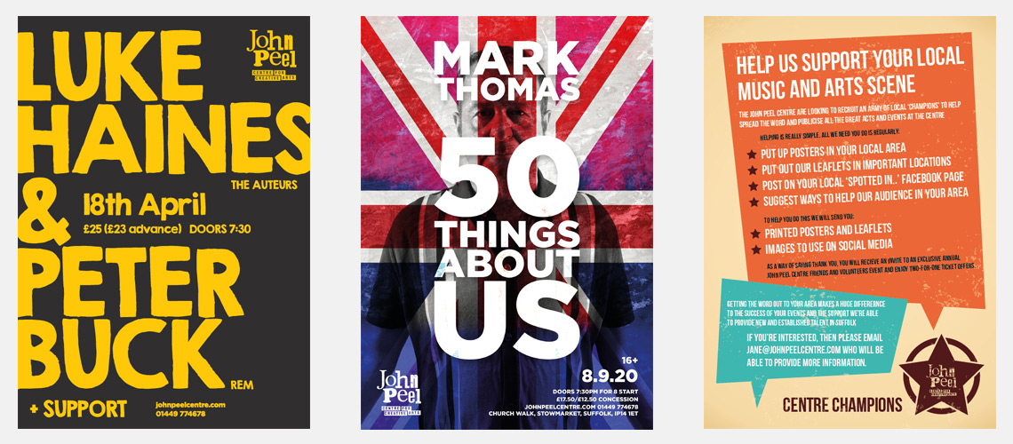
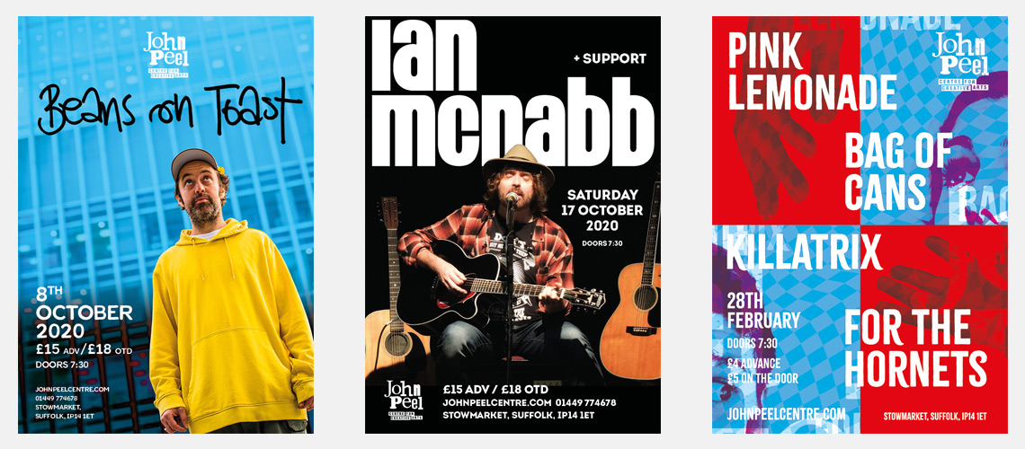
Examples of some poster designs completed for the John Peel Centre for Creative Arts in Suffolk. I regularly help out the Centre with new promotions and event material. As part of that relationship I also provide some marketing support and advice.
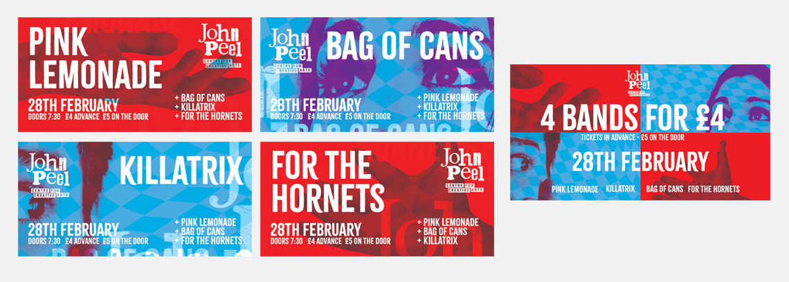
We also designed posters for an event which included four local bands, Pink Lemonade, Bag of Cans, Killatrix and For the Hornets. One of the reasons I get involved in these projects is they can throw up and interesting challenge. In this case, it was how to design a poster which promotes all the acts equally, and without eluding to a specific musical genre. We also wanted to use elements of the poster to promote each band separately. In order to achieve this, the poster is designed into four quarters, giving each band equal weighting. Simple, ambitious imagery and texture gives the background an interesting style. Using this style, we then produced a series of social media graphics to target the individual band’s fans and extend the centre’s overall reach.
As well as supporting the Centre promote their events, we also designed a new ‘Centre Champions’ campaign designed at recruiting volunteers from the villages and towns in Suffolk. With their help, the posters and social media graphics will be promoted in these areas for raise the profile of the centre. The Centre Champions campaign was given its own visual style to help engage new volunteers and promote the scheme with a sense of professionalism. Giving these sort of campaigns their own visual style also allows the centre to have some differentiation between their messages. Having communication from the Centre that all looks the same will result in certain messages being lost, so using this tactical approach enables us to target the audience more effectively.
All poster designs are able to be rolled out quickly over various social media sizes. This keeps my commitment to manageable level and allows the centre to get the information out as swiftly as possible. It also provides the artists with material they can post and promote.
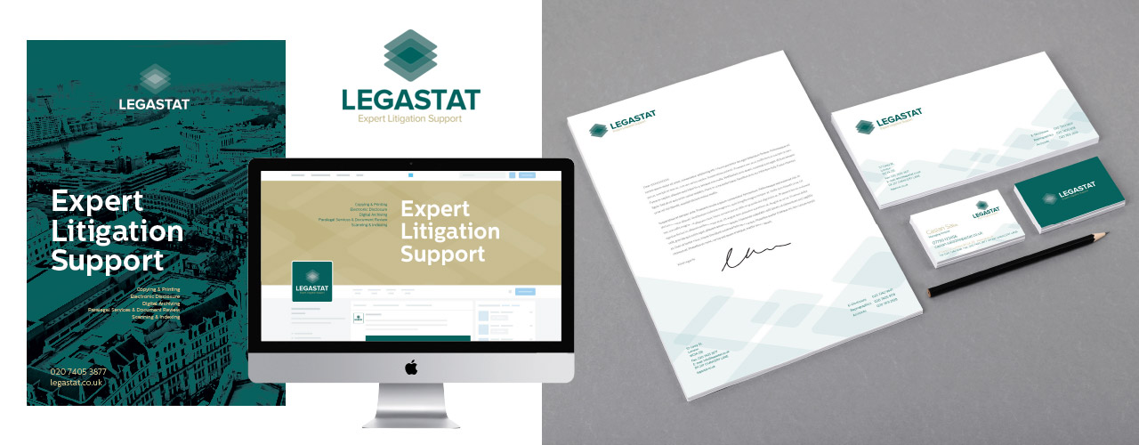
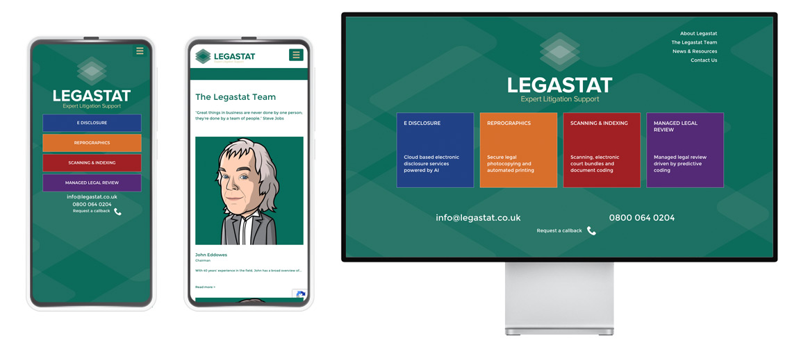
Legastat brand development project for a London based legal services provider.
The project was to totally redesign their logo and corporate identity. The old identity had not been refreshed since the 1960s and didn’t reflect their new digital services. Legastat are well known and well regarded within the legal professional and are considered one of the countries leading litigation support companies. They have an iconic building in the heart of Chancery Lane and Lincoln’s Inn Fields which everybody within the legal sector is aware of. The danger was, people might confuse ‘iconic’ with out-of-date so we began a process of exploring their logo and their visual identity. We felt it was important to experiment with a few ideas, each moving further away from the existing brand identity. This enabled us to discover what was crucial about how Legastat currently present themselves and what elements need to be retained.
Website design for Legastat. To view site click here >
The new Legastat brand development moves the business into a new digital age. The supporting symbol combines the fundamental historical basis of their business, reprographics, with a new twist suggesting new technology based services such as digital archiving. The overarching proposition is demonstrate Legastat specialise in all aspect of legal documentation.
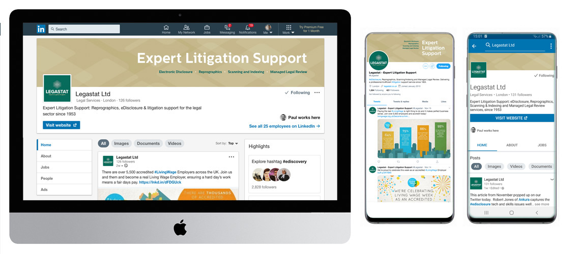
LinkedIn and Twitter Page designs for UK Legal eDisclosure business. This shows how to bring brand consistency across all platforms
As green is such a dominant colour in the history and understanding of the business we have chosen to launch the new identity using similar, but richer green. Once established, this strong colour will be supported by a varied colour pallet to enable Legastat to use more variety in their promotional material.
A bold substantial font carries a sense of authority. The most important aspect of the identity is the name and clients positive relation to it. Their clients know Legastat and need to be able to identify them quickly and easily. The bold font also allows us to add colour to the letterforms adding an interesting new dimension. We also added the descriptor line ‘Expert Litigation Support‘ to help communicate the service to new business.
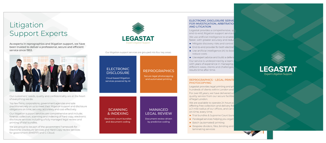
Legastat A5 6pp leaflet. A quick and simple way to promote the new brand and how the business communicates its four core services, electronic disclosure, reprographics, scanning and legal reviews.
The new brand identity was launched in Spring 19. If you have a similar project and need to work through ideas to establish a new brand identity, then get in touch and I’ll happily discuss in more detail the process behind the Legastat brand development.
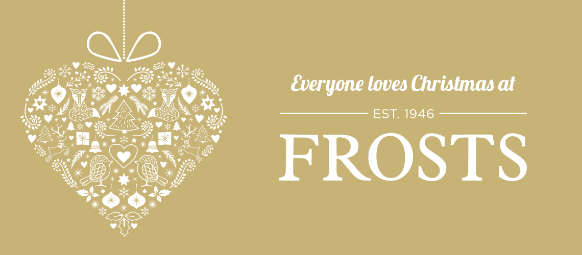
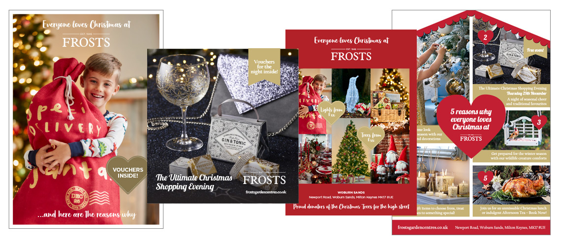
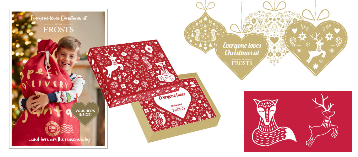
This Christmas campaign design is part of an on going brand development project with Frosts Garden Centres. For more detail of the main brand design, click here >
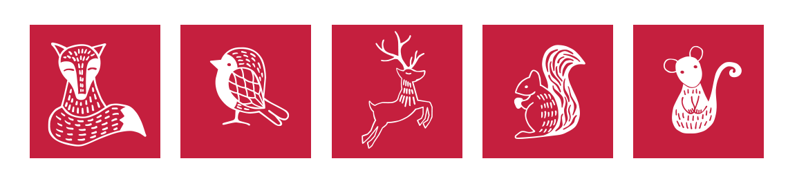
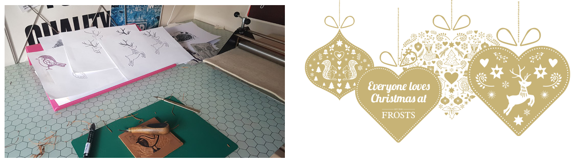
Everyone Love Christmas at Frosts was developed alongside the Frosts marketing and design team. They wanted a beautiful design they could use various elements from throughout their garden centres. They designed a campaign based around 5 unique animal illustrations, a fox, a robin, a deer, a squirrel and a mouse.
Starting with the initial sketches, we designed each character to be used individually and part of a set. This included their use with a Christmas background made up of holly, stars, hearts and mistletoe. Using this background we designed a set of Christmas baubles to accompany the tagline ‘Everyone loves…’. I then produced each character as a lino cut. This gave them a sense of individuality and added to their personality. Once they were printed, the characters were scanned in and redrawn in order to make them vector graphics. This gave us the option to use them and a much larger scale.
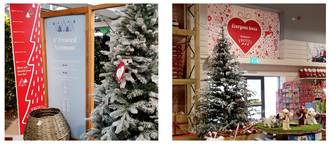
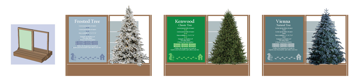
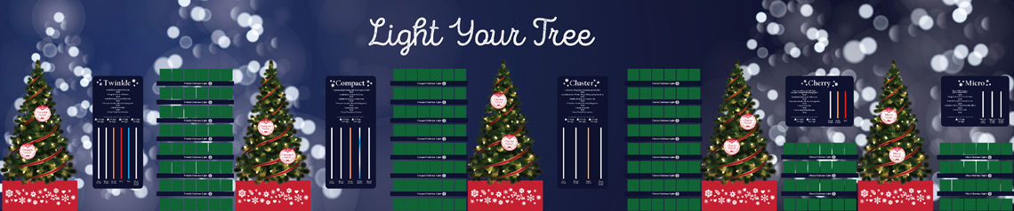
The Christmas campaign design was then rolled out over 2500 separate items of Point of Sale and Information graphics. With 4 different locations and hundreds of items in this was quite the undertaking. Using the Christmas characters and the Christmas pattern we designed POS specifically for each of the 4 locations helping them transform the centres into winter wonderlands.
POS Point of Sale design showing Christmas tree display unit, height chart and on tree bauble. Also showing 6m display board in main Christmas area.
Working closely with the in-house marketing team we also need to develop ways of communicating the choices of certain items to the customer. This included how they were to make an informed decision on which tree, the lights and the decorations. This involved working alongside the build and installation teams in order to ensure the large graphics were produced to the correct specifications. The Light Your Tree Point of Sale shown above has a main graphic printed on the back wall with working lights in separate boards next to a working tree. In order to complete the look, each tree also has baubles showing which light is on display and a branded plinth for the tree to be displayed on.
The design was also used on a series of adverts and supporting leaflets. In order to make the brand fit with the Christmas feel, we changed the brand green to a strong dark red and complimentary gold. Where possible we chose to print the gold as a 5th colour metallic special giving the leaflets a luxury Christmas look.
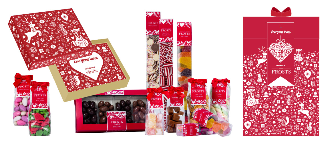
The pattern made up of the animals and other Christmas motifs was an excellent way to brand Christmas products such as voucher cards, hampers and gifts. This was a great way to ensure all products had the Frosts Christmas design irrespective of supplier and county of origin. We either supplied finished artwork or supplied the pattern to the supplier to produce their own packaging.
There are many ways of transforming a brand for specific campaigns, be it Christmas, Easter or commercial activity such as Black Friday. If you would like to discuss ideas on how we can convert your brand to fit a campaign, please contact me and I’m sure I can help.
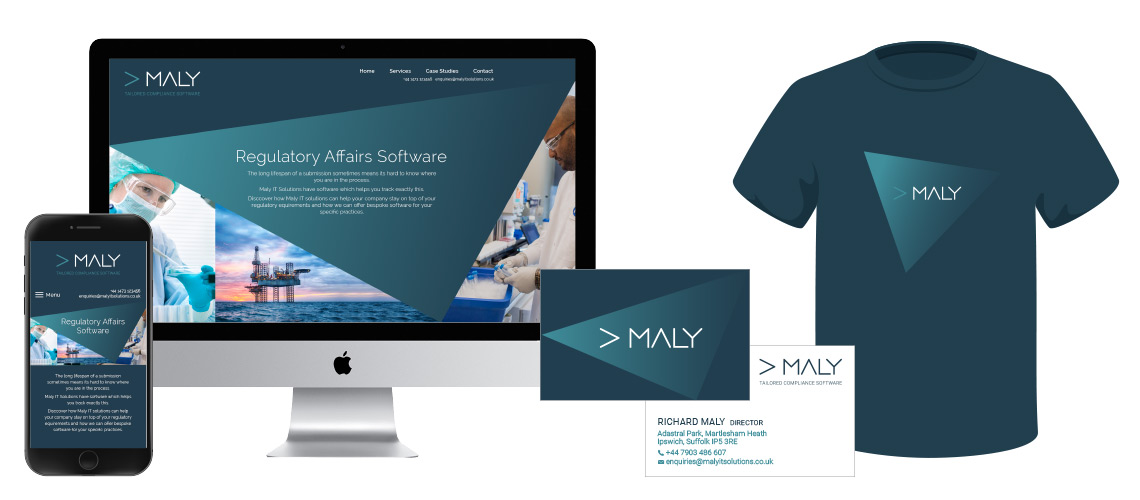
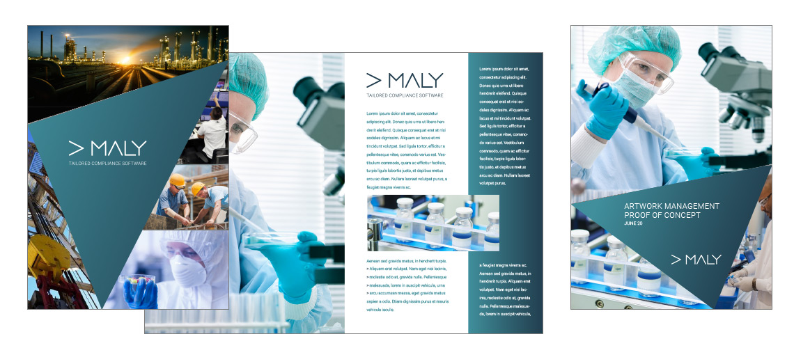
Maly IT are a software development company based in Suffolk. They develop tailored software building bespoke solutions specialising on high end workflow management and quality assurance. This has enabled them to establish themselves as a leading provider to business sectors that require bespoke software capable of handing their regulatory and compliance needs.
As a software development company Maly IT find themselves in a sector saturated with solution providers. These companies will often find themselves being quite abstract in how they present themselves as they are often offering solutions which have to tangible, visual representation. In order to help Maly IT stand out from the crowd, we developed a bold dynamic design. The logo is strong and simple highlighting the efficiency of their software, with a nod to the coding aspect implying their ability to build tailored software which is not just ‘out-of-the-box’.
The shapes which contain the logo appears in different forms across all marketing material helping to emphasise the bespoke offering. The use of this ever changing form helps give the design a distinctive feel and lessen the need to show sector specific imagery. This give Maly IT the ability to tailor their marketing as they do their software to maximise the impact to prospective clients.
The choice of colours pallet is designed to be a sympathetic to the regulatory sectors in pharmaceuticals, education, health and energy. The use of the dark and light shades allows the logo to be as effective in solid colour as is on a white background. These colours now form the basis for additions to the marketing material such as clothing and a new describer presentation as seen on their homepage.
If you are a software development company or similar business that needs to stand out then, drop me an email and we can discuss this projects and others and I’m sure I can offer a similar simple, but dynamic solution.
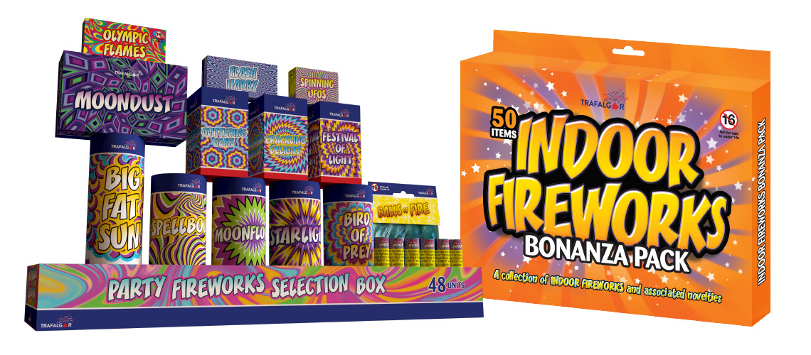
This packaging design project for Trafalgar Fireworks involves many individual products and also their counter display point of sale units.
The products needed to be brash and bold to attract the audience wanting these novelty products. These are sold all across the UK in a variety of outlets. These range from small ‘corner shop’ retailers to large chains such as Hawkins Bazaar and John Lewis.
Outdoor and Indoor Fireworks Packaging primarily for small retailers and novelty gift suppliers
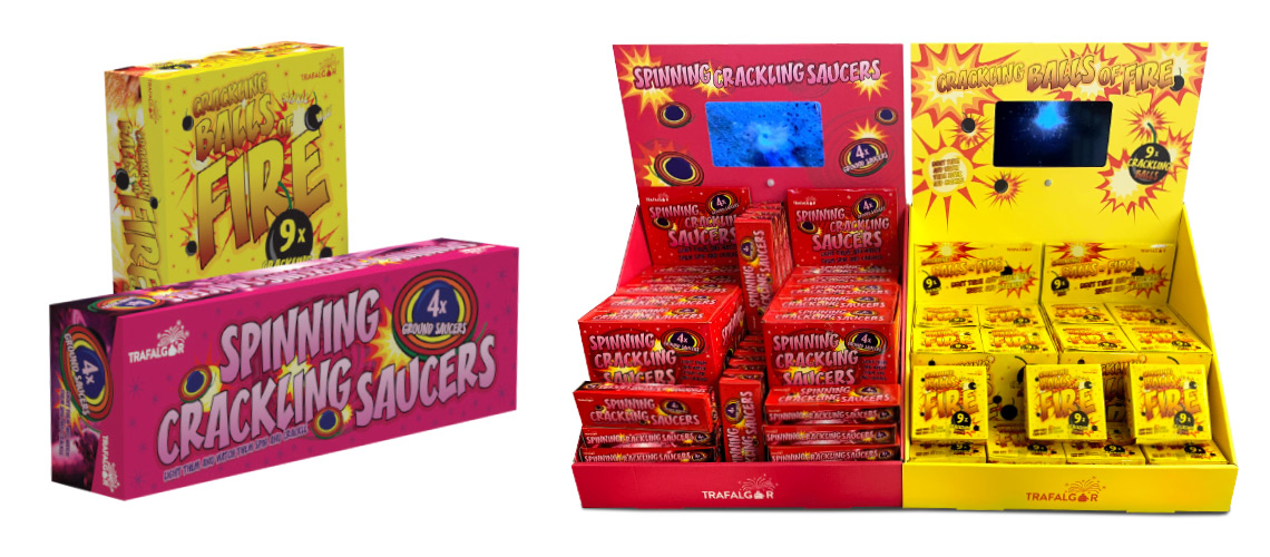
All the packaging use similar images and a common typeface to help bring the products together as a range. Although not essential as most items are stocked independently of each other, this does allow Trafalgar Fireworks to market the range more effectively. We have found this helps push new lines into stockists with them being familiar with previous products.
Counter display units come with all the products inside with a perforated rip top to allow quick simple display. The CDUs also come with a header card to give the product extra visual impact. The Balls of Fire and the Spinning Saucers are new innovative products imported into the UK market for the first time. In oder to help communicate how these products work, we developed a CDU design with an integral video display.
Novelty banging and spinning products with counter display unit with video display
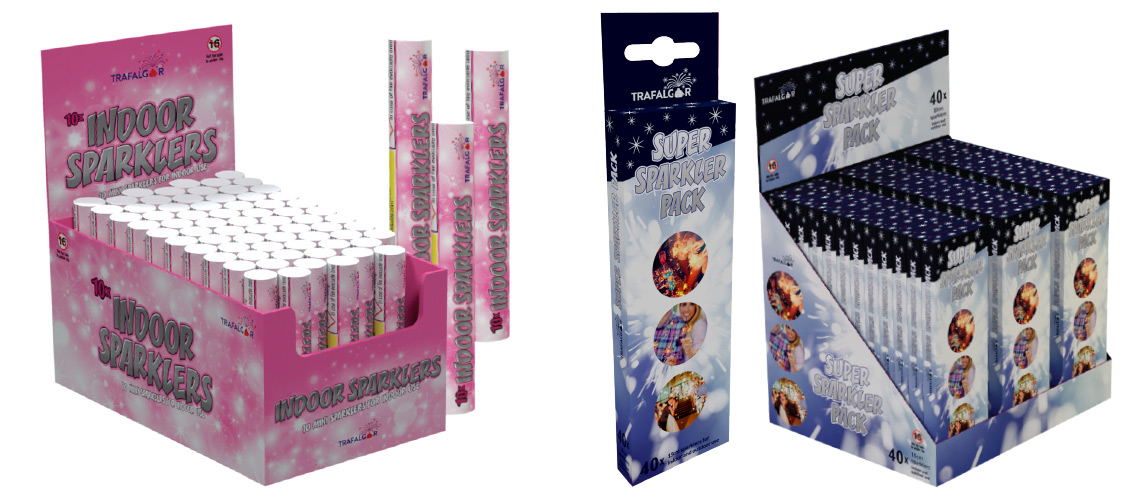
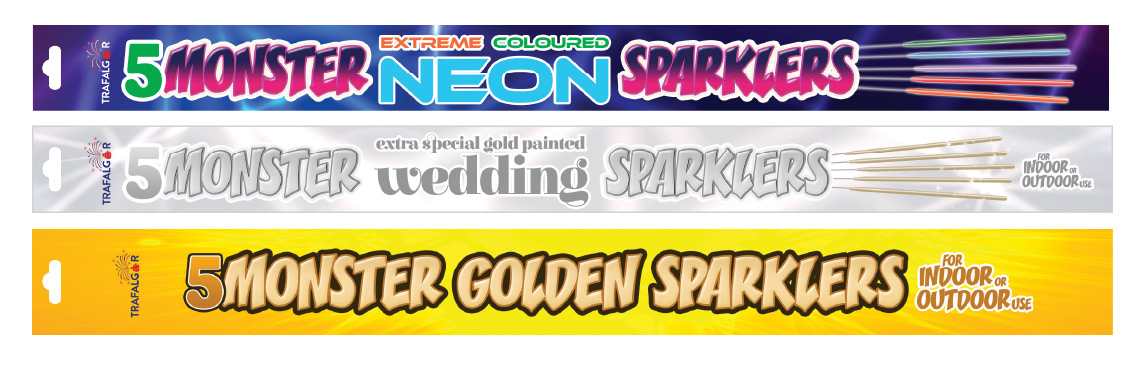
Indoor and outdoor small sparkler packaging and their respective counter display units.
An additional challenge is the variety of different printing and artwork techniques required. Sparkler products for example are foil packs and the CDUs often involve complicated cutter guides.
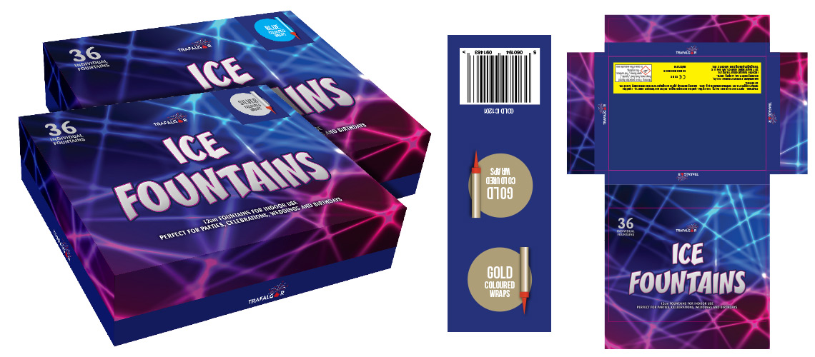
We also need to carefully consider how to save money during production. With bulk products such as these, every penny counts. In order to help keep costs down we introduced ways of printing products that involved using common elements and either over printing variations or using stickers for product modifications. An example of this the the Trafalgar Fireworks Ice Fountains, of which there are four colour options, gold, silver, blue and pink. Rather that print four separate boxes, we designed a single common box and a range of stickers. The stickers contained all product specific information, such as the colour, product reference number and bar code. The stickers were designed with a clear swatch and image to easily identify the product option. The sticker was then designed in such a sway that it wrapped around the box in order to display the product colour both on the top of the box and the side giving the retailer a choice on how to stack the item. The bar code then appears on the back of the box so not to obscure the customer information.
Ice Fountain packs with additional stickers. 4 different colour options are offered with a single box with stickers showing the colour of the product inside.
Monster sparkler foil packaging with euro slot. Also sold in counter display units.
As most products are printed at source in China, it was important to make the artwork as simple as possible. The basic rules to follow are
No embedded fonts. All fonts must be outlined as the systems used by the printers will often have font issues due to their age
Send files with and without the cutter guide embedded. This enables the factories to make small adjustments. It is often the case that the original factory sourced to print the products will no longer be able to complete the order, so an alternative company is found.
Make sure the artwork is complete. It is tempting sometimes when time is against you to send artwork to print and have the printer add in the final information prior to production. This however can lead to complications and its difficult to get a proof from the factory before they go to print. With fireworks, this is especially important and there is a lot of regulatory information to be added, and if this is incorrect, it will cause the whole batch to un-sellable.
Social media graphic creation that is on brand will make a huge difference to how your customers view your business. These immediately stand out from many other posts because they are considered and designed to communicate in a more effective manner. They also help bring a campaign together building trust and encouraging a positive action.
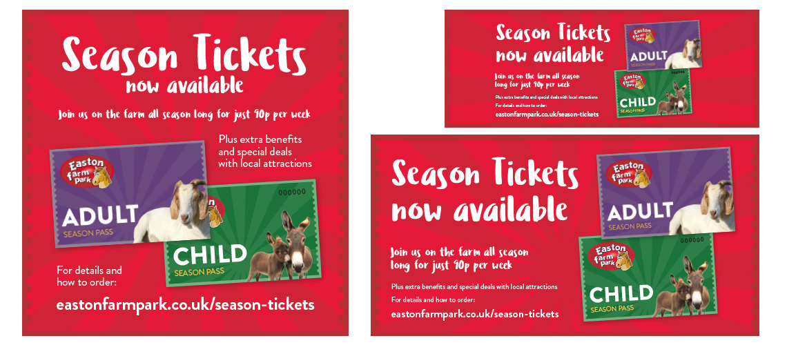
Instagram 1080px, Facebook cover and Facebook 1200px for season ticket campaign
Above shows a series of social media graphics for use on different platforms for a tactical campaign to raise awareness of season tickets. Using a common background and typeface the online campaign is designed to quickly grab the attention and mirror additional marketing activity offline.
Instagram Video Creation
Below shows the how we can use the same social media graphics for video use on Instagram. This includes real footage to bring the offer to life and engage with social media users whom particularly respond to video.
There are plenty of online options for creating social media graphics. The issue is how to use these and remain sympathetic to the brand identity. These site offer simple and quick templates to use, but these have little flexibility when it comes to correctly interpreting the visual feel of the brand.
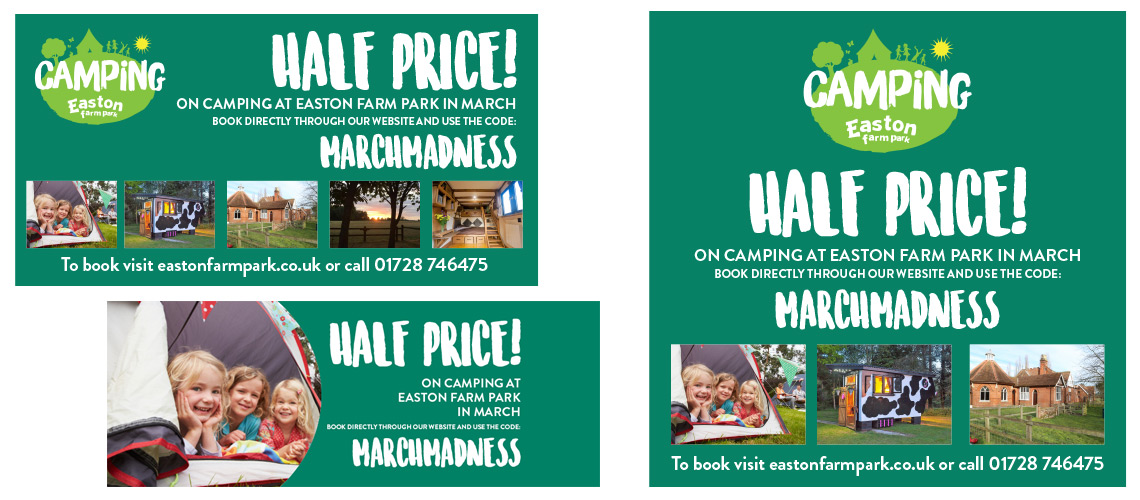
Camping campaign Facebook 1200px, Facebook cover and Instagram 1080px post
Social media graphic creation for stand alone campaigns
Social media is great vehicle to try different campaigns, but you still need to make sure these are targeting the correct customers with clear messaging and retain some link to your brand. The vast about of content a user is expected to consume means you need to work hard to pass on any authority your brand has built up.
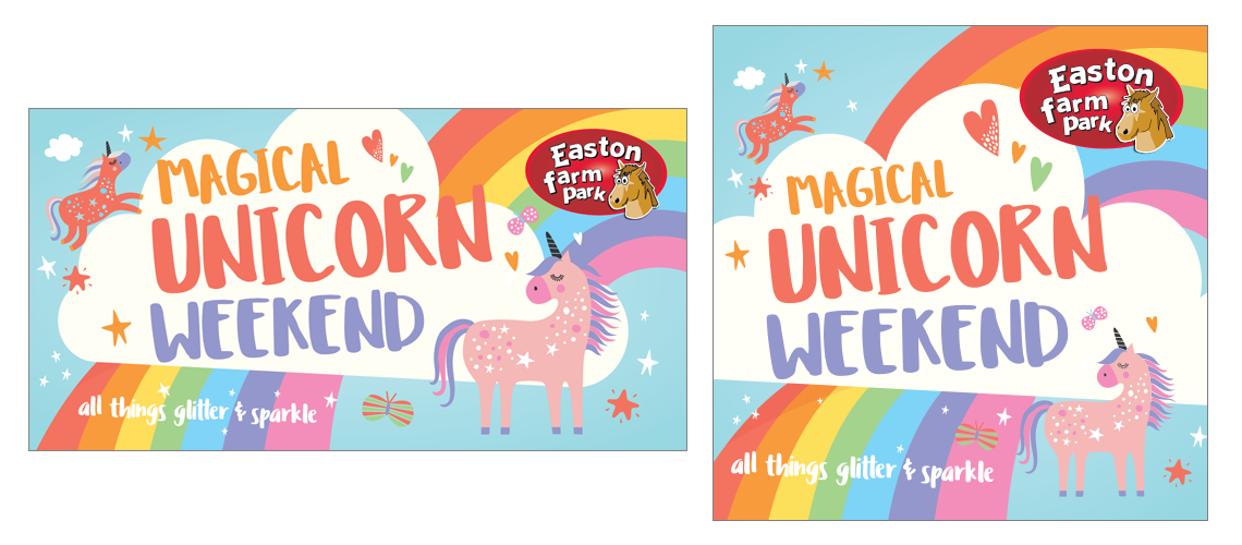
The below campaign for a Unicorn Day was designed to appeal to a specific audience. With such a departure from the main brand we needed to link back to other tactical campaigns by using the familiar informal font and choosing to add the logo onto the graphics. As most social media platforms show a thumbnail of the profile image alongside any timeline images, it is not always necessary to add the logo directly onto the image. In this case however we felt we needed to to make sure the users fully understood the event was owned by Easton Farm Park. With this, the users felt reassured it would be well organised as this is their understanding of the brand.
Social media graphic creation for tactical campaign for a stand alone event
Using social media graphics to show information
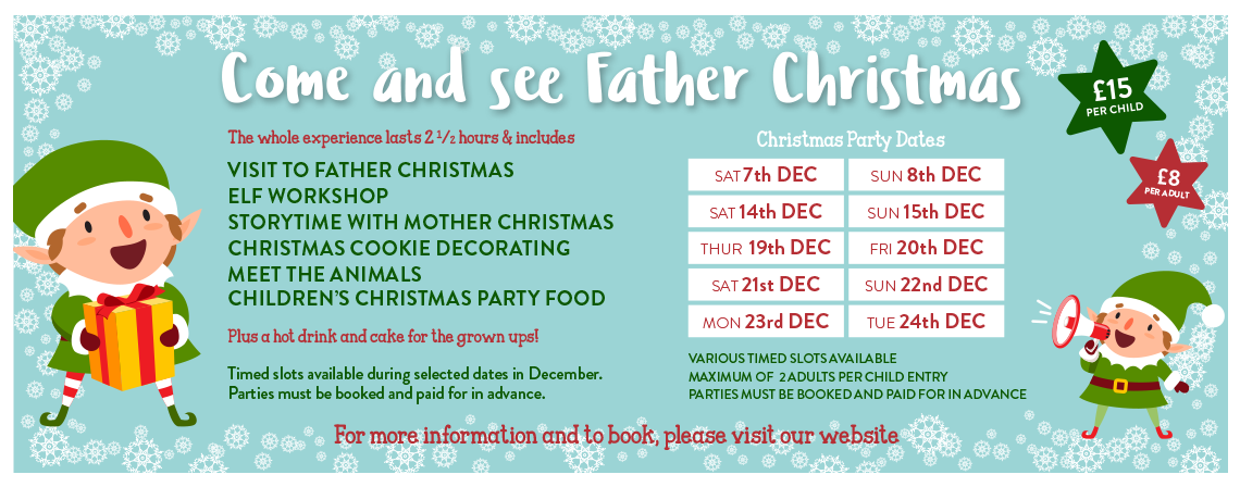
We can use the 1200px wide Facebook graphics to show more detailed information, which will appear directly in timelines once users have engaged with it. This can dramatically help the uptake of events and offers. The example below shows a Christmas event and all available dates. The detailed information encourages shares and results more users declaring their interest. Over 1200 visitors have clicked that they are interested in this event (from a page with 8600 likes). Using the event correctly has allowed the client to offer tickets directly from Facebook making it as easy as possible to purchase. The event can be found here >
Information graphic for use on Facebook timeline and event page
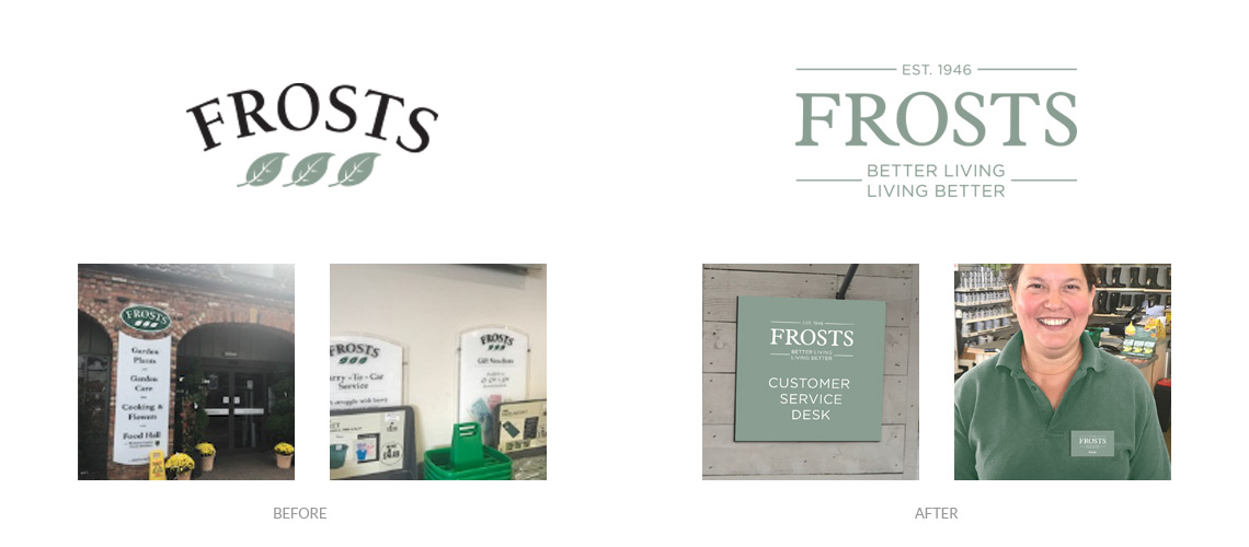
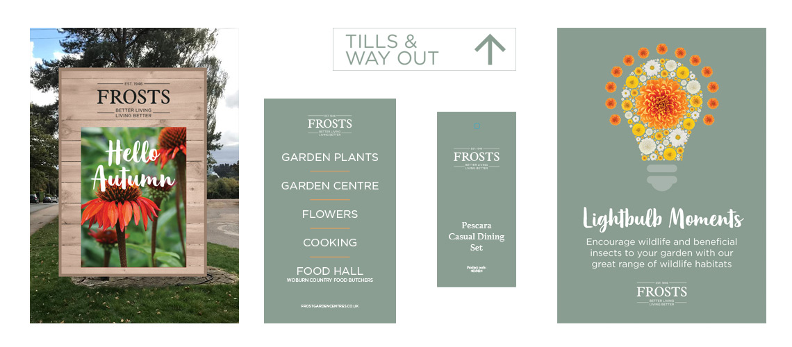
The brief was to work alongside the Frosts Garden Centre Marketing team to help them refresh their existing brand identity. This brand design refresh project was to evolve the original logo and corporate guidelines to better communicate who Frosts are now. During a series of exploratory discussions we felt the logo should reflect the legacy of previous designs. The new should be supported by an all new visual style enabling Frosts to look fresh and relevant as a retail destination as well as a garden centre.
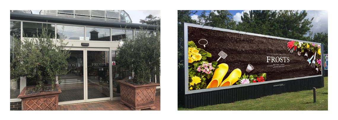
Brand design refresh visuals showing how the logo will work on external signage
The new logo is based on the existing typeface. The decision was made early on that the name no longer needed the curved effect and it was felt the leaves no longer represented the wide variety of goods and services available at the centres. The existing typeface was softened slightly with a redrawn ‘R’ to give the letterforms a pleasing flow and balance. The colour was selected from the existing colour pallet.
Over a few months we collaborated by producing a number of visuals showing how the new brand would work in context. This enabled everyone within the centre to see how the brand design refresh was developing and explore all possible examples of use.
In order to help communicate the Frosts history and values we introduced new descriptor line and chose to add the year the centre was established. This helped add to the trusted nature of the brand and emphasise the heritage the Frost’s customers love.
New road sign, wayfinders and POS
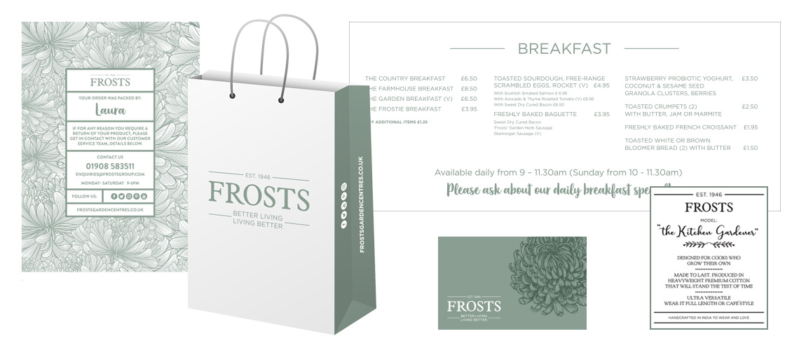
The new brand design refresh works equally well on white, or reversed out of the brand green. We also developed a new set of typographical guidelines with a strong san serif font working alongside a new more conversational script font.
Brand items such as Thank You packaging note, paper bag, menus, labels and staff card
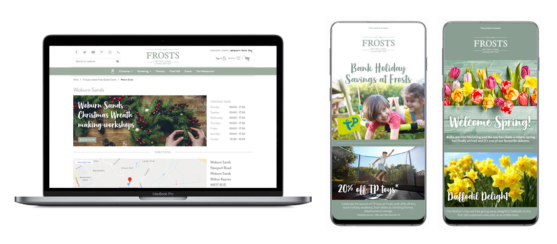
POS examples for the Frosts brand design refreshFrosts website and MailChimp newsletter templates
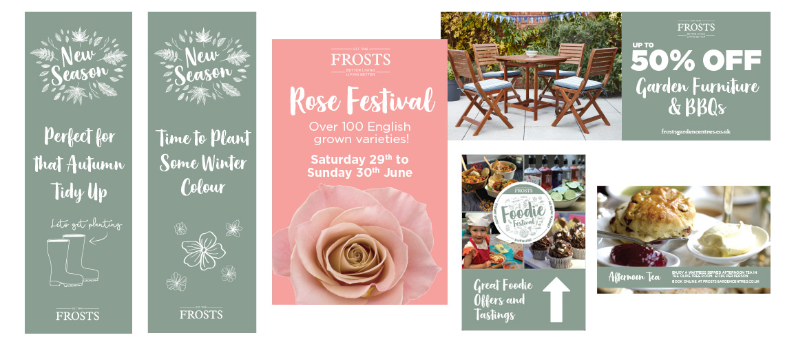
Christmas Campaign Design
Alongside the main brand, we also collaborated on a Christmas campaign design for all 4 garden centres. Using 5 hand drawn characters, the campaign uses a Christmas pattern to help transform the centres into Christmas wonderlands.
Care Development East are an independent, non-profit making, organisation focused on promoting excellence across the social care and health workforce in the east of England. They provide impartial advice, support, guidance and information to many businesses and individuals in the care sector.
Previously The Suffolk Brokerage, their logo centred around the Orwell Bridge. This is something they were keen to retain in the new brand because their service users all recognised the bridge and its place in the Suffolk countryside. We developed various stylised versions of the bridge and open this up to discussion both from with the organisation and a selected number of service users. It was decided the simple curved illustration with the iconic double ‘legs’ best represented the idea.
Once we had developed the logo, the visual identity was rolled out over all their material, including a new website, newsletters and social media. The simple bridge illustration was very much designed with the newsletters and social media in mind. With a long organisation name, it was important the bridge logo be able to be identifiable in isolation, leaving the name to rendered from the social media page name.
The purple colour was heavily used in the original Suffolk Brokerage visual identity and for this reason we decided to retain it for the new Care Development East brand. Alongside this, we introduced a new green to provide a contrasting highlight. Using these colours in combination really helped with services users being able to quickly identify Care Development East and their information.
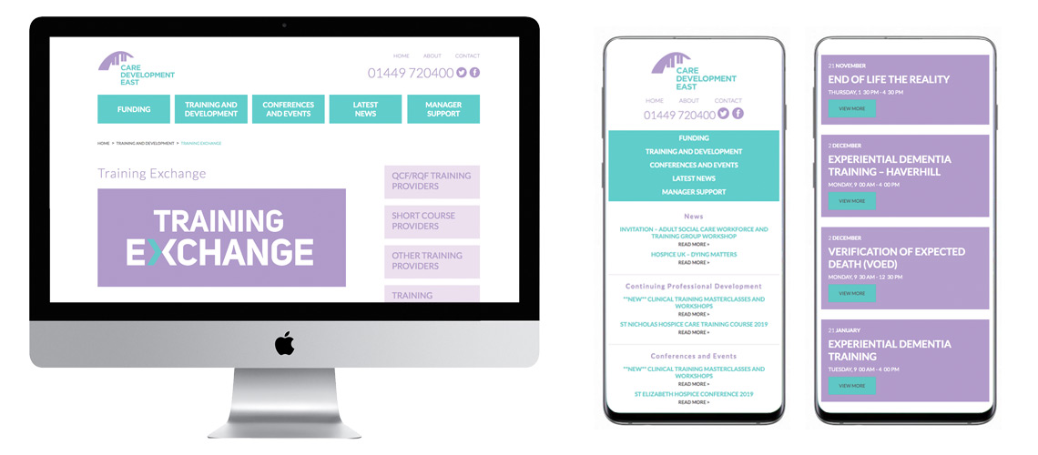
The Care Development East website was developed in WordPress giving them and their communication team total control over all content. We sourced and implemented various plug-ins to make updating the site as easy as possible and add functionality. The Training Exchange provides a dynamic list of training opportunities via a simple to use interface. The Training Provider section provides a list of all providers in the Eastern region offering RQF courses for the care sector.
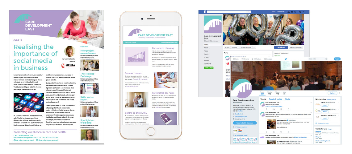
As one of the main roles of Care Development East is the dissemination of information, we also set up a MailChimp account and a series of templates which allow them to send up-t0-date information to their database.
Please get in touch if you would like to discuss this, or any other projects with relevance to logo and brand design.
Suffolk Coffee Shop ‘Coffee Etcetera’ are based at the Suffolk Barns on the A140. Formally the Chilli Farm they needed to develop a new brand for their new coffee shop. With their love of chillis and American cuisine, they wanted a cafe to offer more than just coffee and cakes. In order to offer something different, they have decided to offer a more conventional cafe during the day and a series of evening events. Being open in the evenings for special events will allow Coffee Etc to attract a different customer than a traditional Suffolk Coffee Shop and needed a visual identity to make this possible. We also had to consider how the brand could bring these very different audiences together.
Starting with the logo, we wanted to make it simple to use and simple to reproduce on tableware, clothing, windows and printed literature. The silhouette allows us to use the logo with a strong background colour. This gives the logo an immediate impact and instantly show this is not an old fashioned coffee shop. Not relying on a single brand colour allows the logo to moulded to different events whilst retaining its overall identity.
The design of the supporting material reflects the busy, eclectic atmosphere of a vibrant Suffolk Coffee Shop the business wants to promote. With such a varied offering we added images of food and associated equipment to the poster designs (below). This helps visually identify the event and in combination and with a strong colour pallet, gave each event its own look and feel.
This template can then be rolled out to whatever type of event the cafe offers. This gives them the flexibility to try different events, but still have them appear part of an overall brand strategy.
The examples above show a main coffee shop poster, a Texas style smoked meats evening event and a day time crafting meet up. All these events are very different, yet the design allows them to not only appeal to their individual audiences, but display that they are part of the Coffee Etcetera brand.
1200px wide Facebook Menu
If you would like to know more about this project, or any other logo design or brand development projects, please get in touch. The case studies on this website do not include all my work for marketing agencies and independent marketing consultants, the work of which I’ll be able to email you on request.
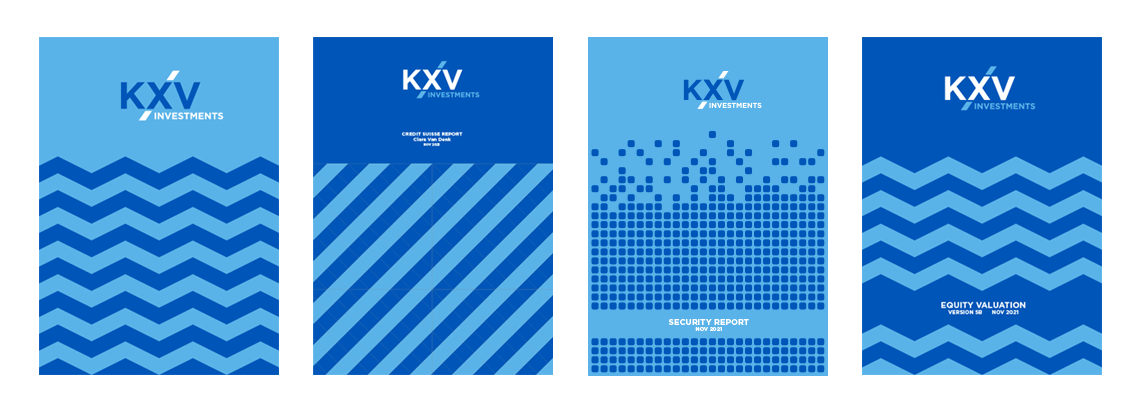
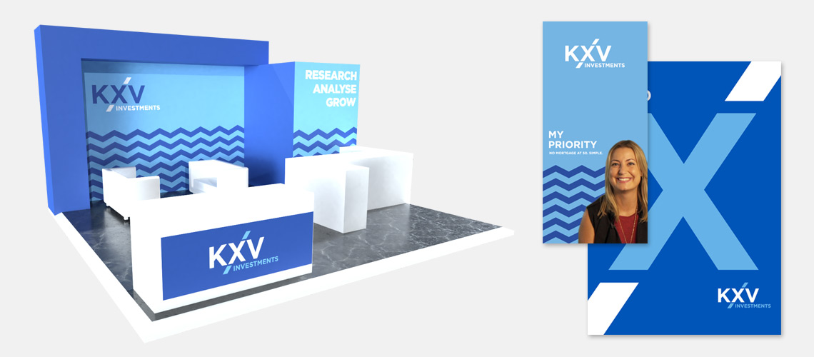
Investment Bank KXV’s brief was to design a simple, bold design that enabled them to make an impact at investor conferences.
The logo design introduced the simple diagonal line mechanism demonstrating investment. The strong shapes help communicate their confidence and their ambitious approach to investment banking.
We designed the colour pallet to change from year to year, with the 2020 being the two tones blue. The plan is then to select a new colour for the following years to keep the brand fresh in the mind of investors. The logo was designed with this in mind so can be used on white, or reversed out of any solid colour. KXV hope this flexible approach will enable them to appear more dynamic than their larger investment bank rivals.
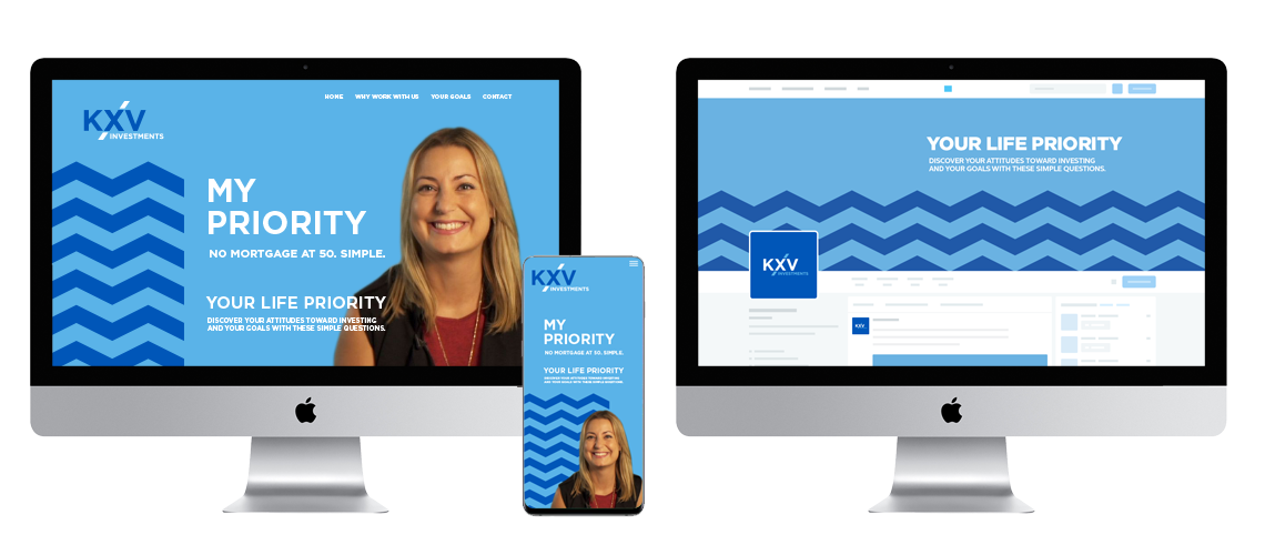
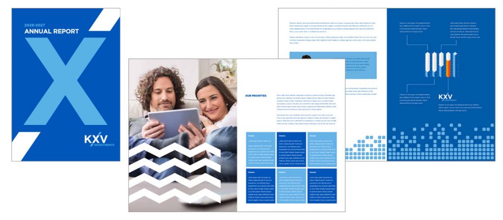
One of the main criteria for KXV Investment Bank was to move away from stock images and only use ‘real’ customers when showing testimonials or campaign messages. The strong shapes used on the brochure covers allow for this. Each cover of a report or presentation has it’s own shape design with a nod to the contents. These examples show a simple ‘tech’ pattern for a report on cyber security and a zig zag pattern for reports on market fluctuation and opportunities.
We developed a campaign based on the individual priorities of the customer called ‘My Priority’ where KXV asked a number of customers why they felt they wanted help with their investments. This enabled us to use the real customers to give the campaign an real world feel and show people future customers could identity with.
If you have any queries, or wish to contact me for more examples, please drop me a line. There are many more examples of brand and logo design on the website, plus many more which have been commissioned by marketing agencies and marketing consultants. Due to rights reasons, these are not shown on the website but these design case study examples can be shown via email.
Animated logo design is becoming more popular as we look to make websites and their visual brand more dynamic. Animating the logo is a great way to add movement and help stand out from in your sector.
As part of a project with a marketing consultant, we developed a new logo and then explored ways to make the brand more exciting. As an interior designer working in a very experimental and innovate way, the client was very receptive to new ways of presenting the brand. As part of a delivering a complete brand for the new business, we introduced this animated logo design.
As this project was completed on behalf of a marketing consultant, I have removed the real name of the art director. If you wish to discuss this project in more detail and see what else we produced as part of the animated logo design project, then please contact me.
The logo itself was a typographic element designed to be clean and simple because we didn’t want it to over power the client’s interior design pieces. It was also to be used as a stencil and needed to be easily recreated in stitched fabric or etched on glass. Away from the design pieces, we wanted to use the logo in more inventive way and animating it helped really communicate the individuality on websites and presentations. This was particularly important as the business was seeking investment for the next stage of their growth, including gallery space in central London.
The animated logo combined the typographic logo style with footage of a falling ink drop. As the ink drop hit the surface, the shape it forms indicated the variation and individuality to seen within the designs. The effect was produced by using a mixture of Adobe Animate, Premier Pro and After Effects. This was then exported as MP4 files for use in the client presentations and as an animated GIF for use on the website and supporting digital marketing.
If you have a similar project, or are looking for a freelance logo designer, then please contact me for more examples.
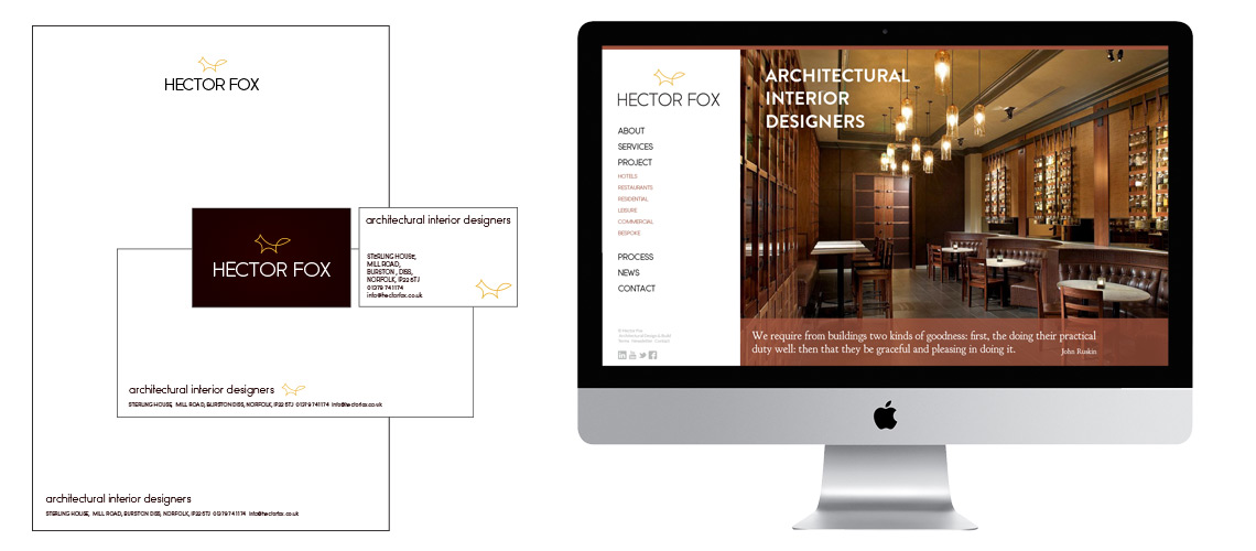
Hector Fox is a sub brand designed for an interior design studio based within TWP Designs. (brand identity project can be found here >). They currently have a good industry reputation within the sector for their work within the restaurant and hotel sector as property refurbishment specialists. However, as a property refurbishment company they were often being overlooked by businesses looking for a design led approach. By this we mean those who wanted to employ an interior design studio to head the project. Traditionally an interior design studio would submit designs and concepts, with the property refurbishment entering to process much further on. The property refurbishment specialists would then take these concepts and implement them.
TWP have an excellent in-house design team producing high end creative concepts for many of their clients. In order to promote these services we felt the best way was to re-brand this area as a stand alone interior design studio. This would allow the team to have fun with the new brand and produce more experimental marketing material aimed at the design side of the sector. This would leave the traditional marketing activity and the main brand untouched.
For the new brand we produced a new logo and corporate stationery along with a new website and social media graphics. This was a quick and simple way to approach the market and test the viability of setting up a completely new interior design studio.
Do you have a similar problem in that your brand is associated with a particular sector? Is this inhibiting any growth into new areas due to people not understand your service? Perhaps you too need to consider a sub-brand to promote and area of the business you want to grow without damaging your overall brand. Get in touch and we could discuss how we approached this Hector Fox project and how a similar approach could help you.
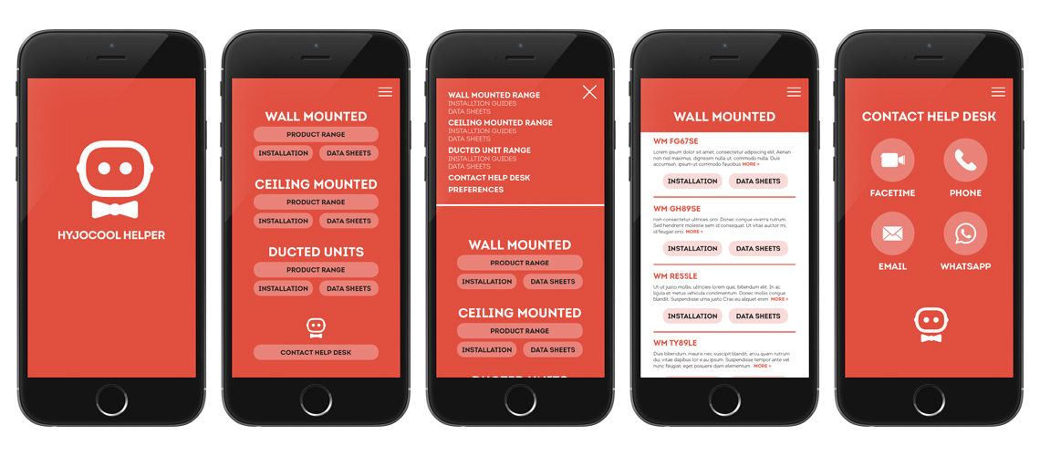
This app design project for Hyjocool provides installers with a quick reference guide to all the specifications and data for their range of restaurant air movement products. It is also designed as a useful toll to enable quick communication with the Hyjocool Help Desk.
Research and Creative Concept
This app design project was the result of conversations with Hyjocool about how they wanted to re-engage with installers and position themselves as a modern, progressive company. Taking these objectives, we explored various concepts before moving the app design project forward. We felt this was the best way to display information, much of which already existed, in an exciting new way. The app would then act a campaign to promote the company as well as proving to be a value tool in itself.
App Design
The app is designed to be simple and easy to use. Installers will often need access to data sheets and installation guides while installing a new system. The provision of this app is gives the installer another good reason to choose a Hyjocool product as they know the information will be easy to find and up to date. It also highlights the dedicated Help Desk.
The products are split into 3 main areas and this can be accessed by a main homepage and through the menu navigation. From here the installer can then drill down to the specific product data.
Screen examples of app design for Hyjocool. Screens show (from left to right) intro screen, main navigation homepage, menu example, product selector, help desk interface
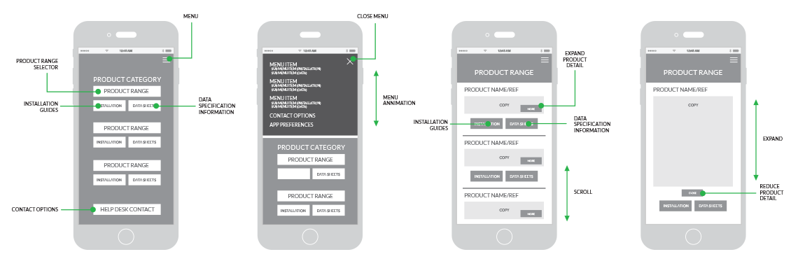
App Design Wireframes
Before any design was completed, we produced a set wireframes to explore how the app would work and the relationship between the pages. Once we were satisfied all the content was available we completed a set of design visuals. These are currently being worked up as a functioning prototype ready to be tested.
Wireframe examples for the Hyjocool app design showing (from left to right): Main homepage, menu example, product range page, product range page with expanded detail.
App Logo and Identity Design
It was important to Hyjocool that the app had it’s own identity. They wanted it to be more that just a tool, they wanted it to add positively to the overall brand perception. The logo designed added value to the app and installers value the way it looks and feels. The identity positioned the app as the as a help to the installers and help elevate any fears they had about accessing assistance.
Do you have an idea for an app to help your business communicate with your customers? Get in touch and we can talk ideas and how best to make it happen. As with this project, as a freelance designer and not just an app designer I am best place to help design it’s own identity and give it a personality of it’s own.
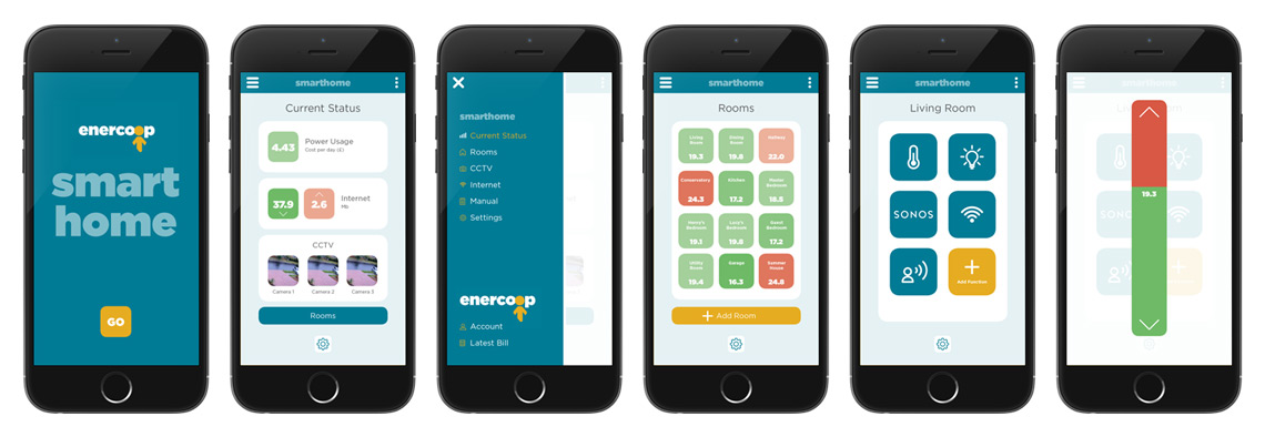
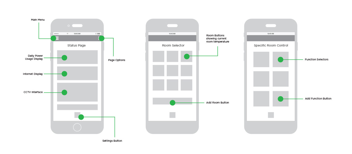
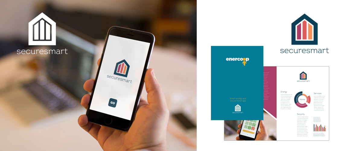
This is an example of UX UI design project for a home control app. This app is being developed by a London based investment company who have stakes in both a CCTV provider and home security business. Their plan is to make available a white label app that can control various home functions and offer it as part of a deal with new energy providers.
Many new energy providers are entering the UK market and this app is offered free in return for the opportunity to provide the customers with home security. Using a white label app offers considerable savings for the energy provider. It also allows the provider to offer the app immediately without needing to embark on a lengthy development process.
Selection of screens showing the app. From left to right: Homepage offering energy provider branding, Current Status screen showing an overview of energy usage and any other chosen services, Menu, Room overview showing each room’s temperature, Example of individual room controls, Temperature control.
The apps works via a number of APIs from the security software that controls the alarms, access points and CCTV. It will then use the smart meters provided by the energy provider to show customer energy use. Additional functionality such as internet control and audio/visual control will then offered as add-ons. Basic SONOS controls for example can be controlled via the app. The app is now in production ready for launch in AW18.
Examples of UX UI design wireframes for main status page, room selector and room control interface
The UX UI design will be tailored to each provider, allowing then to add their own brand identity. As far as the consumer is aware, the app is part of the energy provider’s service so any reference to the white label brand is removed. With this in mind, the design has to be easily adaptable.
As well as the UX UI design we also designed a proposal document and identity for the white label version of the app.
White label branding to use on the app plus example of tailored proposal document designed for to pitch to each energy provider.
Do you have a project you need a freelance UX UI designer to assist with? Get in touch for more examples of interface design and other design projects I have been involved in.
We explored various solutions and discovered WordPress was by far the most suitable. Quick to implement and OpenSource, WordPress is used by millions of websites all over the world. There are plenty of online resources available to help with learning how to update a WordPress site. There are also many pre-built templates to choose from which cost very little.
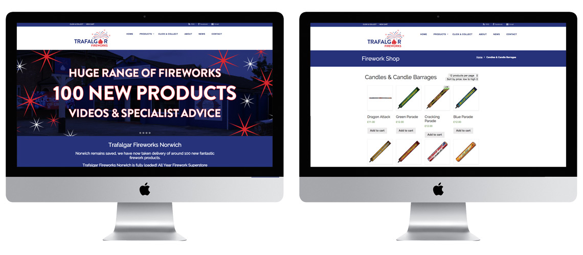
Trafalgar WordPress Design and WooCommerce product page
WordPress can be used alongside an eCommerce solution called WooCommerce. This, as with WordPress, has access to thousands of extensions allowing you to customise a store with added functionality. Due to the nature of the business, it was necessary to find possible ways to add value to the site. Fireworks are notoriously difficult to transport making any delivery options prohibitive due to costs. Very few carriers are willing to deliver fireworks, and those that do require large volumes to make it worth their while. Again, due to the specific challenges faced by the business, we needed to offer an alternative for those with limited time around key dates, such as Guy Fawkes Night, Diwali and New Year.
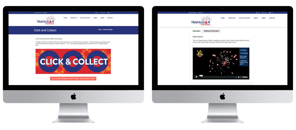
We explored the possibility of a Click and Collect service. The central Norwich location of the shop and the fact that they have parking at the front made this feasible from a logistics point of view. Click and Collect also provided an ideal option during busy periods at it allowed customers to select what they wanted before visiting and allowed Trafalgar to organise the order in advance. With WooCommerce installed, we sought a Click and Collect module which has been installed and has been very successful. The module even had options to allow a certain time slot to be ordered by the customer making the process even more streamlined.
Click and Collect plugin and example of firework embedded video
Another way to add value is to add video to the site. This is something that WordPress excels at and is very easy to embed YouTube links into pages. With videos on the site, Trafalgar can show how a firework performs, giving them the edge over other local firework providers. Not only does this allow customers to understand what they are buying, but also allows them to curate their own displays.
Are you looking for a quick, cost effective WordPress design? Do you want to find creative ways to add value? Drop me a line and we can discuss how you can get your business online and how we can make the site worth visiting.
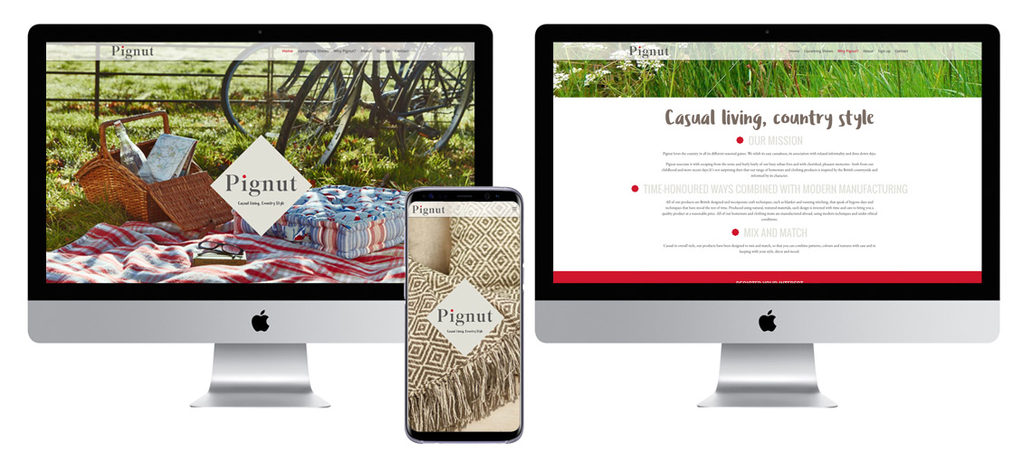
This project for Pignut included developing a single page brand website, an eCommerce site and website training for the marketing department.
Firstly we developed a quick and simple single page website to help establish the brand and build awareness. This site help generate valuable leads while the main site was in production. It also provided a showcase for some of the excellent photography which had been commissioned.
As well as establishing the brand values and visual identity, the site also provides details on trade shows where buyers could view the new product ranges.
Pignut brand website
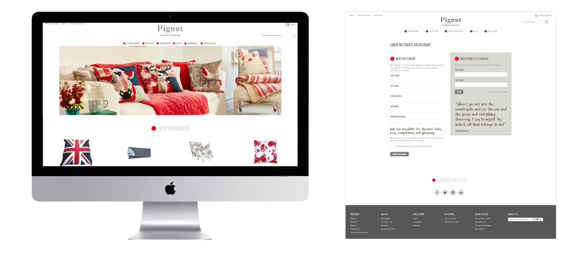
The main site was developed using Magento as the main platform. An excellent eCommerce platform, Magento offers a wide range of services and options and is very flexible and scaleable. The Magento Marketplace offers access to thousands of extensions so any possible functionality will be available.
One disadvantage, as with any out-of-the-box solution is the use of templates. These templates are tried and tested and allow you to get the site live quickly. The danger is however, every templated site will look the same. We therefore had to work hard to produce extra design and code to ensure the brand value are experienced at every point during the customer’s journey.
Example of Pignut login page with brand elements
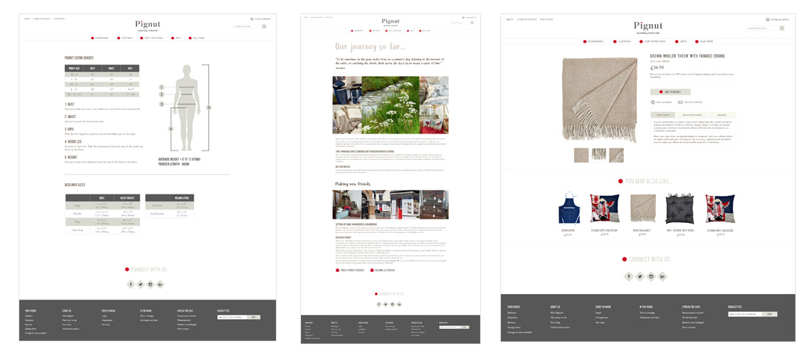
Pignut Sizing page, Brand Story page and Product page
Website Training
Once the site was ready to go live, we delivered a number of website training days teaching the Woodbridge marketing team on how to use Magento. This showed them how to add/edit products, how to add offer codes and how to add news articles. They also mastered the ordering process making sure all customer communications where in line with the brand values.
In order to make sure the teams were comfortable with how the system worked, I embedded myself in their offices for a week and helped with all updates. This also allowed me to observe how they went about updating the content and adjust my training accordingly.
Website Design
Do you have a similar website design project? Are you worried your site will look to generic if you use a template solution? Get in touch and we can talk about ways to make your website stand out and deliver your brand values.
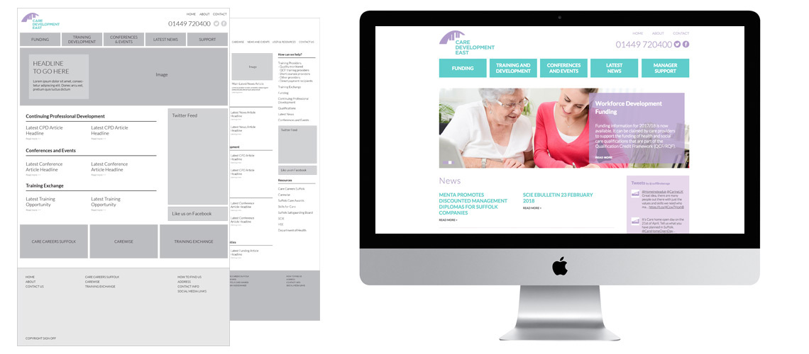
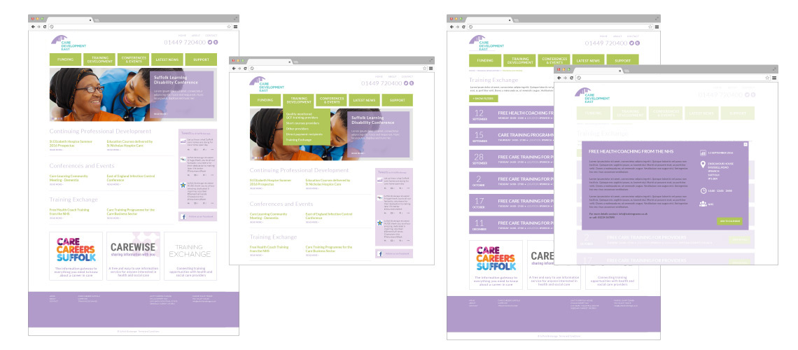
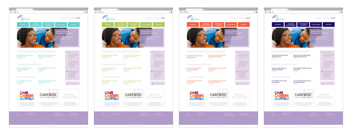
This website development project for Care Development East started with a series of interviews to establish the clients requirements. This included, not only the proposed content of the site, but also who in the organisation was responsible for updates, their experience with CMS systems and any additional functionality needed. They wanted to bring a new fresh, clean design to their online activity and provide new tools to allow them to provide more training opportunities to a wider audience.
We decided to build a bespoke site but use WordPress as the platform. Care Development East had knowledge of the WordPress CMS which would mean any training time would be kept to a minimum.
Once we had established the content we produced sitemaps showing the information architecture. Production of wireframes were then designed to show the information hierarchy and proposed layout.
Once the wireframes had been approved by all departments, we produced a series of flat website designs of the homepage and key pages. The design utilises a lot of white space giving the design the fresh clean look we were looking for. The principle information is contained in a single, large top navigation and any lesser navigation is retained in the footer.
As part of the website development we needed to tweak the Care Development East corporate identity design. The brokerage used a series of established purple colours as part of their identity. We felt while designing the website we needed a new accent colour to bring the deign to life and help highlight important information. We experimented with a number of designs and all agreed the teal green was the perfect accompaniment to the purple.
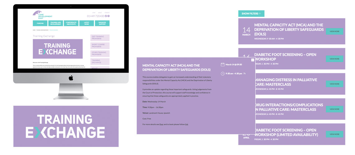
Care Development East Training Exchange
One of the challenges was to add the required functionality to the site as quickly and efficiently as possible. As WordPress access various plugins, we wanted to use these as much as possible rather than code our own. A good example of this was the Training Exchange added to the site. This area needed to display a number of specific training opportunities allowing the care sector to share training courses. In order to achieve this we sourced an excellent plugin designed to manage classroom bookings and repurpose it to use as Training Exchange. This kept costs to down to just the plugin, implementation and design. This area was then given its own logo and identity design adding to its value.
Suffolk Training and Course Providers
Another section which required additional functionality was the Training Provider and Short Course Provider section. This area allows providers from Suffolk to list the training they provide. It is a section which gives care professionals a simple list of all relevant providers to contact when organising mandatory and additional training for their staff. This again utilised a WordPress plugin, in this case a portfolio plugin to give the Suffolk Brokerage a quick cost effective solution.
Website Development from a Suffolk Freelance Website Designer
Do you have a similar website design project? This is one of a number of projects I have completed and demonstrates how I can discuss with you to find the best solution. This is done without confusion and with a total understanding of the skill sets of those involved. It also shows how we can develop an excellent site without a massive budget by using existing software. If you would like to see any other examples, including those completed on behalf of agencies or marketing companies (which I don’t show on this site), then please contact me.
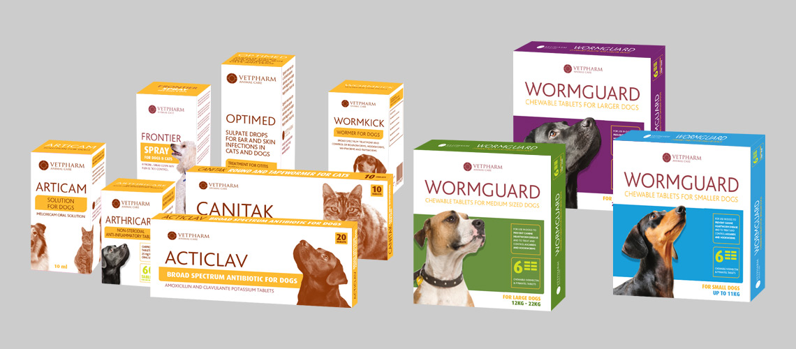
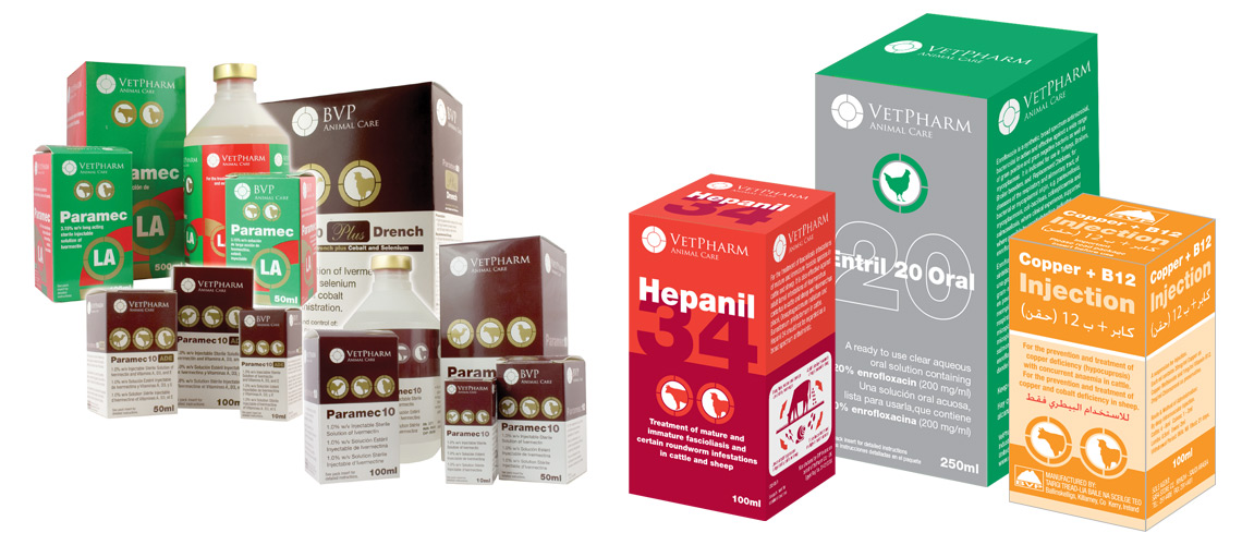
This start up company design case study for VetPharm Pharmaceuticals is a demonstration of how working with a business from the initial development meetings through to full launch and beyond.
Working with the VetPharm Directors, we produced a series of brand designs while they prepared the company for launch. All the directors were leaving positions within the pharmaceutical sector and would be under contractual embargo with regards existing contacts. Having the brand design and website ready to go from day one allowed them to begin to attract new contacts while honouring their contracts.
The project was typical in its nature in that those involved were experts at developing products and getting them to market, but hadn’t previously been involved in the design and marketing. Due to the sensitive nature of the relationship with their previous employer, they needed to make employ a new freelance graphic designer who would help understand their vision and work with them as they formulated the new company.
We began work by researching similar global businesses and examining their corporate identities. From the research we established that our new identity had to be flexible enough to reach a range of very different customers.
VetPharm went on to bring a number of original new products to market alongside mass produced animal health medicines such as Ivermectin. These products were sold on global market with particular strength in Vietnam/Korea, the Middle East and Africa. as well as commercial farming products, we developed packaging for the domestic pet market.
Alongside the packaging range, we produced sales literature, exhibitions, websites, including mini-sites to target niche products and I even helped art direct various photoshoots in their Uk and Irish production facilities.
As they matured, VetPharm introduced an in-house manufacturing department which was capable of inventing and testing new products. As moved away from the initial start up company design we explored the best way to sell to these countries and how the cultures responded to colour and design. For example, the African market responded to images of the animals on the packaging, primarily because a lot of the farming population are illiterate and the Middle Eastern market responded to metallic finishes and colours as they represented quality.
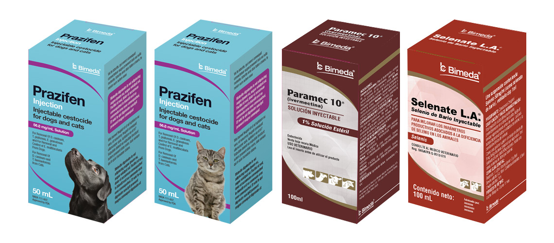
Being able to acquire the relevant export licenses for numerous countries, VetPharm emerged as a partner for many larger companies. After 10 years of successful growth, VetPharm was sold to US pharmaceutical giant Bimeda who continue to sell and develop the many innovate products. As part of the hand over, I worked closely with the Bimeda team in Chicago to convert all the VetPharm packaging over to the US design.
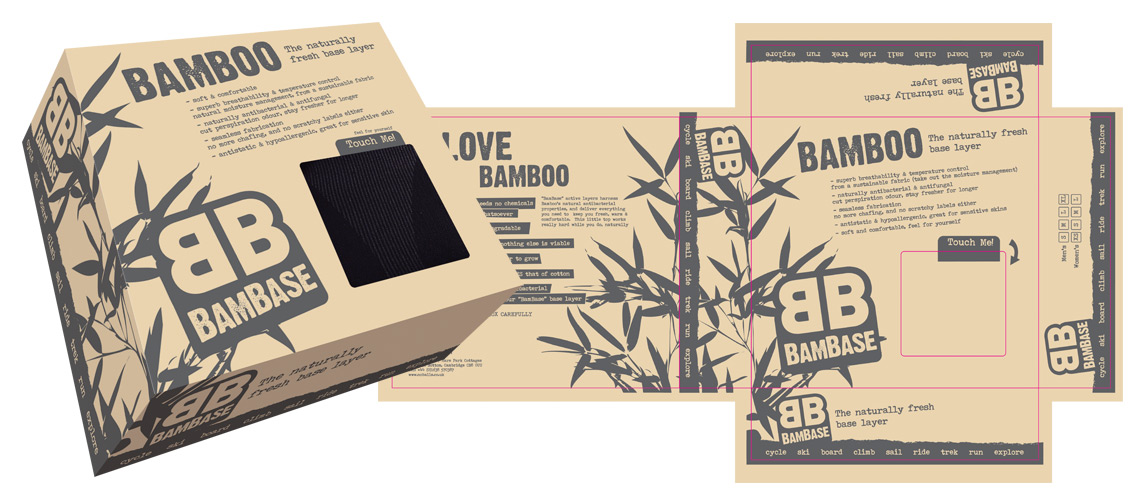
Bambase was a sub-brand specifically created to sell a range of bamboo yoga wear. Bamboo has some special characteristics which needed to be reflected in the design.
Bamboo is a fast growing plant making it ideal to farm for commercial use. It also requires very little water and combined with it’s natural defences which require no pesticides this makes it the perfect environmental choice. The design reflects this with a simple, single colour print onto recycled material. The obvious shape of the bamboo plant helps reenforce the natural product and gives the graphics an interesting, attractive quality. The use of the single colour print gives the design a strong brand identity which looks great on all media. It also helps in keeping the print costs down allowing BamBase to focus on the materials ensuring they are of good quality as well as sustainable.
Bambase Bamboo yoga wear box design and artwork
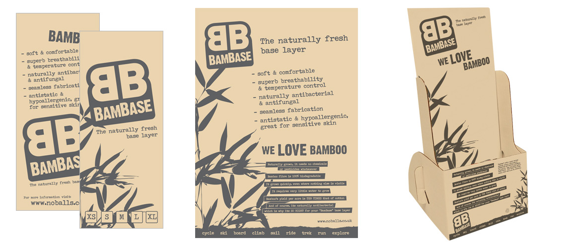
Bamboo yoga wear design project
As part of the project we produced packaging design that had section to remaining clear allowing consumers to touch the product. This was important as one of the great benefits of bamboo is how it feels. Larger products were accompanied by swing tags with the sizes added giving the shops the task of circling the relevant size. A series of posters and POS display units were produced to support in store marketing. These identified the benefits of bamboo and educated the consumers on why the product needed their attention.
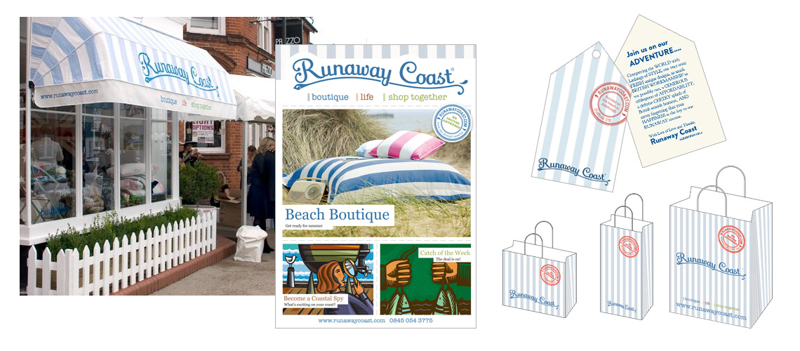
Runaway Coast were a high end homewear retailer based in Aldeburgh, Suffolk. They produced and sold to both to consumer and trade, a variety of bedding, cushions and other home products. Working with Runaway Coast Runaway we developed a fun and attractive brand which proved very popular amongst their local and national customers. The business expanded operations into London and various other pop up shops and trade customers.
Runaway Coast Aldeburgh shop, original 4pp consumer leaflet, consumer bags and product label
The brand identity was developed using an existing logo. We designed a signature style for literature and the retail outlets using their Lighthouse Stripe fabric. This was the best selling bedding range and had quickly become synonymous with the brand. Using the stripes on bags, leaflets and adverts gave the brand instant recognition and provided a useful tool to bring all the elements together. It was also valuable that using this brand pattern was simple and therefore cost effective to print.
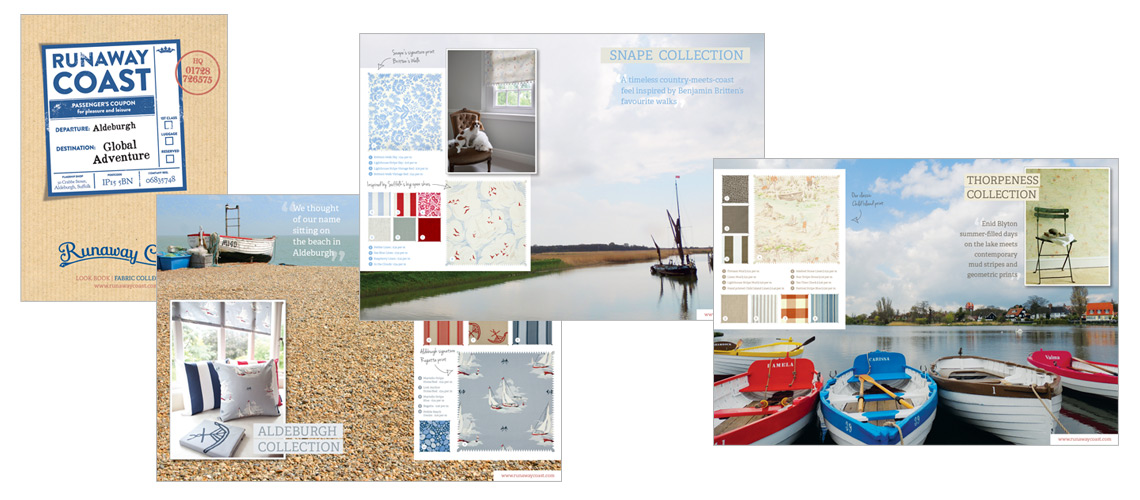
Runaway Coast 16pp Lookbook designed to showcase their fabrics to trade buyers
We wanted to base the activity and the look of the brand material around the fun, memories and the beauty of the Suffolk coast. Rooting the brand on the Suffolk Coast gave it a strong sense of identity and helped promote the narrative behind the company. We borrowed heavily from established iconography and imagery found in coastal designs to influence the brand style. Memories of coastal holidays provided a very strong, positive message and using this helped the brand. Runaway Coast was all about presenting themselves as fun and friendly and the depth of material provided by coastal objects such as postcards and travel labels were wonderful to use in the designs.
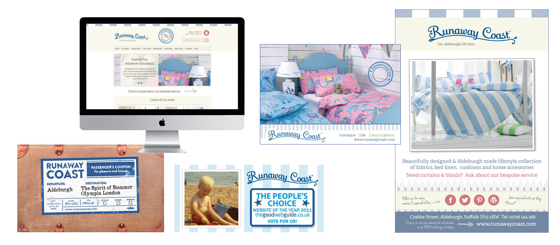
Runaway Coast website, examples of social media graphics and press adverts
The brand was also influenced by what the coast represents. The sense of freedom and escape the Suffolk coast offers was something else we wanted to weave into the designs where at all possible. Using photographs showing the space and natural beauty of the coast we helped convey these aspects in literature and point of sale.
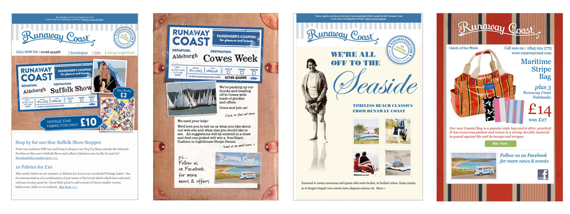
Examples of the highly successful Runaway Coast email campaigns
If you have a brand which needs a similar narrative or feel your story isn’t coming through in your brand design, get in touch and we can discuss some options. As you can see from the examples, we worked hard to make sure the brand message was communicated on all elements.
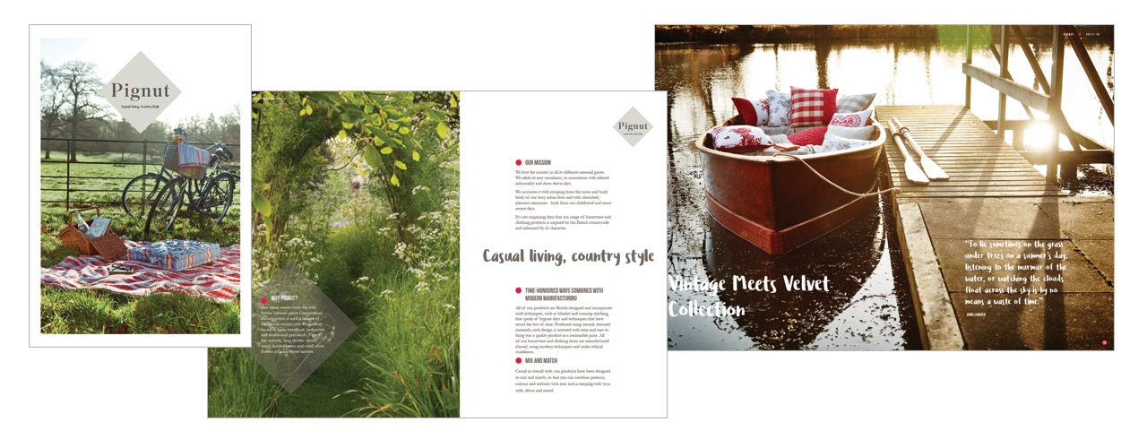
The project was to build on the brand identity work produced a London agency and ensure all the Pignut graphics and supporting material remained on brand as the company launched the business in Suffolk.
Taking the logo and the brand colours, we developed a number of projects including the opening of their new shop in Woodbridge, the design and print of their new consumer brochure, trade show promotional literature and all supporting documentation.
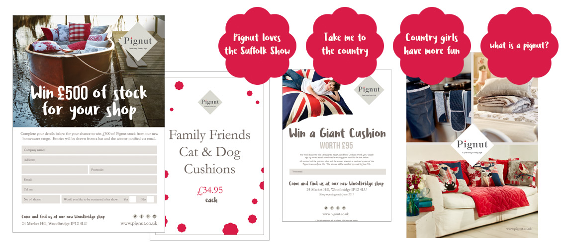
Trade and consumer show graphics, including leaflets, flyers and shaped stickers
Pignut Consumer Leaflet Design
A balance between aspiration and accessibility
Pignut position themselves very much as an aspirational, but accessible brand and the graphic design had to reflect this. Using the flower and the shape from the logo as motifs to run throughout the visual identity we developed a creative platform to use on all material. Pignut invested in some great photography so it was important the design didn’t over power these and allow the products to sell themselves.
Strong use of the brand colours is seen throughout the designs. The font choices were of particular interest. There were three corporate fonts in use and it was important to retain a consistent message when using these. A robust font is used for headlines supported by a serif body font. These are complimented by a script style font to use in a more conversational way for quotes and requests. This allowed the visual identity to be more personal while retain some authority when needed.
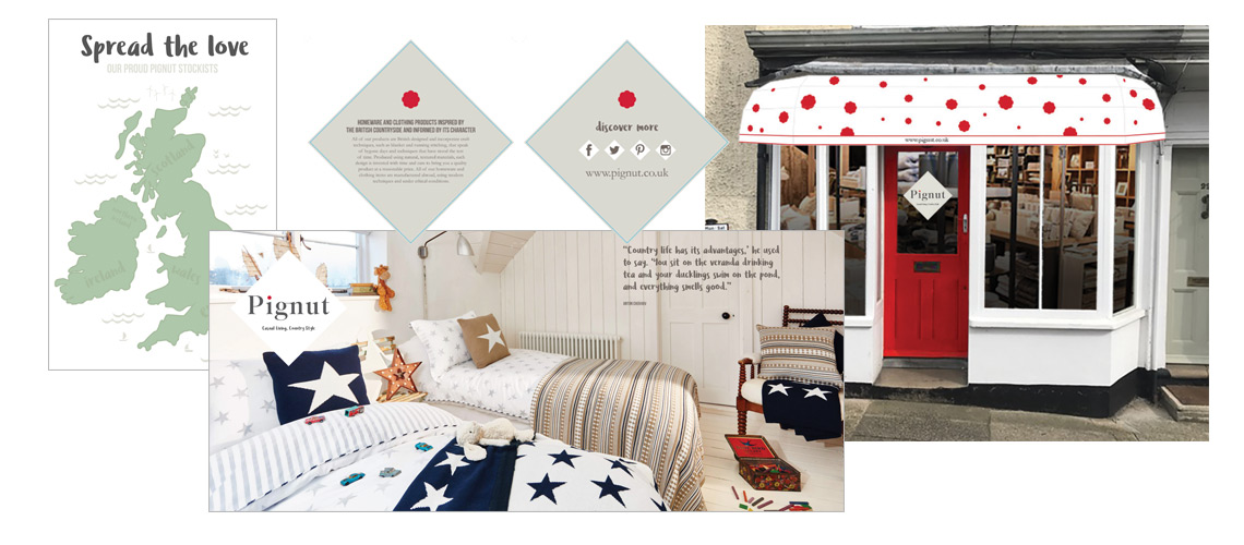
Pignut shop visual and some of the internal vinyl graphics
Pignut graphics – style and detail
As the brand is all about style and detail, we needed to establish these brand values in the design. Time was taken to ensure all the Pignut graphics and documentation, even down to the most basic of order forms followed their visual style.
This continues through to their social media channels, press adverts and even the shop posters. This all adds up to a clear brand style which communicates their values.
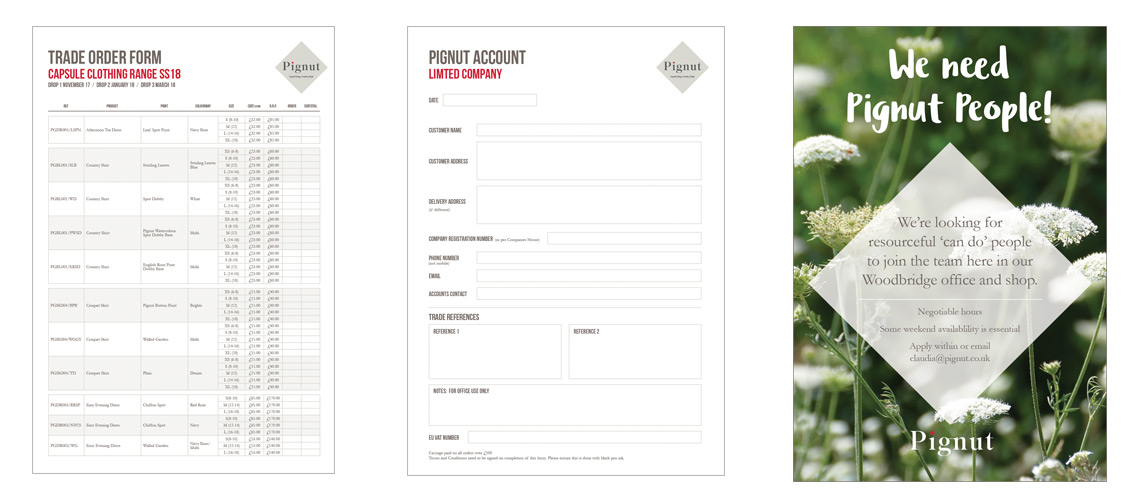
Even the simplest price list and order form are styles to give brand consistency across all documentation. This shows a Trade Order Form, Account Application and shop recruitment poster.
If you have a similar project and would like to know more about how we brought Pignut to Suffolk, drop me a line. I have many other examples of Brand Development which might be of interest. Check out some other examples here >